


UK Tax Burden Infographic Video
 Randy
RandyThe UK Tax video, posted on Youtube by See What You Mean, explains how much money you actually receive after taxes in the UK. Below is the final infographic.
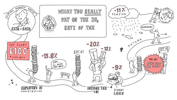
The tax and deductions on your job are much higher than you might think. The Government likes to talk about a ‘20p rate’ – as if that’s all you pay. But actually, for a typical middle income graduate, total deductions are more than 48p in every pound earned (over the £21k threshold). And will rise to nearly 60p when the statutory pension scheme comes in by 2018.
What will it do for the incentive to work and do better, and to the UK’s general prosperity, when graduates only get 40% of any extra they earn?
Against this backdrop some politicians still talk of increasing the taxes on these middle earners.
This is a great example of using the hand-drawn style of design for infographics. Often used for graphic recording of events and meetings, the hand-drawn style has the look of someone just drawing on a whiteboard.
Video infographics tells stories in a very linear way, and in this case the visual metaphor of a road builds on that linear storyline even more. The drawing continues to build and reveal more information as the video progresses, and the viewer can see the overall design coming together.
I say this often, but I'll say it again. "Big numbers are not data visualizations." Visualizations can help the audience by showing the taxes percentages as taking their portion of a person's total salary. Just showing the text number of the percentages, doesn't help the viewers understand how large that tax burden is to them.
Thanks to Richard for sending in the link!

Reader Comments (1)