About
Randy Krum
President of InfoNewt.
Data Visualization and Infographic Design

Infographic Design

Infographics Design | Presentations
Consulting | Data Visualizations

DFW DataViz Meetup

Join the DFW Data Visualization and Infographics Meetup Group if you're in the Dallas/Fort Worth area!

Search the Cool Infographics site

Custom Search

Subscriptions:


Feedburner

The Cool Infographics® Gallery:

How to add the
Cool Infographics button to your:

Cool Infographics iOS icon

- iPhone
- iPad
- iPod Touch


Read on Flipboard for iPad and iPhone

Featured in the Tech & Science category

Flipboard icon

Twitter Feed
From the Bookstore

Caffeine Poster

The Caffeine Poster infographic

« Massive Infographic of Star Wars A New Hope | Main | Sizing Up Sharks »
Monday
May232016

Dogs Hate Hugs

Dogs Hate Hugs infographic

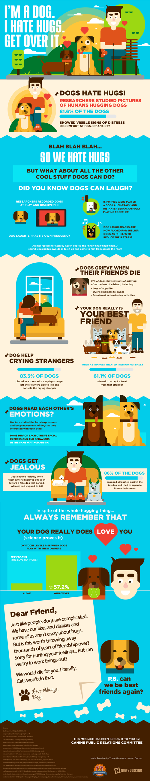
The Dogs Hate Hugs infographic from Pet Insurance U reveals the surprising fact that dogs really don't like being hugged.

This infographic shows humans why, in spite of this whole hugging fiasco, dogs are still your best friends. Do dogs hate hugs? Researchers studied pictures of humans hugging dogs, and 81.6% of the dogs showed visible signs of distress, discomfort, stress or anxiety.

Designed by NowSourcing, this is a good example of an infographic highlighting an insight that is probably surprising to the audience. Infographics should share some insight or knowledge learned from data research that will actually teach the readers something new.

I have one major issue with the way they visualized their data. The statistic of "Oxytocin levels rise by 57.2% when dogs play with their owners" is visualized with a non-zero baseline, making the increase in the bar chart appear to by a 10x difference. This visualization is extremely misleading. Don't adjust the scale of the y-axis to over-emphasize a change in the data!

Thanks to Brian for sending in the link!

PrintView Printer Friendly Version

EmailEmail Article to Friend

Reader Comments (3)

I love this graphic! I didn't know a lot of that stuff but it's super interesting!
May 24, 2016 | Unregistered CommenterHouston Electrician
Hi Randy, thanks for posting this!

I'm a bit of a data extrapolation newb, can you explain how you can tell the oxytocin fact didn't have a zero baseline without seeing numbers on the x and y axis? Thanks!
June 2, 2016 | Unregistered CommenterStephanie
Sure Stephanie. If the Oxytocin chart had the correct zero-baseline showing the righthand bar 57% taller, the lefthand bar would be about 2/3 the height of the righthand bar. For example, if the value of the lefthand bar (Alone) was 100, the righthand bar (With Owner) value would be 157. Slightly higher, but not 10x higher. Big visible difference even without the values shown on the y axis.
June 2, 2016 | Registered CommenterRandy
Editor Permission Required
While we are migrating to a new site design, you must have editing permission for this entry in order to post comments.