


Comparing Presidential Election Forecasts
 Randy
Randy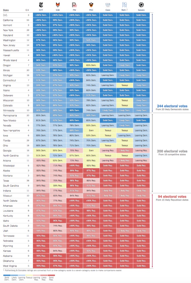
In addition to their own forecast, the NY Times maintains a great graphic Comparison of Presidential Election Forecast Models showing the current results from of seven different election forecasts based on statistical models, expert predictions and even betting markets. The results are updated daily, so check the NY Times site for the most current information!
How Other Forecasts Compare
The New York Times is one of many news organizations to publish election ratings or forecasts. Some, like FiveThirtyEight or the Princeton Election Consortium, use statistical models, as The Times does; others, like the Cook Political Report, rely on reporting and knowledgeable experts’ opinions. PredictWise uses information from betting markets.
We compile and standardize these ratings every day into one scoreboard for comparison.
Each organization’s state-by-state ratings. Viewed together, the differences between the models become much clearer.
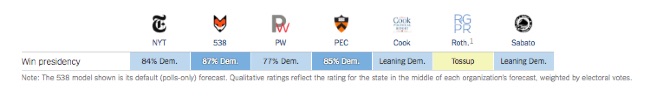
They also publish this simple complete prediction comparison showing the total predictions from each group:
Although they have built this in HTML5 on the website, anyone could create a similar comparison graphic style using Conditional Formatting in Excel. This is a great way to highlight differences and outliers in a table of data!

Reader Comments (2)