About
Randy Krum
President of InfoNewt.
Data Visualization and Infographic Design

Infographic Design

Infographics Design | Presentations
Consulting | Data Visualizations

DFW DataViz Meetup

Join the DFW Data Visualization and Infographics Meetup Group if you're in the Dallas/Fort Worth area!

Search the Cool Infographics site

Custom Search

Subscriptions:


Feedburner

The Cool Infographics® Gallery:

How to add the
Cool Infographics button to your:

Cool Infographics iOS icon

- iPhone
- iPad
- iPod Touch


Read on Flipboard for iPad and iPhone

Featured in the Tech & Science category

Flipboard icon

Twitter Feed
From the Bookstore

Caffeine Poster

The Caffeine Poster infographic

Entries in alcohol (4)

Tuesday
Sep162014

Beer Colors

Beer Colors Cans Visualization Infographic

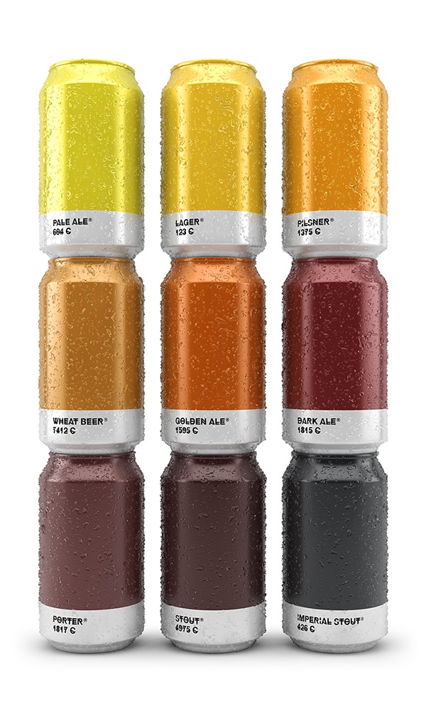
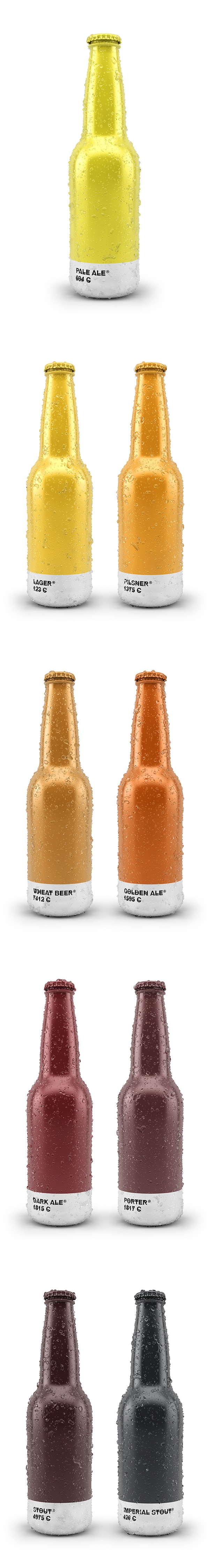
Beer colors is a fun design idea that combines packaging design with beer label design, these beer label designs imitate Pantone® color chips.  Maybe more of a data visualization of colors than a true infographic, but I love it!

Concept and design based on the color of the beer. Each type of beer is associated with its corresponding Pantone color. The typeface chosen is HipstelveticaFontFamily in its bold version by José Gomes, thanks for sharing.

Designed by Spanish creative agency Txaber, this series of beer packaging labels show each brew type represented by its corresponding official color. 

Beer Colors Bottles Visualization Infographic

Found on creativebloq and BoingBoing


Monday
Oct142013

The Magnificent Multitude of Beer

The Magnificent Multitude of Beer infographic poster

The Magnificent Multitude of Beer is a cool new poster design from Pop Chart Lab.

This wall map is the most complete charting of beer ever, breaking down ales and lagers into over 100 delicious styles from hoppy IPAs to fruity lambics, and including over 500 individual beers as notable examples of each style as well as glassware recommendations. The Magnificent Multitude of Beer captures the proud work of hundreds of breweries around the world, clocks in at a staggering 60 inches by 40 inches, and is the perfect finishing touch for your man cave or lady lair.

SALE today only!  The team at Pop Chart Lab has a 15% OFF Everything sale for Columbus Day (October 14).  Use the code COLOMBO at checkout to get the discount.  The code is valid until 12:30pm EST tomorrow.

Friday
Sep272013

The Anatomy of Sangria

The Anatomy of Sangria infographic

A good way to start the weekend!  The Anatomy of Sangria from Wine Enthusiast Magazine is a nice visual explanation of what goes into making sangria, including different variations of ingredients.

It’s sometimes tough to know where to start when making sangria. In addition to selecting a red wine or white, there are several elements to consider: Which fruit will you use? What mixer will you add? Will you choose a savory or sweet garnish? Flavor combinations can make or break even the simplest of sangrias, so to make sure your next batch is stellar, use the guidelines below to create a version that promises to suit your palate—and your guests.

Bright, colorful design using photographs of the different ingredients is visually appealing and should get shared frequently.

This is also a great example of a long Online Lifespan topic for an infographic.  The ingredients for making sangria don’t change, so the infographic will be relevant for years to come; driving traffic and links to the website.

The footer should include a copyright statement, and the URL to the infographic landing page so readers that find this infographic on other sites can find the original full-size version.

Found on Foodista

Friday
Aug232013

The Periodic Table of Alcohol

The Periodic Table of Alcohol infographic

The Periodic Table of Alcohol infographic does a good job of organizing popular alcoholic drinks in the periodic table design format.  Posted on Visual.ly by designer Mayra Magalhães (mayra.artes), 

This infographic shows important information about the most famous alcoholic beverages.

It’s unclear who the infographic was designed for.  The footer of the infographic lists BestCollegesOnline.com, the landing page on Visual.ly lists the Consumer Media Network and the URL actually links to CarInsurance.org.  It looks like this design is a modification of a design from 2011 done for Best Colleges Online called the College Student’s Guide to Boozing.  I’m guessing Mayra uploaded this recently to be included as a part of her design portfolio.

The infographic has been heavily shared, and I found this version on Laughing SquidBusiness Insider, Popular Science, This is Happiness, Geekologie, and Gizmodo.