About
Randy Krum
President of InfoNewt.
Data Visualization and Infographic Design

Infographic Design

Infographics Design | Presentations
Consulting | Data Visualizations

DFW DataViz Meetup

Join the DFW Data Visualization and Infographics Meetup Group if you're in the Dallas/Fort Worth area!

Search the Cool Infographics site

Custom Search

Subscriptions:


Feedburner

The Cool Infographics® Gallery:

How to add the
Cool Infographics button to your:

Cool Infographics iOS icon

- iPhone
- iPad
- iPod Touch


Read on Flipboard for iPad and iPhone

Featured in the Tech & Science category

Flipboard icon

Twitter Feed
From the Bookstore

Caffeine Poster

The Caffeine Poster infographic

Entries in animated (13)

Monday
Apr272015

Flight Patterns Deconstructed

Flight Patterns Deconstructed Animated Infographic

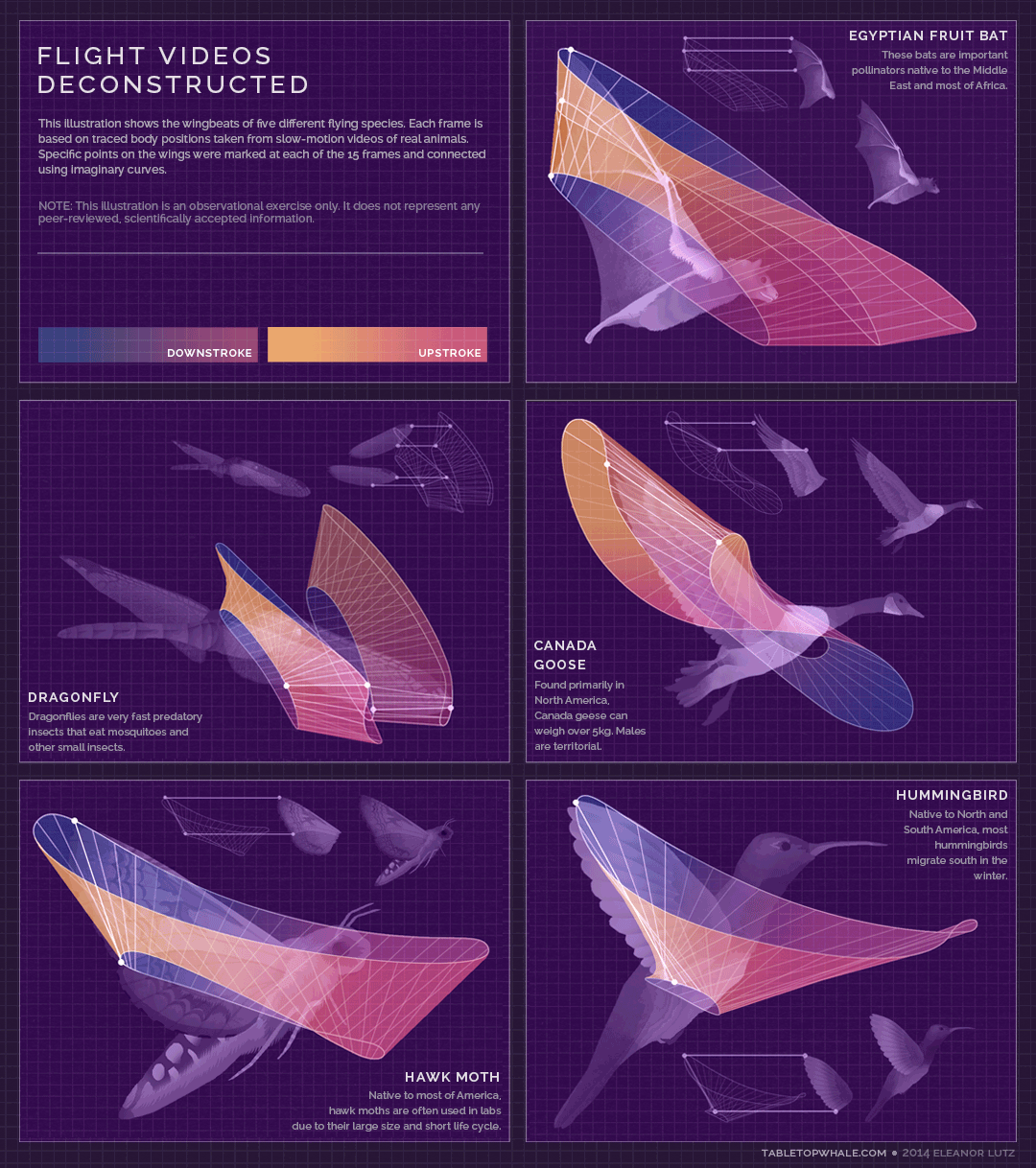
Flight Videos Deconstructed is a fantastic animated infographic design by Eleanor Lutz at TabletopWhale. Eleanor is a designer from Seattle and has a Bachelor's in molecular biology from the University of Washington. She used to work in a research lab teaching mosquitoes to fly through mazes.

This week's post isn't entirely scientific, but I thought I'd upload it anyway since it's related to animals and patterns in nature.

When I worked in an insect lab as an undergrad, I helped out with an experiment about mosquito larvae. As part of the process we used a Matlab program to manually input the larva's location during thousands of video frames.

It was a fun experiment, and I wanted to make something similar from Youtube videos. I found slow-motion videos of five flying species, and mapped out specific points on the wings during one wingbeat. I ended up with 15 frames per wingbeat, and I connected every frame using imaginary curves that went through all of the 15 mapped points.

Of course, 15 frames isn't nearly enough for any kind of factual conclusion, so this week's post is just an art exercise. But hopefully you can enjoy this as an artistic pattern based on real life :)

Animated infographics distributed as animated GIF image files are making a resurgence, and I believe it's because they are easier to share online than videos or embed code for javascript animations. They work best when the animation adds valuable context and aids the audience to better understand the information.

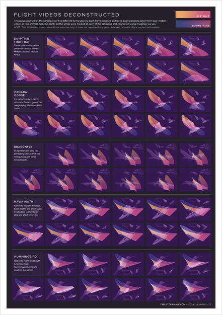
The design is also available as a printed poster that shows the flight patterns by breaking out the wing motion into multiple images.

I had the pleasure to meet Eleanor in March at the Malofiej Infographics World Summit in Spain, where her design won a Silver medal in the online design category. The design work she is doing is amazing, and her talk on animated infographics was one of the highlights of the conference.

Friday
Dec132013

100 Years of Rock Visualized

100 Years of Rock Visualized infographic

From Gospel to Grunge: 100 Years Of Rock in Less Than a Minute is an ambitious design project from ConcertHotels.com.  It’s an animated, interactive timeline design that let’s you click on any genre to highlight it’s specific history and play a sample of the appropriate music.

The history of rock music is pretty interesting. Everyone knows that it’s roots lie in genres like Gospel, but what about all the other genres?

How did Cowpunk come about? Or Indie Rock? Or Nu Metal?

These are the sorts of questions we ask ourselves here at Concert Hotels (oh, and other important topics like what we should have for lunch).

Curiosity piqued, we decided to trace the roots of the various rock genres, kinda like ‘Who do you think you are?’ but for rock music, and then visualize it.

We embarked upon what turned into a mammoth research task, the likes of which none of us have undertaken since college. But we stuck with it. We think it was worth the effort.

Ladies and gentlemen, we give you our Rock Time Machine - click here to journey through 100 years of rock in less than a minute.

And there’s more - while we were at it we thought it might be pretty cool to be able to hear a sample of each genre.

So turn your speakers up to 11 (or pop your headphones in if you’re the considerate type) - you never know, you might just find a new music genre to fall in love with.

Although music heritage isn’t an exact science, the color-coded flow arrows are easy to follow throughout the design.  However, they get more complicated at the bottom.  Apparently there hasn’t been any new music since Y2K?

Found on Fast Company


Thursday
May302013

Drones Kill - Animated, Interactive Visualization

Drones Kill - Animated, Interactive Visualization

Great data visualization design from Pitch Interactive.  Out of Site, Out of Mind is an animated data visualization of every U.S. drone strike in Pakistan since 2004 and the associated kills reported in the news.  There is also an interactive element is that the readers can hover their pointer over the visualization an more details appear in a popup window.  Visit the original site to see the animation.

Since 2004, the US has been practicing in a new kind of clandestine military operation. The justification for using drones to take out enemy targets is appealing because it removes the risk of losing American military, it’s much cheaper than deploying soldiers, it’s politically much easier to maneuver (i.e. flying a drone within Pakistan vs. sending troops) and it keeps the world in the dark about what is actually happening. It takes the conflict out of sight, out of mind. The success rate is extremely low and the cost on civilian lives and the general well-being of the population is very high. This project helps to bring light on the topic of drones. Not to speak for or against, but to inform and to allow you to see for yourself whether you can support drone usage or not.

The visualization is created in HTML5 and JavaScript. We recommend Chrome for the best viewing experience.

The challenge with gathering the data and how drone attacks are represented in the news is shown by the large OTHER category of victims.  Also, it’s the largest category of victims.  A data visualization like this is a tremendously effective way to bring this issue to light.

The category of victims we call “OTHER” is classified differently depending on the source. The Obama administration classifies any able-bodied male a military combatant unless evidence is brought forward to prove otherwise. This is a very grey area for us. These could be neighbors of a target killed. They may all be militants and a threat. What we do know for sure is that they are targeted without being given any representation or voice to defend themselves.

The visualization was created by Wesley Grubbs, and there is a video interview of him about the data visualziation process by The Huffington Post.

Thanks to Ray for sending in the link!

Page 1 2