About
Randy Krum
President of InfoNewt.
Data Visualization and Infographic Design

Infographic Design

Infographics Design | Presentations
Consulting | Data Visualizations

DFW DataViz Meetup

Join the DFW Data Visualization and Infographics Meetup Group if you're in the Dallas/Fort Worth area!

Search the Cool Infographics site

Custom Search

Subscriptions:


Feedburner

The Cool Infographics® Gallery:

How to add the
Cool Infographics button to your:

Cool Infographics iOS icon

- iPhone
- iPad
- iPod Touch


Read on Flipboard for iPad and iPhone

Featured in the Tech & Science category

Flipboard icon

Twitter Feed
From the Bookstore

Caffeine Poster

The Caffeine Poster infographic

Entries in book (36)

Monday
Oct282013

The Cool Infographics Book is Now Available! #coolinfobook

unboxing Cool Infographics book

The Cool Infographics book is now shipping!  I received my own printed copies on Friday for the first time, and they look fantastic!  It’s a special feeling to hold the physical result of 12 months of hard work in my hands.  The publisher, Wiley, did an awesome job printing them.

I know that people who pre-ordered the book have begun to receive their copies.  Everyone that pre-ordered copies should get their shipment shortly.  If you’re interested in an ebook version, I believe the Amazon Kindle version is now available, and other book sites will have an ebook version available in a couple weeks.

As I posted last week, I’ve made a free sample chapter excerpt available.  Use the online form to request the link to download the PDF sample chapter.

DON’T MISS OUT!  Time is running out to take advantage of the discount code “CINFO” to get 40% off list price on the Wiley publisher site.  The discount code is still good through the end of October (10/31/13).  Last time I checked all of the book retailer sites (yesterday), this was the best price online to get the book for only $23.99.

Friday
Oct252013

Download A Free Sample Chapter from the Cool Infographics Book #coolinfobook

Cool Infographics Book Sample Chapter

The Cool Infographics book comes out next week!

I now have a sample chapter available for download as a PDF file for FREE.  Fill out the form on the request page, and you’ll get an automated email with the link to download the sample chapter.

The sample chapter excerpt includes 30 pages from the first chapter, and covers the following topics:

  • Chapter 1: The Science of Infographics
    • Infographics vs. Data Visualizations
    • The Explosive Growth of Infographics
    • The Rise of the Informavore
    • The Rise of Big Data
    • Why Infographics Work
    • The Art of Storytelling

DON’T MISS OUT!  Time is running out to take advantage of the discount code “CINFO” to get 40% off list price on the Wiley publisher site.  The pre-order discount code is only good through the end of October (10/31/13).  Last time I checked all of the book retailer sites (yesterday), this was still the best deal online to get the book for only $23.99.

Cool Infographics Book

Wednesday
Oct022013

40% Discount on Cool Infographics Book Pre-Orders

40% Discount on Cool Infographics Book Pre-Orders

As a special offer for readers of the Cool Infographics blog, Wiley is offering a 40% discount when you pre-order the print version of Cool Infographics directly from their site.  The list price for my book is $39.99 in the United States (CDN $47.99 in Canada, £26.99 or €32.00 in Europe), so the discount brings the price down in the U.S. to $23.99 for pre-orders.  This offer is available globally from the countries included on the Wiley site.

Discount: 40% off list price

Link: http://www.wiley.com/WileyCDA/WileyTitle/productCd-1118582306.html

Discount Code: CINFO

Expires: 10/31/13

The 40% off pre-order discount is available for the month of October, leading up to the official release on October 28, 2013.

This discount is only available for orders of the print version of the book from the Wiley site.  The prices from online book retailers Amazon or Barnes & Noble change daily (or more frequently) based on their pricing algorithms, so there’s no telling what their prices will be on any given day.  That’s why the discount is only available from Wiley.  Enter the discount code “CINFO” at checkout.

Please share this offer with any friends or co-workers that would enjoy the book!

Note: Contact me for additional discounts on bulk orders for 26 or more copies for your organization.

Saturday
Sep282013

Gone To Press!

It’s out of my hands!

This week, my project editor at Wiley told me that Cool Infographics the book has officially “gone to press!”  That means that all of the electronic layout files have been sent to the printer, and the book is in the printing schedule.  The official release date is October 28th, from online book retailers and should even include your local bookstore!

Over the last 12 months I’ve been gathering all of the materials together into the binder you see above, but I’m super excited to see the complete printed book.  I can’t wait to see the printed copy and share it with everyone.  You’ll love the full-color infographics and data visualization examples included.  The final book will be close to 380 pages!

Intended for everyone, not just designers, the book explains how to utilize infographics effectively as part of a content marketing strategy.  Things like how to structure your information flow, how to choose a topic, how to be credible to your audience, and how to publish and promote your final infographic design.  Just like this site, the book includes visual examples from designers and companies all over the world.  I designed a bunch of custom data visualizations for the book, but most of the examples are some of the coolest infographics from the web.

You can find out more about the book on the dedicated landing page I setup here: coolinfographics.com/book

To receive the book as fast as possible, pre-order your copy today from Amazon, Barnes & Noble or directly from Wiley!


Monday
Sep162013

Introducing Cool Infographics, the book

Introducing Cool Infographics, the book


Today I’m excited to introduce my new book, Cool Infographics: Effective Communication with Data Visualization and Design!  This project has taken up an enormous portion of my time over the last 12 months and will be available at the end of October 2013 from all major booksellers (print and ebook).

This book is written for anyone that wants to learn how to use infographics and data visualizations more effectively.  Whether you design your own or work with a designer, the tactics and tips included will help you create better infographics and effectively publish them online.  Using over 100 visual examples from designers all over the world, I explain how companies are successfully using infographics every day.  It is an accumulation of knowledge and experience from designing infographics and running the Cool Infographics blog over the last seven years.

Seven major areas are covered in depth:

  • The Science of Infographics: Why do infographics work?  Humans are visual creatures.  Any information that we can communicate visually will get more attention, is easier to understand and is more likely to be remembered.  Infographics tell stories with data using a combination of data visualizations, images, illustrations and text.  Used effectively, infographics can be one of the most powerful forms of communication.
  • Online Infographics: The use of infographics online has grown exponentially in the last few years.  Why are infographics so popular as online content and how are infographics being used successfully by companies?  Are you trying to build your brand equity, drive traffic to your website or explain product features to your customers?  Different goals require different types of infographics, so make sure you know how to plan your infographics for success.
  • Infographics and SEO: Why do some infographic go viral and others flop?  Infographics and Search Engine Optimization (SEO) go hand in hand, but you have put some effort into releasing an infographic.  Issues like keywords, embed code, online lifespan, meta data and landing pages all have an impact on the success of your infographic online.  A complete infographic release strategy is outlined that covers the entire process from releasing the infographic to getting posts and links from other sites.
  • Infographic Resumes: The use of data visualization design to improve job candidate resumes is still new, but is growing rapidly.  Good infographic resumes combine the best practices from traditional resume design and viral online infographics.  Learn to design a cool infographic resume of your own.
  • Internal Confidential Infographics: There’s a secret world of data visualizations and infographics being used inside companies using confidential data.  Unlike online infographics, these internal designs are often included in presentations or shared as printed handouts.  Take the best parts of online infographics, and adapt them for your own use in presentations.
  • Designing Infographics:  Will your infographic pass the 5-second rule?  This chapter will help you design great infographics with clear data visualizations, transparent data sources and engaging topics.  We look at some best design practices as well as some common mistakes to avoid. 
  • Design Resources: Ready to get started?  Designing infographics is a combination of visualizing data, creating custom illustrations, editing images and putting together the complete design.  I’ve gathered together the major tools used by infographic designers to help you find the right software for your project.  I’ve even included a number of sources for finding data and websites that can be used to design complete infographics.

Pre-order now to get your copy as soon as it’s released!

Friday
Aug302013

Infographic Cookbook - Picture Cook

Picture Cookbook infographic

A new way to take directions for cooking, the Picture Cookbook infographic from Katie Shelly. It is an easy step by step visual explanation design that will get you to the desired tasty product, with very little use of words!

The following recipes are not intended as precise culinary blueprints. Instead they are meant to inspire experimentation, improvisation and play in the kitchen.

Great design work by Katie to create recipes as visual explanations.  The hand-drawn style also helps reinforce the flexible methods.  They aren’t strict, rigid recipes with sharp images and corners, but instead are more casual which allows for interpretation and change.  I love the color-coding for easy navigation within the book too.

Found on Fast Company

Available soon for purchase in print in October 2013.  I’ve already pre-ordered my copy.

Thursday
May162013

The Stephen King Universe

The Stephen King Universe infographic poster

Are you a Stephen King fan? Have you yourself made these connections? From TessieGirlThe Stephen King Universe has been updated to include the many connections to the Dark Tower series.

When I was in Grade 5 (guess I was ten), my friend Tarnya Smyth brought her mum’s battered copy of Stephen King’s ‘Carrie’ to school. We broke it into about 4 pieces and passed them around, all taking turns reading each battered section. I told mum about it and she FLIPPED HER WIG and told me to ‘Stop reading that book immediately!!’ So I finished it.

Now, I TOTALLY do not recommend  ten year olds reading Stephen King books (messed me up good), but this was when my life long relationship with Mr King began. My love for his books is based around his characters. They are so full. I love Stephen King dialogue. I love his sense of humour. And I love the links and connections between the books. I am the kind of annoying person who likes to know the ‘In Joke’. So, of course, I MADE A FLOW CHART!!!

This chart is like my fourth child. Be kind to it. It means a lot to me.

I wish they had published a higher-resolution version online.  Some of the text is too small to read, but I think I can follow all of the connections.  A must have for any Stephen King fan!

Also, it’s available for purchase as a poster from the TessieGirl site for $25 plus shipping from Australia.  You can also see the original version.

Thanks to Becky for sending in the link!

Friday
Jul062012

Informotion: Animated Infographics - Interview & Book Giveaway

Informotion: Animated Infographicsfrom Informotion: Animated Graphics, Copyright Gestalten 2012

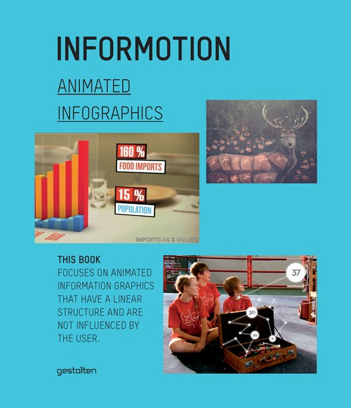
The Informotion: Animated Infographics book edited by Tim Finke, Sebastian Manger and Stefan Fichtel was just released from Gestalten, and only recently appeared in the U.S.  I also have a promotional copy of the book to giveaway!  So keep reading until the end to find out how to get a chance to win the book.

Informotion: Animated Infographicsfrom Informotion: Animated Graphics, Copyright Gestalten 2012

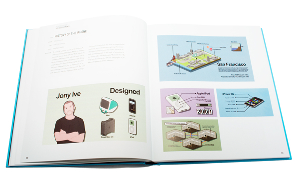
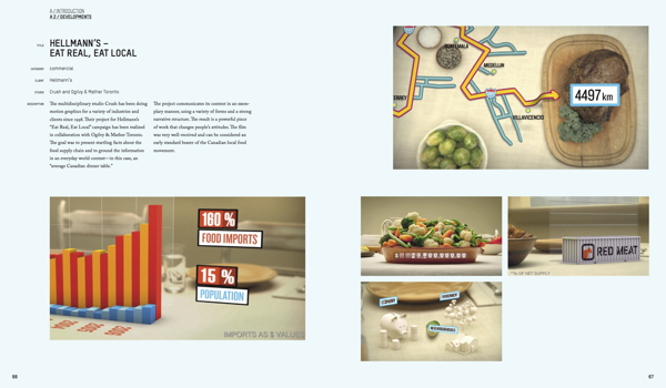
This is the only book I am aware of that focuses on infographic animation and video production.  The book covers topics like Forms of Representation, Storyboarding, Animation, Voice-Over Narration and Content.  The book also highlights at least 25 animated infographic videos, and takes a deep look at how they were made.

At the nexus of design and journalism, the field of information graphics offers some of the most exciting and dynamic work for creatives. Today, even more so than static versions, animated information graphics are serving to communicate complex correlations succinctly. The production of such animations on the basis of up-to-the-minute data is already common practice in select TV programs. Now, these moving formats are finding wider application in television and on the internet, as well as on an increasing number of mobile devices, and in public places. They can be seen in editorial contexts and in the areas of advertising and corporate communication.

Informotion is the first book to document the fundamentals needed to create compelling animated infographics and to explain them with numerous examples. It focuses on key aspects of visualizing data, current forms of information graphics, and future possibilities for moving images. The publication also outlines the factors that improve the viewer’s ability to absorb information.


Informotion: Animated Infographicsfrom Informotion: Animated Graphics, Copyright Gestalten 2012


Sebastian Manger was kind enough to provide some of his time to answer a series of interview questions about the future of infographic videos and production of the book:

CI: What brought you, Tim Finke, and Stefan Fichtel together to collaborate on the book?

Sebastian

 Manger: Tim and I both studied communication design at the University of Applied Sciences in Potsdam near Berlin. Our collaboration on many projects during our studies welded us together as team, and so we decided to do our master’s thesis as a joint project as well. This thesis formed the initial basis for Informotion. During our research for the book we came into contact with Stefan Fichtel. We initially just wanted to interview him about his experiences in the field of information graphics, but we then wound up working with him more closely.

CI: You cover this briefly in the book, but how do you define the difference between data visualizations and infographics?

Sebastian

 Manger: Data visualization is mostly based on a very complex set of data, which is then transmitted by tools such as processing into a graphical representation. Examples can include user behavior in a certain context or the air traffic in a given airspace. In our opinion, an infographic is more concentrated on a particular piece of information that needs to be communicated. In contrast to data visualization, infographics often boil something down to one core message that is then conveyed.

CI: Who do you see as the primary audience for the book?

Sebastian Manger: The book is a guide for designing animated infographics. Therefore, the primary target group is, of course, designers who create those. But Informotion is actually also interesting for any designer who deals with the transfer of information through moving images because it deals with our general perception of animation. The book introduces the range of tools now available for implementing animated infographics and explains their appropriate use. 

In addition, Informotion is also very interesting for journalists. They can gain valuable insight into how the information they first researched can be processed into an animation. This insight can then help avoid misunderstandings in any future collaboration.

CI: How difficult was it to select the videos in the book and did you get support from the companies that produced the videos?

Sebastian Manger: In some cases, the choice was indeed very difficult—especially when we needed examples focusing on a particular means of implementation. In those cases, we needed scenes that showed exactly what was meant without getting overlayed by other effects or information. In our thesis, which was the original inspiration for the book, we simply created such specific examples ourselves. For Informotion, however, we wanted to always use current examples from actual practice.

Once we found a fitting example, it was usually quite easy to convince the agency or studio to participate in the book. It was, however, sometimes a bit difficult to figure out who exactly was the author of a certain animation.

CI: Based on what you have observed, is there a “best practice” method for releasing an infographic video on the Internet?

Sebastian Manger: As the field of animated infographics is still quite young, it is currently very difficult to speak of a “best practice” example. We do hope that our book can help generate such an example one day.

CI: Do you believe that infographic videos are a stronger tool than static image or interactive infographics? 

Sebastian Manger: Yes, we do. People’s viewing habits are changing more and more. Ever more videos are appearing on the internet (YouTube, Vimeo, etc). The viewer is already getting used to absorbing information more passively. This environment is very favorable for the use of animated infographics. A certain fact can be presented to viewers in a simple manner without the need for them to toil through charts or diagrams themselves.

But herein also lies a danger or a special responsibility for the designer of an animated infographic. Under these conditions, a given set of information must always be reduced to a few details. In a static infographic, a statistic for example, viewers can make conclusions by themselves—provided, of course, that they take the time to do so.

CI: How quickly are infographic videos growing as a communication tool?

Sebastian Manger: In our research over the last few years we have ascertained a clear increase in the use of animated infographics. A simple indicator of this, for example, is the increasing number of videos tagged as “animated infographics” on YouTube or Vimeo. The number of websites and blogs that feature animated infographics is also growing continuously.

In addition, infographic design elements are being used more and more frequently in music videos, commercials, main titles, etc. This paves the way for consumers to deal with infographics as a means of implementation. Of course, the use of graphic elements in these fields is currently mostly limited to decoration, but why can’t it expand over the next few years and become more professional? These circumstances are causing viewing habits to change. Designers not only have a significant interest in these changes, but are also a contributing factor to them.

CI: What do you see as the future of infographic videos?

Sebastian Manger: We expect that the trend just described in our previous answer will continue and that animated infographics will be used even more frequently—especially in fields such as reporting but also in advertising. For most people, the use of information graphics is an indicator of seriousness. However, interactive graphics and data visualization will certainly play a huge role too.

CI: How difficult was it to put together a paper book about the highly visual topic of infographic videos?

Sebastian Manger: Not very difficult. Informotion includes a login code for accessing a password-protected website from where you can watch all the referenced videos in full length. In the printed book we use screenshots from and explanations of these videos to identify and explain current theories and means of implementation.

CI: Do you have any plans for a video infographic about video infographics in the future?

Sebastian

 Manger: Not until you came up with this question, but we’ll surely think about now!


Free Copy of the Book:

I have two copies of the book to give away to readers of Cool Infographics.  To enter you name into the hat, tweet a link to this blog post on Twitter and include the hashtag #informotionbook so I can find the Tweets.  At noon on Friday, July 13, 2012, I will randomly choose two people from the Tweets to receive a copy of the book.  You need to be following me (@rtkrum) on Twitter so I can send you a Direct Message (DM) if you are selected.

Here’s an example Tweet that would qualify:

Check out Informotion, the new book about animated infographic videos bit.ly/OdaGTg #informotionbook

Thanks to Sebastian for all his hard work, and participating with the interview.

Friday
Apr272012

Mapping Popular Story Plot Lines

Finally! The secret ingredient to writing a good book has been revealed. Plot Lines, the infographic from Delayed Gratification, the slow journalism magazine, shows the dominant themes in last year’s books nominated for the Man Booker Prize for Fiction.  An interactive, zooming viewer available on the original landing page.

What makes a prize-winning novel?  As Julian Barnes wins the Booker Prize, Johanna Kamradt charts the themes of this year’s longlisters.  (Illustration by Christian Tate)

If you want to write a hit novel, it pays to stick with the tried-and-true plot lines.  DEATH of your characters is clearly the overall winning theme, with every one of the novels listed from 2011 including death as a theme.  Other classics like WAR, LOVE, BETRAYAL and CORRUPTION followed closely.  Obscure plot points like AN ESCAPED TIGER and HOMICIDAL COWBOY BROTHERS are certainly much more of a risk.

I love this design, and how it takes the multiple, complex story plots from the complicated mix on the left, and converts the chaos into order on the right.  Even with all of the crossover lines, you can still pretty easily follow a line across the diagram.  It’s fun and engaging for readers to follow the connections, and draws the readers in to look more closely. 

Found on visualnews.com

Friday
Feb242012

See Mix Drink: Infographic Cocktails

The See Mix Drink Cocktail Guide is a fabulous infographic drink recipe book from Brian D. Murphy (@murph_e).  Currently available for about $10 on Amazon.com, it’s on my wish list.  Featured on GQ.com back in October when it was released, I have been totally remiss by not posting about it until now.  (My apologies Brian!)

Have you tried mixing a Mojito? What about a Rusty Nail? Or a Cosmopolitan? With See Mix Drink, the first-ever cocktail book to offer instruction through info-graphics, making the drinks you love at home is as easy as, well, See, Mix, Drink.

This unique, illustrated guide graphically demonstrates how to make 100 of today’s most popular cocktails. For each drink, color-coded ingredients are displayed in a line drawing of the appropriate glassware, alongside a pie chart that spells out the drink’s composition by volume for intuitive mixing. No other cocktail book is this easy or fun. Instantly understandable 1-2-3 steps show exactly how each drink is prepared, and anecdotes, pronunciation guides, and photographs of the finished drinks will turn newbie bartenders into instant mixologists. 

The GQ.com feature has the designs for ten of the recipes from the book.  They are all simple to understand, and easy to follow.

One thing I would suggest to improve the visualization design style is to combine the key and the ingredient portions.  No need to make the reader look to both sides of the glass illustration to figure out how much of each ingredient.  Just putting the name with the amount on the left side and getting rid of the color key would eliminate an eye motion for the readers.

Thanks to Brian for sending in the link (back in October!) and congratulations on the publication!