About
Randy Krum
President of InfoNewt.
Data Visualization and Infographic Design

Infographic Design

Infographics Design | Presentations
Consulting | Data Visualizations

DFW DataViz Meetup

Join the DFW Data Visualization and Infographics Meetup Group if you're in the Dallas/Fort Worth area!

Search the Cool Infographics site

Custom Search

Subscriptions:


Feedburner

The Cool Infographics® Gallery:

How to add the
Cool Infographics button to your:

Cool Infographics iOS icon

- iPhone
- iPad
- iPod Touch


Read on Flipboard for iPad and iPhone

Featured in the Tech & Science category

Flipboard icon

Twitter Feed
From the Bookstore

Caffeine Poster

The Caffeine Poster infographic

Entries in corporations (104)

Tuesday
Dec042007

Apple's Tipping Point: Macs For The Masses


From Paul Nixon on nixlog.com. In 2005, Apple finally released products from both the Mac line and the iPod line that reached the masses. This created the Tipping Point Effect that has rocketed Apple products and stock in the last two years. Rock on!

The Sweet Spot. Until January 2005, Apple had no iPod or PC products that served the mass market. With the launch of iPod Shuffle and Mac mini they have finally converged two product paths with the mass market in mind. This will not only drive more iPod sales (via the Shuffle), but also fulfill the promised "halo" effect of the iPod products as PC users jump to the Mac mini.
Thanks to Karen for the submission

Monday
Nov052007

Infographic Video Advertisement


Found on Uswim, a French company developed an ad campaign around the infographic video style we saw in the Royksopp video.

It had such an impact that a few years later Areva, the French nuclear giant, wanted to use it for their advertising. Being denied it by the Norwegian pop group they finally went for the hit “Funky Town” on a video that looks very similar (as it was done by the same French art collectif H5 that did Royksopp’s video).


Their objective was to show Areva’s expertise in the energy sector (see their corresponding website using Flash animation) as part of the branding campaign of a company anticipating to go private (still waiting because of internal French politics). The choice of animated graphics was to reinforce the educative aspect on Areva’s business and avoid the harsh reality of images of nuclear plants. In a way the almost childish graphics (almost like a comic strip) make it look like a video game of some sort, some kind of SimCity. It was very successful and the idea was again used in a slightly different angle (accelerated special effects video) by EDF (another French energy giant) in a commercial

I found the link to Uswim on Simple Complexity.


Friday
Oct262007

Who Owns the Media Companies?


Similar to my earlier post about Who Owns the Car Companies?, I found that Advertising Age magazine has created a poster showing the ownership in the media companies.

You thought the car companies were complicated...

Tuesday
Oct232007

Who Owns the Car Companies?

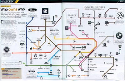
I found three different images showing the complex network of ownership between the automotive companies. Three different attempts at making these complex relationships easier to understand. This first one is a scan from a magazine, but I can't find any reference to which actual magazine it came from. Charted out like a subway map, it's pretty easy to follow.

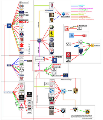
This next one from Too Many Cars is charted like a family tree, or a mind map. It's the easiest the follow, but probably the least aesthetically pleasing. Online the image is broken into smaller pictures so you can zoom closer, but is also available as a large poster in PNG or PDF formats. The data for this one is from 2006, and is the most current of the three.


This last graphic claims to show the ownership mix in the auto industry as a form of bubble chart, but I can't find any date or source data link. I think the bubble sizes represent something, like size of the company or ownership, but I can't tell. So I can't tell how accurate this is. The image is on Tinypic.

Page 1 ... 7 8 9 10 11