About
Randy Krum
President of InfoNewt.
Data Visualization and Infographic Design

Infographic Design

Infographics Design | Presentations
Consulting | Data Visualizations

DFW DataViz Meetup

Join the DFW Data Visualization and Infographics Meetup Group if you're in the Dallas/Fort Worth area!

Search the Cool Infographics site

Custom Search

Subscriptions:


Feedburner

The Cool Infographics® Gallery:

How to add the
Cool Infographics button to your:

Cool Infographics iOS icon

- iPhone
- iPad
- iPod Touch


Read on Flipboard for iPad and iPhone

Featured in the Tech & Science category

Flipboard icon

Twitter Feed
From the Bookstore

Caffeine Poster

The Caffeine Poster infographic

Entries in electron (8)

Wednesday
Oct212009

Circular Periodic Table of the Elements


Mohd Abubakr has redrawn the classic periodic table in a circular pattern to improve the proximity and relationships between the elements.
So why change it? According to Mohd Abubakr from Microsoft Research in Hyderabad, the table can be improved by arranging it in circular form. He says this gives a sense of the relative size of atoms--the closer to the centre, the smaller they are--something that is missing from the current form of the table. It preserves the periods and groups that make Mendeleev's table so useful. And by placing hydrogen and helium near the centre, Abubakr says this solves the problem of whether to put hydrogen with the halogens or alkali metals and of whether to put helium in the 2nd group or with the inert gases.
The strongest feedback about the new circular table is that you have to rotate it to read it.  Kind of a problem when you print a poster and post it in a classroom or a laboratory.  Although I think it's an easy thing to remedy by changing the orientation of the text.

Original post on Technology Review by MIT, and found on VizWorld by Randall Hand.

Friday
Sep112009

"Meet The Elements" - infographic video for kids

Found on BoingBoing and Information Aesthetics, a infographic music video, "Meet The Elements", from They Might Be Giants from their new kids album titled "Here Comes Science". Video directed by Feel Good Anyway.

Monday
Feb092009

"The Graph" - The Future of Solar Power


Known as "The Graph" in scientific circles, this chart projects the future of solar power.  It was highlighted in a Fast Company article in December 2008.
The Graph was created by a scientific organization that counsels the German government, but it has since become a prized piece of propaganda, embedded in glossy brochures and PowerPoint presentations by solar companies from California to gray-skied Saxony. At the left-hand, present-tense end of the scale, solar power is a microscopic pencil line of gold against the thick, dark bands of oil and natural gas and coal, an accurate representation of the 0.04% of the world's electricity produced by solar power as of 2006. The band grows slowly thicker for 20 years or so, and then around 2040 a dramatic inversion occurs. The mountain-peak lines indicating the various fossil fuels all fall steeply away, leaving a widening maw of golden light as solar power expands to fill the space. By 2060, solar power is the largest single band, and by 2100 it is by far the majority share.

Tuesday
Oct072008

Vampire Energy infographic video & chart

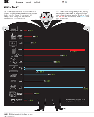
From GOOD magazine, they created an infographic video about Vampire Energy, all of the energy used by electronics in your house while you are not actively using them.  The chart itself from the magazine is fairly simple chart, but I really like it.  It's effective getting the message across with simple graphics.

Friday
Sep262008

The Rush to Wind Farms!


The rush to wind farming is an interesting article in The Atlantic.  With Federal subsidies, its almost like a land rush.  The planned expansion of wind farm sites is impressive.

Thanks for sending in the link Garrett (also posted on Capturing Ephemera)!

Monday
Nov052007

Infographic Video Advertisement


Found on Uswim, a French company developed an ad campaign around the infographic video style we saw in the Royksopp video.

It had such an impact that a few years later Areva, the French nuclear giant, wanted to use it for their advertising. Being denied it by the Norwegian pop group they finally went for the hit “Funky Town” on a video that looks very similar (as it was done by the same French art collectif H5 that did Royksopp’s video).


Their objective was to show Areva’s expertise in the energy sector (see their corresponding website using Flash animation) as part of the branding campaign of a company anticipating to go private (still waiting because of internal French politics). The choice of animated graphics was to reinforce the educative aspect on Areva’s business and avoid the harsh reality of images of nuclear plants. In a way the almost childish graphics (almost like a comic strip) make it look like a video game of some sort, some kind of SimCity. It was very successful and the idea was again used in a slightly different angle (accelerated special effects video) by EDF (another French energy giant) in a commercial

I found the link to Uswim on Simple Complexity.


Sunday
Sep162007

The Elegant Universe


Following my earlier post on Imagining the Tenth Dimension, I found that NOVA has put the entire 3-hour show The Elegant Universe on their website.


The show is full of different visual methods to visual strings, gravity, the scale of particles and multiple dimensions. Brian Greene really did a fantastic job with this show based on his book on the same name.

Sunday
Jul152007

Hydrogen Atom


phrenopolis.com

Cool website that visualizes a hydrogen atom, showing how much empty space makes up our universe.

The page is scaled so that the smallest thing on it, the electron, is one pixel. That makes the proton, this big ball right next to us, a thousand pixels across, and the distance between them is... yep, fifty million pixels

If your monitor displays 72 pixels to the inch, then that works out to eleven miles - making this possibly the biggest page you've ever seen.