About
Randy Krum
President of InfoNewt.
Data Visualization and Infographic Design

Infographic Design

Infographics Design | Presentations
Consulting | Data Visualizations

DFW DataViz Meetup

Join the DFW Data Visualization and Infographics Meetup Group if you're in the Dallas/Fort Worth area!

Search the Cool Infographics site

Custom Search

Subscriptions:


Feedburner

The Cool Infographics® Gallery:

How to add the
Cool Infographics button to your:

Cool Infographics iOS icon

- iPhone
- iPad
- iPod Touch


Read on Flipboard for iPad and iPhone

Featured in the Tech & Science category

Flipboard icon

Twitter Feed
From the Bookstore

Caffeine Poster

The Caffeine Poster infographic

Entries in flowchart (38)

Wednesday
Feb152012

Website Hosting Decisions

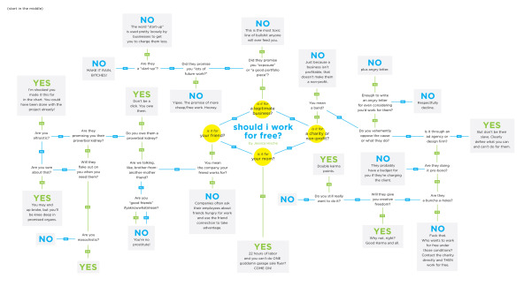
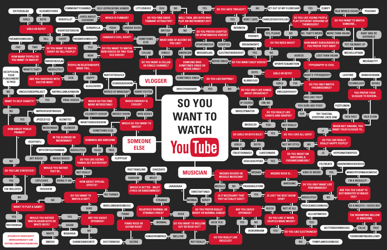
The Hosting Decisions, From the Chalkboard infographic from Rackspace UK Hosting helps customers to choose how to host their site with this visually decision map.

OK so you already know that we’ve been helping customers define their hosting needs for some years now.

But as customers adopt more service based computing resources like cloud hosting, it’s only logical that they will also now ask more of their hosting provider to ensure they are getting the correct solution.

So we thought hey, let’s produce an infographic to take customers through a simple decision making process on a route to the solution that’s right for them.

This one is a clear, focused topic.  Easy to read, and not a lot of illustrations or images to get in the way.  This decision for companies is actually a little more complicated, but the infographic does pose the right questions.

Thanks to Sav for sending in the link!

Thursday
Oct202011

The Socially Optimized Business


Attributes of a Socially Optimized Business is a new, visual XPLANATION from the Dachis Group after acquiring the XPLANE company.  You can view it in SlideShare (they should have put it into Prezi), or download the high-resolution PDF.

What’s a Social Business? It’s a business alive with energy and big ideas. It’s collaborative, authentic, customer-centric, trusted, open and real-time.

And it’s about time. After decades of mechanistic, process-oriented management dogma, progressive organizations are waking up to the disturbing truth that they’ve squeezed all the creativity out of their business. But when companies embrace organic, passionate, socially-savvy initiatives, they blossom. That’s Social Business.

This would make a great poster!

Wednesday
Oct122011

Top 100 SciFi and Fantasy Books Flowchart


SF Signal has created The Top 100 SciFi & Fantasy Books Flowchart, a decision tree flowchart for NPR's list of the top 100 books.  They have a high-resolution printable version available too.

Over the summer, NPR solicited the input of its listeners to rank the top science fiction and fantasy books of all time. Over 60,000 people voted for the top picks which were then compiled into a list by their panel of experts. The result? This list of 100 books with a wide range of styles, little context, and absolutely no pithy commentary to help readers actually choose something to read from it.

We at SF Signal have, once again, come to the rescue. This flowchart is designed to help you follow your tastes, provide context, and fulfill (indeed exceed!) any need for pithy commentary you might harbor.


I ended up on Hyperion, one of my all-time favorite series.  Bring on the Shrike!

Found on FlowingData

Monday
May162011

Client Infographic: How Affiliate Marketing Works

How Affiliate Marketing Works


Recently, InfoNewt (my company) designed How Affiliate Marketing Works for Internet Marketing guru Rae Hoffman-Dolan and her site: Sugarrae.com.  You can see the high-resolution version here.

After spending over a decade in the Internet marketing industry, I think I often forget – and have failed to address – the most obvious question most folks new to the industry have about affiliate marketing.

When I appeared as a guest on Weapons of Mass Marketing earlier this week to discuss the topic of marketing affiliate programs, the hosts evidenced the importance of the often overlooked question by leading off their interview with a variation of it…

“How does affiliate marketing work?”

No numbers, no statistics, no data visualizations.  This infographic is visualizing a process, and I do many of these for clients.  Business processes, strategies, workflows, business models, flow charts and explanations of how things work.

In this case, characters on a simple path visualizes a process of 10 steps.  Way more interesting than a text numbered list in a blog post don’t you think?

You should follow Rae on Twitter: @sugarrae

Thursday
Mar242011

Google's Collateral Damage


Another cool flowchart-style infographic by Jess Bachman for SEOBook.com.  Google’s Collateral Damage visualizes how Google’s evolving search algorithm is impacting the Web.

Google’s PageRank worked well until people realized what drove search & how to optimize for it. But the web moves much faster than the colleges do. A million spam pages are created every hour! Thus Google’s relevancy algorithms have grown in complexity over the years.


Tuesday
Feb082011

What Kind of Pasta is on Your Plate? #infographic

What kind of pasta is on my plate?
What kind of pasta is on your plate? by Charming Italy

Came across this great family tree/decision tree to help you identify the different kinds of pasta from CharmingItaly.com.  What Kind of Pasta is on Your Plate? breaks the pasta types down into shape families and uses some nice visuals to help you identify your pasta.

I’m an avid reader of Coolinfographics.com - some of the infographics you mentioned on your blog inspired me to create one for our blog as well. Unlike the usual chart- and fact filled graphics, we decided to create a somewhat educational infographic. It highlights the most common and/ or popular types of pasta, and helps you to identify the type of pasta on your plate.

I wish they would hang this up in the pasta aisle in the grocery store!

Thanks to Paolo for sending in the link!

Thursday
Jan132011

Should I Work for Free? - a flowchart

Should I Work for Free? is a great decision tree flowchart from Jessica Hische.  Start in the middle and work your way out.  

I made this flowchart for my future students but I think it’s useful for pretty much any creative, myself included. Prints to come!

I’ve heard some of these rationales before…

Thanks for the link Erica!

Thursday
Sep302010

World GHG (Green House Gasses) Emissions Flow Chart

From the World Resources Institute, the World GHG Emissions Flow Chart needs a new name, but shows the composition of GHG (Green House Gasses) emissions and where they come from.

Sources & Notes: All data is for 2000. All calculations are based on CO2 equivalents, using 100-year global warming potentials from the IPCC (1996), based on a total global estimate of 41,755 MtCO2 equivalent. Land use change includes both emissions and absorptions; see Chapter 16. See Appendix 2 for detailed description of sector and end use/activity definitions, as well as data sources. Dotted lines represent flows of less than 0.1% percent of total GHG emissions.

They also have this one for just U.S. GHG emissions:

Found on Data Mining: Text Mining, Visualization and Social Media

Friday
Aug062010

The YouTube Flowchart

Karen Kavett is a graphic design student at the Rhode Island School of Design and she was inspired to create the So You Want To Watch YouTube flowchart after seeing the So You Need A Typeface flowchart by Julian Hansen.

I was really inspired by the So You Need a Typeface poster and figured, why not make one for which YouTube channel to watch? It was a bit of a bigger undertaking than I originally anticipated, taking about 3 days from start to finish. I began by making a list of everyone I’m subscribed to and other popular YouTubers I thought should be on it. Then I divided them into Vloggers, Musicians, and Everyone Else, and just went at making a really ugly graph showing all the different routes. I had to cut some people out since their channels were just too similar to others I had already used, so if you’re not on here please don’t feel offended. If I included everyone I wanted to it would probably be about twice as big! Finally, I designed this final piece, which luckily, everything fit perfectly into.

Nice job Karen!  I especially like the “Get out of my flowchart” endpoint!

Wednesday
Jul282010

Inside the Glenn Beck-Goldline Scheme infographic

Fools Gold: Inside the Glenn Beck Goldline Scheme is a new infographic posted on The Big Picture blog.  Designed by our friend Jess Bachman from WallStats.com, Fool’s Gold is a controversial visual explanation of how Glenn Beck’s comments on his shows can drive viewers to purchase gold coins from Goldline, who is one of his show sponsors.