About
Randy Krum
President of InfoNewt.
Data Visualization and Infographic Design

Infographic Design

Infographics Design | Presentations
Consulting | Data Visualizations

DFW DataViz Meetup

Join the DFW Data Visualization and Infographics Meetup Group if you're in the Dallas/Fort Worth area!

Search the Cool Infographics site

Custom Search

Subscriptions:


Feedburner

The Cool Infographics® Gallery:

How to add the
Cool Infographics button to your:

Cool Infographics iOS icon

- iPhone
- iPad
- iPod Touch


Read on Flipboard for iPad and iPhone

Featured in the Tech & Science category

Flipboard icon

Twitter Feed
From the Bookstore

Caffeine Poster

The Caffeine Poster infographic

Entries in flowchart (38)

Tuesday
Jul132010

The Entrepreneur's Visual Guide to Tech Startups

HackFwd is a European tech investment firm, and they posted this flowchart on their front page to help startup companies see what it’s like to work with them.

We’re experienced tech entrepreneurs looking to support and invest in Europe’s most passionate geeks. We’re a pre-seed investment company designed to enable great people to launch great ideas. Our start-up and support process accelerates the route to beta, profitability, and success.

We want you to feel good at every step along the way. Here’s how your experience might look:

Apply-Rinse-Repeat

Found on FlowingData.com

Wednesday
Jun302010

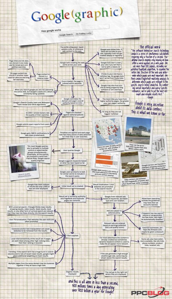
Google(graphic) - How Google Works


PPCblog.com brings us the Google(graphic) flowchart that documents what happens in the fraction of a second after 300 million people press the Search button every day.  Created by infographic designer Jess Bachman at WallStats.com.

So here is my latest infographic, hot off the press.  How Google Works.  It’s a flow type chart that diagrams the process of how google gets it data and what happens in the second after you search.  It’s a $20 billion a year process for google, and pretty interesting.

Friday
Apr302010

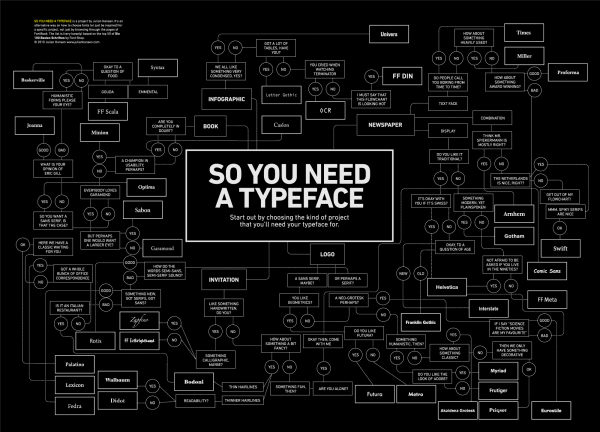
What Font Do I Use? - a Typeface Decision Flowchart

Graphic designer Julian Hansen created this cool typeface decision flowchart, So You Need A Typeface, as part of a school project.  The high-resolution version is available to view online, but you can also pre-order the poster version here for $22.  It should start shipping on May 2nd.

So you need a typeface is an alternative way on how to choose fonts (or just be inspired) for a specific project, not just by browsing through the pages of FontBook. The list is (very loosely) based on the top 50 of the “Die 100 besten schriften”.

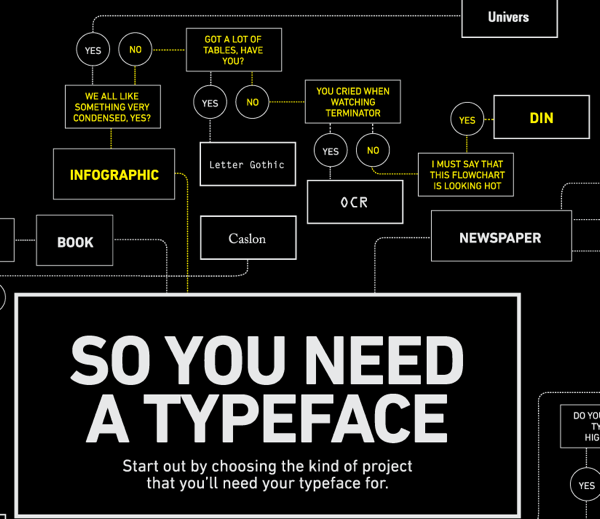
Of course, the part all of you want to see is the infographic branch…

Found on FlowingData.com

Wednesday
Nov182009

Visual Map of 30 Free Online Promotion Websites


Great visual map of the connections between free online sites to promote your content.  Made by Chris Watson at Visualization Magazine.
This visualisation was made to help inform and advertise on how easily and effectively you can use the web 2.0 tools to build an online presence through free sites, feeds, embed and monitor progress/stats.
Chris also has links to all of these icons in his post in case you want to create your own Web 2.0 visual.

Monday
Oct122009

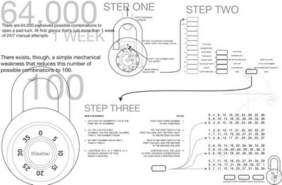
How to Crack a Master Lock [infographic]


Designed by Mark Edward Campos, this infographic takes the confusing instructions that have been on the Internet for years, and translates them into a simple graphic.  64,000 possible combinations reduced to less than 100 attempts.
This design project was born to understand the inner workings of the padlock, and to develop a notation system to engage the viewer and provide a guide to beat a pad lock.
Found on Gizmodo.

Tuesday
Aug252009

U.S. Energy Use Decreases in 2008 [infographic]


Infographic from the Lawrence Livermore National Laboratory, this is their estimate for the total U.S. Energy Consumption for 2008.  Although not depicted in the graphic, their estimate for energy usage dropped by 2% from 2007 to 2008, and use of alternative energy sources like wind and solar increased.

Found on CleanTechnica.com


Estimated U.S. Energy use dipped in 2008 to 99.2 quads (quadrillion BTUs), down from 101.2 quads in 2007. Energy flow charts show the relative size of primary energy resources and end uses in the United States, with fuels compared on a common energy unit basis. The amount of energy in one quad is equivalent to that produced by the burning of 36,000,000 tonnes of coal.

Thursday
Mar052009

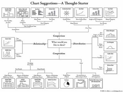
Chart Chooser


A quick reference guide (in the form of a mind map) by Andrew Abela on choosing the right type of chart for the type of message you are trying to communicate with your data.

Found on Digital Inspiration

Wednesday
Jan282009

The Ultimate Mammal Family Tree


This is very cool.  Going back 166 million years to see each of the branches where we share common mammalian ancestors.  The PDF is available for download, and is very detailed.  You need to zoom a long way to even see that there is text naming each of the known mammals in existence today.  It's a radial family tree that also represents a timeline as you move outwards from the center.  Here we are:


ABC TV in Australia did a short video on the family tree hosted by Dr. Paul Willis, and he literally walks around the infographic describing different parts.  Well done, and seemed very reminiscent of Carl Sagan in some of his shows.  The video credits Robin Beck, a Mammalian Systematist as the University of NSW, of creating the family tree.  Here's the link to the ABC page where you can watch the video, or you can click on the image below.


Thanks for the link Alwyn!  Great find!

Tuesday
Jan272009

The Life of a Web Article


Great infographic from the team at Eliiance.com showing how web content (articles) gets from publishing to actual consumption by online viewers.

Friday
Dec122008

The Nuclear Express


From NYTimes.com, this graphic is a summary of the proliferation of nuclear weapons based on the new book "The Nuclear Express: A Political History of the Bomb and Its Proliferation" by Thomas C. Reed and Danny B. Stillman.  The graphic is part of the NY Times article titled "Hidden Travels of the Atomic Bomb".
"The Nuclear Express" a new book on the history of the atomic age, describes the interlocking web of influence and espionage behind the proliferation of nuclear technology.  This diagram gives a summary of the authors' tracking of the transfers of nuclear technology and secrets.
Thanks Jesse for sending in the link.