About
Randy Krum
President of InfoNewt.
Data Visualization and Infographic Design

Infographic Design

Infographics Design | Presentations
Consulting | Data Visualizations

DFW DataViz Meetup

Join the DFW Data Visualization and Infographics Meetup Group if you're in the Dallas/Fort Worth area!

Search the Cool Infographics site

Custom Search

Subscriptions:


Feedburner

The Cool Infographics® Gallery:

How to add the
Cool Infographics button to your:

Cool Infographics iOS icon

- iPhone
- iPad
- iPod Touch


Read on Flipboard for iPad and iPhone

Featured in the Tech & Science category

Flipboard icon

Twitter Feed
From the Bookstore

Caffeine Poster

The Caffeine Poster infographic

Entries in health (118)

Monday
Nov252013

Get Your Head Around Migraines

Get Your Head Around Migraines infographic

Migraines are not fun.  Not fun at all!  Learn how to combat them with tips from the Get Your Head Around Migraines infographic from Napiers.

Migraines impact an estimated 1 in 7 people across the UK and in total about 610,000 suffer from them chronically. Women are more than twice as likely to be affected as men with 18% of all women affected and 8% of men. Symptoms of migraines include visual disturbances to the eyes, intense and throbbing pain on one or both sides of the head, nausea and vomiting, sensitivity to noise, sensitivity to smells and tingling, pins and needles, weakness and/or numbness in limbs.

Migraines are undiagnosed and untreated in at least 50% of patients and less than 50% of migraine sufferers seek medical help. The headaches can be so serve that the World Health Organisation classifies chronic migraines as more disabling than blindness, paraplegia, angina or rheumatoid arthritis but migraines remain the least publically funded of all neurological illnesses when adjusted for economic impact. Severe headaches also leave sufferers at three time’s greater risk of depression than non-sufferers.

This is a long form design, with a lot of detail.  Not intended to be digested and understood in only a few seconds, this infographic is meant to be an ongoing information resource.  The statistics should have been visualized to make them easier for the readers to understand.

Thanks to Napiers for sending in the link!
Monday
Nov042013

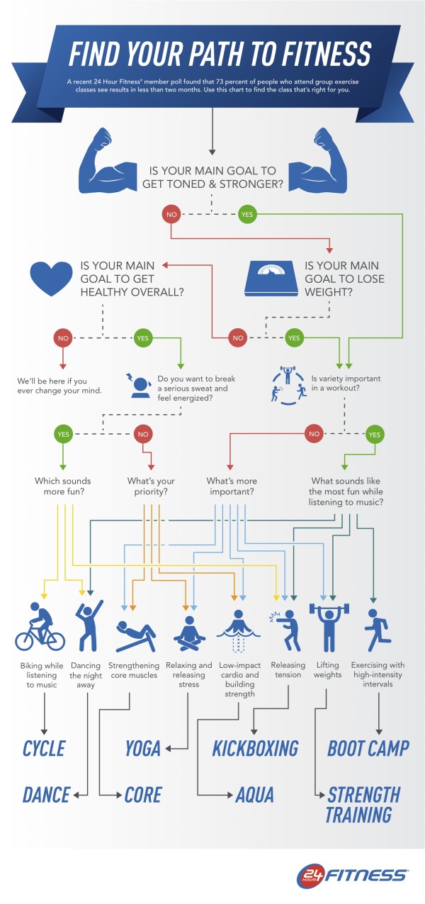
Find The Best Group Exercise Class for You

Find The Best Group Exercise Class for You infographic

24 hour fitness has created an easy to read flowchart to figure out the best group fitness class for your lifestyle in the infographic Find You Path To Fitness, a decision tree based on your wants.

A recent poll revealed 73 percent 24 Hour Fitness members see results in less than two months of participating in group exercise classes. With the popularity and effectiveness of group exercise, 24 Hour Fitness developed a fun, interactive infographic where readers can find out which group exercise class is the best fit for them, based on preferences and fitness goals. The Find Your Path to Fitness infographic, released today, leads readers through a series of questions and directs them to the group workout they’ll find most beneficial.

This is a great design. 

  • Visually appealing
  • Minimal text, the icons and diagram tell most of the story
  • Clear, focused message.  No extraneous data included, which keeps the design simple
  • Topic highly relevant to 24 Hour Fitness without being an advertisement
  • Long online lifespan.  This infographic will be informative to readers for years to come

The footer should include copyright information, and the URL link to the original infographic landing page so readers can find the full-size version.

Thanks to Alafair for sending in the link!

Tuesday
Oct012013

What Are Anxiety Disorders?

What Are Anxiety Disorders? infographic

What Are Anxiety Disorders? is a very detailed infographic from Global Medical Education to help people understand the history, issues and treatments of anxiety disorders.

Anxiety disorders are the commonest psychiatric illnesses globally. There is no test for anxiety disorders like panic disorder, PTSD,OCD or social anxiety disorder and the diagnosis is based on a good history and examination. The signs and symptoms of anxiety disorders are often missed or explained away. Anxiety disorders are also commonly comorbid with other psychiatric disorders particularly mood disorders.

There is no cure for anxiety disorders but very effective treatments are available with a good evidence base. The treatments for anxiety disorders include medications like benzodiazepines, SSRIs or SNRIs or other new generation antidepressants, atypical antipsychotics, as well as augmentation therapies.  Several proven therapies are also efficacious in patients with anxiety disorders. These include cognitive behavior therapy, relaxation training, and prolonged exposure therapy. Yoga and meditation have also demonstrated benefits.

There is a lot of information in this design.  It’s all good, but packing this much information into one infographic is a risk.  On one hand, all of the major information in included in one place.  On the other hand, an infographic this big with this much text will discourage many readers that are looking for a fast and easy explanation.  The overall design can be intimidating to readers that are evaluating the amount of time they would need to invest in understand the information before they start reading.  Many will leave before reading any of the infographic.

Thanks to David for sending in the link!

Thursday
Sep122013

Slather on the Sunscreen: What You Should Know About Skin Cancer


Slather on the Sunscreen: What You Should Know About Skin Cancer infographic

After this infographic, you’ll never think the same of tanning. Slather on the Sunscreen: What You Should Know About Skin Cancer infographic from fourpointsdermatology.com starts with comparing skin cancer to the other types of cancers, educates you on what the symptoms are to look for, then points out the causes of skin cancer, and finally the possible treatments.

“Slather On That Sunscreen: What You Should Know About Skin Cancer” exposes the most commonly diagnosed type of cancer, explaining the three main types of skin cancer and revealing characteristics and statistics for each. Visually explained in the graphic are the symptoms, causes, prevention, and treatment options for skin cancer. With “Slather on That Sunscreen: What You Should Know About Skin Cancer”, Four Points Dermatology is educating viewers that skin cancer prevention can be nearly effortless, and knowing what signs to look for can be life-saving.

Skin cancer incidence has increased 300% since 1994, and shows no sign of slowing down. This infographic was created to educate and encourage people to seek treatment quickly if suspecting of a skin cancer growth. By creating awareness of what symptoms people should be looking for, Four Points Dermatology hopes that the steadily increasing number in cases of skin cancer can be minimized.

Great visuals. Everything from what the symptoms look like, to the causes and preventions are illustrated in a very comprehensible way.

The pie charts with slices that each have a different radius is pretty, but creates a false visualization that doesn’t match the data.  Readers see the area of objects when comparing them, and changing the radius, changes the area of each pie slice.  By reducing the radius of the smaller values, the area is actually reduced much lower than the actual values.

Thanks to Ramsay for sending in the link!

Monday
Jul222013

What the Health? Understanding Obamacare's 11 Year Health Plan

What the Health? Understanding Obamacare's 11 Year Health Plan infographic

Interested in the new health plan but have no idea what it means? What the Health? Understanding Obamacare’s 11 Year Health Plan infographic from Clarity Way breaks down each year of the 11-year health care plan of Obamacare. 

If the re-election of Barack Obama as America’s 44th President of the United States means anything, it is that American citizens can expect a little more consistency within their legislation. Among the most notable acts of legislation promised by Obama during both of his campaigns for the Presidency was the concern over America’s health care system.

When our 44th President first earned his chair in leading the nation, he immediately took initiative to put into action a new proposal for health care reform called the Affordable Care Act. And now that he has regained his position, we can count on seeing this initiative furthered in the next 4 years!

But among this 11 year plan was a ton of confusing political jargon, making it easy for Americans to misinterpret how the Act would impact themselves and their nation. So as a duty to our followers and role in the promotion of health, we wanted to create a little bit easier of an explanation of the Affordable Care Act!

This health reform infographic breaks down the Affordable Care Act in an effort to explain how it will affect each and every citizen, from small businesses to large ones, college students to parents, and senior citizens to the young! It’s important that you know about the Affordable Care Act and understand that if we had maintained our status-quo, over 14,000 Americans would lose their health insurance daily!

I think there’s too much text in this design, but it does walk the reader through each year, step by step.  The statistics should have been visualized.  Big fonts are NOT data visualizations, and I see this done by designers all the time.  Big fonts don’t provide any context, and don’t make the numbers any easier for the audience to understand.

Thanks to Adrienne for sending in the link!

Tuesday
Jul092013

What Is Autism?

What Is Autism? from Global Medical Education is a long, informational infographic that covers the symptons, signs, types, treatments and history of diagnosing autism.

Autism Spectrum Disorder is very common. About 1 in 50 school aged children had parent reported ASD in 2011-2012. There have been changes in DSM-5 with the category of Autism Spectrum Disorder being introduced  which includes Autistic disorder, Asperger’s disorder, Rett’s disorder and Pervasive Developmental Disorder-NOS from DSM-IV. Researchers have studied several important questions in this disorder.

This is a big design with a bunch of good information.  However, I think it’s way too much text for an infographic.  Infographics should make information easier to understand, and most readers won’t stick around to read this much information.  In fact, many readers won’t read any of the information because that much text is intimidating and implies an investment of time and attention by the reader.

The information is fantastic, and should have been broken up into multiple infographics to cover the different topics.  This would make the information easier to digest, and would also spread out links and views to the hosting site over a longer period of time.

Thanks to David for sending in the link!


Tuesday
Jul022013

Can Washroom Soap Can Make You Sick?

Can Washroom Soap Can Make You Sick? infographic

Can Washroom Soap Can Make You Sick? from GOJO Industries brings to light a growing health risk in public restrooms everywhere.  Restaurants, offices, stores, hotels and more.  Those bulk soap dispensers (on the wall or built into the counter) that janitors refill by just pouring in more soap can easily become infected, and the bacteria can survive and grow inside the soap dispenser!  Yuck!

It’s hard to believe, but you could actually walk away with more bacteria on your hands after washing with soap from a refillable bulk soap dispenser in a public restroom. The contamination could even include fecal matter!

How could this be? Check out the infographic below to find out how this happens, discover smart alternatives, and see how you can help protect your family’s health by being a voice for change.

Designed by InfoNewt, this design walks the reader through a clear sequence of information.  It conveys a simple story with easy to understand information and clear sources for credibility.

  • What’s the problem? 
  • How does it happen?
  • What’s the specific risk?
  • What’s the solution to the problem?
  • What can the reader do?

This is a persuasive infographic design that ends with a very specific call-to-action.  Sign the e-petition online to support the cause or forward the infographic to someone that can make a difference.

Friday
Jun212013

Smoothie Recipes For Everything

Smoothie Recipes For Everything infographic

Who knew that the solution to most our problems could be solved with a smoothie?! Smoothie Recipes For Everything infographic from Super Skinny Me gives you the ingredients and visually represents the amount of each that should put in. Trying to lose weight? Want to de-stress? Or maybe just want a bedtime drink. This infographic has it all.

Is there anything as versatile, adaptable and convenient as a smoothie? I doubt it. Nor are there many things as universally beloved.  Smoothies are scrumptious, indulgent concoctions that tickle the taste buds and, inexplicably, with every sip make you feel just a little bit happier and make the world a little bit friendlier. The smoothie is so much greater than the sum of it’s parts. And just to prove the smoothie can do no wrong, it can actually make you more awesome too.

Smoothies contain a smorgasbord of ingredients, and depending on what you throw in, smoothies can ascend from mere flavorsome delight and sweet-tooth satisfier to the dizzying heights of muscle-building, energizing, health-enhancing superdrink. Why eat just one superfood, when you can combine a load of goodness into one easily digestible drink? Plus, it’s super quick and absurdly easy to prepare, making it weirdly efficient not just nutritionally, but generally. Created in the 1940’s, but perfectly designed for 21st century living.

Smoothies can be tailored to suit your own needs. And while the flavors are virtually limitless, don’t just think about taste, but also why you’re making it. Do you want to lose weight or perhaps build muscle? Do you need a pick-me up or extra energy to power through an intense workout? Had a bad day and want to wind down? Or maybe you can’t get to sleep. With a little smoothie science, you can easily make a smoothie that doesn’t just taste good (or look pretty), but actually does something.

The major issue I have with this design is that the proportions visualized for each smoothie aren’t accurate to the recipe.  The sections are sized to fit the text, and have no relationship to the data.  Big mistake!

Also, the actual amounts of each ingredient aren’t shown.  The recipes are on the infographic landing page in the text portion, but aren’t included in the infographic itself.  The issue with infographics is that they need to include the complete information because they are shared all by themselves, without any accompanying description text.

Found on superskinnyme.com

Monday
Jun172013

What You Don't Know Will Kill You

What You Don't Know Will Kill You infographic

1000 people die from cardiac arrest a year. You can die within 10 minutes of the event. EMS only has a 6-10% success rate in saving people because the window of time is so small. Then how do you stay prepared? What You Don’t Know Will Kill You infographic from AED has the solution.

This is a very busy design, but loaded with good information.  Definitely a good comparison/explanation of cardiac arrest vs. heart attack.  The data could have been visualized much better though. 

Thanks to Justin for sending in the link!

Monday
May202013

Common Causes of Tummy Aches in Children

Common Causes of Tummy Aches in Children infographic

Common Causes of Tummy Aches in Children from Tummy Calm is guide for all parents, because all kids get unexplained stomach aches at some point.   The infographic does a good job of clearly walking the audience through the potential symptoms, causes and remedies.

A tummy ache can be a frustrating symptom to understand in small children.  While it’s a common problem, there are a wide variety of potential causes.  This infographic reviews many potential causes of stomach ache and offers pros and cons to potential remedies.

Designed by InfoNewt, this infographic is much more visual explanation and less data visualization.  Health-related topics are also designs that you need to be careful with.  You want to provide good information to the audience, but you don’t want to be interpretted as advising medical care.  The design was carefully worded to be helpful to parents, but also reviewed by a pediatrician to make sure the information presented didn’t cross the line into providing medical advice.