About
Randy Krum
President of InfoNewt.
Data Visualization and Infographic Design

Infographic Design

Infographics Design | Presentations
Consulting | Data Visualizations

DFW DataViz Meetup

Join the DFW Data Visualization and Infographics Meetup Group if you're in the Dallas/Fort Worth area!

Search the Cool Infographics site

Custom Search

Subscriptions:


Feedburner

The Cool Infographics® Gallery:

How to add the
Cool Infographics button to your:

Cool Infographics iOS icon

- iPhone
- iPad
- iPod Touch


Read on Flipboard for iPad and iPhone

Featured in the Tech & Science category

Flipboard icon

Twitter Feed
From the Bookstore

Caffeine Poster

The Caffeine Poster infographic

Entries in how-to (67)

Friday
Dec092011

The Anatomy of a Perfect Website

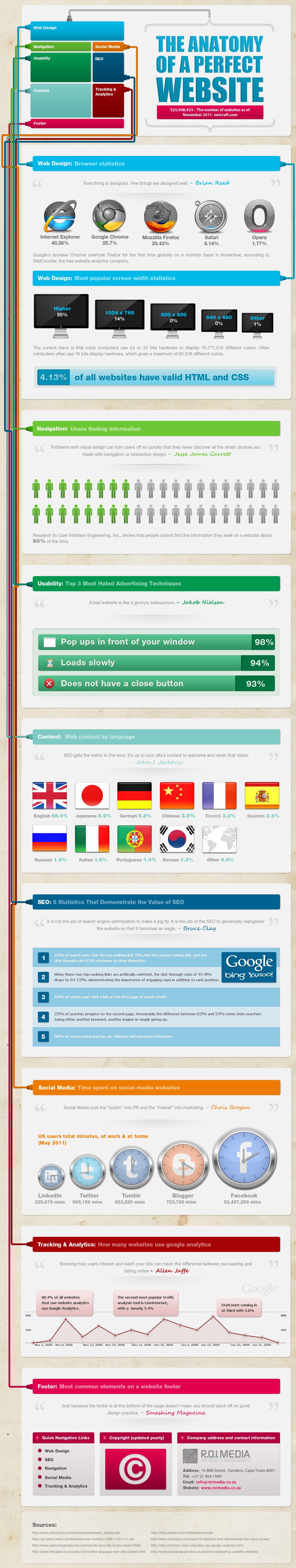
The Anatomy of a Perfect Website from R.O.I Media does a really good job of looking at the primary components of a good website design.  There are many decisions that need to be made by website owners and designers in each of the different sections, and of course data should be driving those decisions.

Websites need a formula – a vivid blueprint that painstakingly weaves technicality, design and detail into something iconic and memorable. Without it, most wouldn’t function for more than a moment and they certainly wouldn’t impress. You may have navigation and usability down, but in today’s fast paced climate you’ll crash and burn without social media. What about SEO, where would it be without content? These are all the things we have to consider, if we are to succeed – from vital tracking and analytics to the often disregarded footer, every detail oils the machine. With that in mind, we bring you the Anatomy of a Perfect Website…

A couple things bother me about the visualizations used in the design.  Designers need to get the “area” of objects correct for the data visualizations to be accurate.  In the Social Media section, the size of the clocks with the site logos should represent the scale of the time spent on each of the sites, but the sizes aren’t actually connected to the values at all.  They’re only a series of increasing shapes without any meaning.  The Facebook clock should be at least five times the diameter shown.

Also, the Browser Statistics section is another victim of the “area” challenge.  I LOVE the visual design style of the color saturation only extending up on the logos as far as the statistics show!  However, you can’t just use the height of the percentage because all of the logos are round shapes.  You need to use the Area of a Circle Segment to calculate the appropriate height to use.  This visual design is probably close, but it’s not accurate.

Thanks to Francois for sending in the link!

Friday
Nov112011

Broken Appliances: Repair or Replace?


PartSelect.com brings us a cool, interactive infographic that helps customers evaluate what to do with their Broken Appliances: Repair or Replace?  Obviously a design from an appliance parts retailer showing customers why they should buy repair parts instead of replacing their appliances, but it’s really good information and doesn’t feel like a hard sell.  It is actually very valuable information for consumers.

We created this diagnostic infographic to troubleshoot some of the common problems that affect household appliances. Clicking on the pulsing dots shows each common issue and the parts required to correct the problem. Many people replace an entire appliance, which is neither cost-effective nor environmentally responsible. We displayed the average cost of replacing the appliance as well as the cost of the parts required to fix the problem (and a scale of the difficulty of the repair).

I really like the design that places the replacement parts radially around the applicances.  The color coding for cost and difficulty also works well, but it would have been better without the legend (“Legends are Evil”).  Without the 1-2-3 as the text in the arc, it could have easily said Easy-Difficult-Very Difficult in the arcs.

Apparently the length of the arcs doesn’t have any meaning, although it looks like it should.  They are just designed long enough to fit the text and the images.

Figure 1 - Layering of the symptoms animation

In addition, PartSelect posted a lengthy, thorough post about the interactive infographic development process they went through.  This is fantastic!  While I may not agree with all of the decisions they made along the way, this type of transparency and under-the-hood information is what helps build credibility and trust with customers.

The Interactive Infographic Process

The process now looks like:

  1. Project Manager decides to make an infographic with some data.
  2. Project Manager brings on board a Programmer and Designer.
  3. Project Manager must decide on the balance of technology vs audience, based on discussions with the team.
  4. Designer fleshes out some rough concepts.
  5. The team meets to discuss; each has specific input:
    1. Project Manager: vision and potential target audiences.
    2. Designer: design concepts and how to make it clean.
    3. Programmer: what is possible. Ideas based on what the technology can do which PM and designer may not be aware of.
  6. Designer creates fleshed out design.
  7. Team meets again and iterates over designs until everybody happy.
  8. Programmer puts together technical spec on how it will be built, which will influence deliverables from designer.
  9. Designer sends across deliverables decided by programmer.
  10. Programmer builds the first functional version.
  11. Team meets and probably iterates and refines design in same process.

Thanks to Stephen for sending in the link!

Monday
Sep192011

US/China Trade Infographic [Making-of Video]


Back in 2009 Jess Bachman designed the Visualizing the US/China Trade infographic for Mint.com.  This design uses a sankey diagram visual that has line widths representing the relative size of all the country values.

Like it or not, the US and China have a trading relationship that has global repercussions. The plastic US flags that say Made in China don’t tell the whole story. No, not everything is made in China. In fact the US manufactures and exports almost as much as China but it consumes a great deal more. Hence, the trade imbalance. What’s interesting is exactly what the US imports, stuff like machinery and toys and as much steel and iron as it does shoes. And what we export — high-tech stuff like airplanes and medical equipment and, for some reason, 7 billion dollars worth of oleaginous fruit which is used to make cooking oil, presumably for Chinese food.

A cool infographic all by itself, but even better is that Jess captured screen shots every 10 seconds automatically using Snagit (a process he calls flowcapping), and recently put them together into a behind-the-scenes video and blog post showing his design process.  10-hours of design work, compressed down into a couple minutes.  View the high-resolution version if you can so you can actually read what’s on the screen.  This is the short version.

And the longer, 7-minute version let’s you see even more details behind his process.

Jess (ByJess.net) is best known for his annual Death & Taxes infographic poster of the U.S. Federal Budget, and recently joined the team at Visual.ly as Creative Director.  Great job Jess, and thanks for sharing your process with the world!

Friday
Sep092011

The Science of Salary


Salary Science builds on the information from Jim Hopkinson’s book, Salary Tutor, and the SalaryTutor.com site.  Designed by Shaun Sanders, the infographic is not actually from the book.  Instead, it shares information that goes above and beyond the book, as a great way to build awareness and help promote the book.


Jim has also published an in-depth, behind-the-scenes look at the making of the infographic on his blog: How to create a viral infographic to market your brand.  You learn about his planning process, the infographic design cycle that Shaun goes through and see early images of the infographic taking shape.


I really appreciate some of the design choices they made along the way, and think the infographic is a super way to attract interest and promote Jim’s brand.  If you’re interested, here’s a link to the book on Amazon as well.  A must-read in my library.


Tuesday
Aug232011

The Art and Science of S'mores


I love this cool infographic from REI, The Art and Science of S’mores

 A group of REI sweet tooths has put together what is perhaps the definitive infographic on s’mores. Check it out, and share it with your camping buddies. We’re betting The Art and Science of S’mores will make your next campground outing just that much more interesting.

This is a fantastic example of designing an infographic to be informative about a fun, interesting subject related to your brand.  Very shareable in social media channels, and it doesn’t feel like an REI ad.  You don’t have to be an outdoor enthusiast to enjoy the topic either, so the audience is a very wide array of people.  Even my 11 year old son loved it!

Found on Visual News.

Friday
Oct292010

The Scariest Halloween Party [infographic]


From Fixr.com, The Scariest Halloween Party: Get You Home Ready brings you a whole bunch of ideas to improve your Halloween party.

Monday
Sep272010

Infographics Feature: Advanced Photoshop Mag


Issue #73 of Advanced Photoshop Magazine (on sale now in the U.S.) includes a special feature on infographics starting on page 90.  There’s the feature article, and a separate step-by-step tutorial by Josh Overton.  Sadly, the article isn’t available online anywhere that I can find.


I did an interview for the feature article, including my thoughts on why infographics are growing in popularity and the process of creating infographics.  The article also includes thoughts from designers Mike Sudal, Bryon Thompson, Jude Buffum, Vic Kulihin, Samuel A. Minick and Raj Kamal.

Sadly, as sometimes happens in the editing process, none of my infographic images were included in the final article, and at least one of my responses was attributed to another designer. :(


I did find that Josh Overton has posted a scan of the tutorial on his site, and the source PSD file is available from the Advanced Photoshop tutorials website.

Page 1 ... 3 4 5 6 7