About
Randy Krum
President of InfoNewt.
Data Visualization and Infographic Design

Infographic Design

Infographics Design | Presentations
Consulting | Data Visualizations

DFW DataViz Meetup

Join the DFW Data Visualization and Infographics Meetup Group if you're in the Dallas/Fort Worth area!

Search the Cool Infographics site

Custom Search

Subscriptions:


Feedburner

The Cool Infographics® Gallery:

How to add the
Cool Infographics button to your:

Cool Infographics iOS icon

- iPhone
- iPad
- iPod Touch


Read on Flipboard for iPad and iPhone

Featured in the Tech & Science category

Flipboard icon

Twitter Feed
From the Bookstore

Caffeine Poster

The Caffeine Poster infographic

Entries in interface (67)

Monday
Sep102007

The Bloomberg Makeover

Three design firms took on the challenge of re-designing the Bloomberg terminal interface, and the results were fantastic. The challenge came from Portfolio.com. The original article is here, but the fantasy terminals are here with an interactive interface that lets you highlight and zoom in on particular features. The design above is from thehappycorp.com and is my personal favorite.

Bloomberg claims to be constantly improving their interface design, but it still looks like runs on DOS and is straight out of the 80's.


Here is the desing from IDEO.com:


And one from Ziba.com:

Wednesday
Sep052007

Marumushi News Map


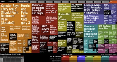
Marumushi.com has a fantastic News Map using the treemap visualization style. This is one of the best implementations of a treemap that I have found. Updated every 6 hours, it groups news stories (from the Google news aggregator) by overall category (technology, world, sports, etc.). You can choose to show the news map from 11 different countries, and the color shading of each block represents how old that particular news story is. Hovering your mouse over any square shows the whole title, and clicking takes you directly to the story.

Tuesday
Sep042007

Microsoft Car HUD


Found on arstechnica.com, this one has me really excited. I have been disappointed for at least two decades that real HUDs (Heads-Up Displays) have not become standard, or even available as a third party product for our cars. Now a US patent application from Microsoft has been published showing a possible future HUD for your car.

More than just your speed, with today's technology we should have things like incoming caller-id, compass direction, outside temperature, current playing music title, live GPS map and distance to the car in front of us showing around the edges of our windshields.

We can only cross our fingers and hope that this would some day become a reality.

Thursday
Aug302007

What does 16 Million colors look like?


From David Naylor's blog, a color map that includes all 16.8 million RGB colors.

Thursday
Aug162007

Periodic Table of Visualization


This table is a must-see site for anyone who works creating visualizations. This website from visual-literacy.org has grouped visual methods into six categories (like Concept Visualization and Metaphor Visualization), and made it interactive so when you move your mouse over one of the specific methods it shows you an example.

This is a great resource to help inspire you to visualize your data in new ways. I find that I like trying to visualize the same data in a couple different ways to find out which works best at communicating the data to others. Ironically it's missing the visual method of laying out data into a periodic table!

Tuesday
Jul242007

Gapminder on Google!


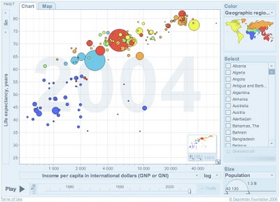
Here it is! Live on Google. Gapminder is the Trendalyzer software used by Hans Rosling and acquired by Google. It's now online at Google, but it looks like an early test. I'm not sure if you can use your own data yet or not, but that is one of the goals.

Check out all of the Gapminder tools, and see more presentations using the Gapminder software at www.gapminder.org

Sunday
Jul222007

Jonathan Harris TED Talks 2007

Jonathan Harris is working on some cool, interesting, fascinating but weird stuff. This is his presentation at TED 2007 about We Are Fine and his new project Universe. You can see this on the TED site here.

Universe is now live at universe.daylife.com, and you can enter a news topic and watch it graphically associate all of the relevant stories in the media about that topic. This would be really cool for consumer products too, but sadly that doesn't exist.

The TED Talks are now available on iTunes as free video podcasts. I've been watching some older ones from 2002-2007.

Page 1 ... 3 4 5 6 7