About
Randy Krum
President of InfoNewt.
Data Visualization and Infographic Design

Infographic Design

Infographics Design | Presentations
Consulting | Data Visualizations

DFW DataViz Meetup

Join the DFW Data Visualization and Infographics Meetup Group if you're in the Dallas/Fort Worth area!

Search the Cool Infographics site

Custom Search

Subscriptions:


Feedburner

The Cool Infographics® Gallery:

How to add the
Cool Infographics button to your:

Cool Infographics iOS icon

- iPhone
- iPad
- iPod Touch


Read on Flipboard for iPad and iPhone

Featured in the Tech & Science category

Flipboard icon

Twitter Feed
From the Bookstore

Caffeine Poster

The Caffeine Poster infographic

Entries in iphone (34)

Friday
Jul222011

35 Years of Apple Products - Visual History

From Mashable come The Apple Tree, a visual, iconic timeline 35 years of Apple product releases.  Designed by Mike Vasilev (@mvasilev on Twitter).

When it comes to industrial design, few consumer electronics or computer makers have the legacy or influence of Apple, Inc. In the last 35 years, Apple has introduced a myriad of products and devices, some very successful, some, not so much.

Artist Mike Vasilev created this infographic for Mashable, highlighting the major Apple product releases and design changes from 1976 through 2011.

I love how recognizeable all of the product illustrations are.  I’ve owned way too many of these products over the years.

Found on Social Media Graphics.

Friday
Jul152011

Our Choice: Interactive, Infographic iPad book

Our Choice, is a new ebook for the iPad and iPhone by Al Gore that includes many infographics and interactive data visualizations that the readers can interact with.  Intended to be the sequel to his book and presentations, An Inconvinient Truth, Our Choice brings a lot of the global warming data to life.

Mike Matas presented the book design in the TED Talk video above, and he’s the co-founder of Push Pop Press, a new digital publishing company. This is the first book from Push Pop Press, but they are working to make the software tools used to make this ebook app available to produce more ebooks.

Ignoring the message and any controversy this book will inspire, the use of data visuals in a ebook format like this is a sign of many more data visualizations to come.

Al Gore’s Our Choice will change the way we read books. And quite possibly change the world. In this interactive app, Al Gore surveys the causes of global warming and presents groundbreaking insights and solutions already under study and underway that can help stop the unfolding disaster of global warming.

Our Choice melds the vice president’s narrative with photography, interactive graphics, animations, and more than an hour of engrossing documentary footage. A new, groundbreaking interface allows you to experience that content seamlessly. Pick up and explore anything you see in the book; zoom out to the visual table of contents and quickly browse though the chapters; reach in and explore data-rich interactive graphics.

More than 30 original interactive infographics and animations

100% of Al Gore’s earnings from Our Choice will be donated to the nonprofit Alliance for Climate Protection.


The app is $4.99 in the iTunes Store, and if you purchase through this link, Our Choice ebook, a small portion will go to helping maintain the Cool Infographics site.  You can also buy the printed book from Amazon.

Thursday
Jul142011

Distracted Driving Infographic

From the Christensen Law Firm in Utah comes the Cell Phones & Driving infographic that looks at the horrifying statisitics behind accidents and deaths caused by people using cell phones while driving in the U.S.

shocking facts about the realities of texting and driving in modern culture. It mentions, for example, that 18% of all fatal accidents are caused by cell phone use, and that 6 collisions occur every 10 minutes because of cell phones. In other words, keep the cell phone as far away from you as possible while driving, because frankly, becoming one these statistics is not an admirable achievement.

The design style is very crowded and busy, but I like the unique approach to using each number on the keypad as a statisitic.

“More than one in four Americans who download apps admit to using those apps while driving.”  On my iPhone, one of those apps is the TomTom GPS app, so of course I use it while driving!

Thanks to Jake for sending in the link!

Tuesday
Jun212011

Foursquare Reaches 10 Million Users


Foursquare yesterday announced that they have reached 10 Million members, and released this infographic for the occasion.

And, to commemorate this pretty crazy occasion, we put together a little infographic. Be sure to click through to see it bigger; if you’re anything like us, watching the full-size animated map puts butterflies in your tummy. Thank you so much for supporting us!

I love the animated portion right in the middle!

Personally, I have mostly given up on Foursquare check-ins without the points or mayorships earning anything for me.  I wonder how many of those 10 Miliion joined, but don’t use Foursquare anymore?

Tuesday
Jun142011

Microsoft: The Mobile Commerce Revolution


The Microsoft TAG team has released a new infographic focused on intelligent shoppers.  Mobile Commerce Revolution: Smartphones & Smarter Shoppers looks at the data behind how we use our smartphones to compare prices, look-up coupons, make purchases with our phones and more.

This is a very busy infographic, with some great data hidden inside.  I like the visuals and the isotype style, but there isn’t a cohesive story or clear path for your eye to follow.  The e-commerce sales growth from 2009 to 2015 is a huge data point and should be much more prominent.

Thanks to Nick for sending in the link!

Wednesday
May252011

Apple Approves 500,000 Apps...and counting


To celebrate Apple (unofficially) reaching the 500,000 apps milestone, 148Apps, Chillingo and Chomp got together to create an infographic.  The 500,000 Apps infographic uses a cool blend of visual styles to explore the history of Apple’s App Store.

Early this morning, Apple approved app number 500,000.  For that, we salute the hard working developers and the enthusiastic community of app seekers (you!).

Because Chomp wouldn’t be here without all of these glorious apps plus our amazing community of app seekers, we’ve put together an infographic highlighting an array of app milestones along the way, including apps you’ve loved since the beginning.

Pie chart, timeline, bar chart, area chart, doughnut chart, stacked area chart and plain old BIG NUMBERS combine together to tell the story of the Apple App Store.

I’m disappointed that the data sources aren’t listed on the infographics.  That opens up the discussion to challenge the numbers and the validity of the overall infographic.

Cool design by Stefanie Kraus (@stefaniekraus)

Three cheers for Team Chomp member, Stefanie, who is responsible for ‘beautifying’ all of the 150+ data points into what is now being dubbed the longest (and most stunning) infographic you may ever see. 

Don’t worry Stefanie, I’ve seen LONGER infographics…


Found on The Unofficial Apple Weblog

Thursday
May052011

The Reality Behind Social Location Apps #infographic

Digital services company Beyond compiled the results of their research into location-based apps, and designed this infographic summarizing the results; Check-In Data: The Reality Behind the Hype.  Released in conjuction with the Social-Loco conference in San Francisco, CA on May 5th.

As part of our involvement in the Social-Loco conference we have done some research to try to understand the difference between what people are saying online compared to the actions of early adopters and the views of the rest of the US population when it comes to their mobile check-in habits.

The results give us a clear understanding of who the winners and losers are likely to be, as well as the types of things that will motivate the mass consumer to adopt location-based apps. They also highlight some of the real challenges there are to consumers embracing this technology.

The data is very interesting.  Personally, I continue to use Foursquare, but find myself checking in less and less because I don’t get any direct benefits out of it.

From a design standpoint, I like the circle clusters, but I don’t like data separate in a legend on the side.  I appreciate that the color-coding remains the same, so Twitter is the same color in each visualization.  I would have included the logo images for the social location-based apps, and connected the data directly to the circles.  Data legends like this make your readers work harder to understand the information.

I also think that the most interesting learning from the study is the comparison between how people interact with national brands and small, local businesses.  However, this is the last visualization at the bottom, and gets lost.

Found on Mashable!

Friday
Apr152011

Client Infographics: Wine iPhone Apps


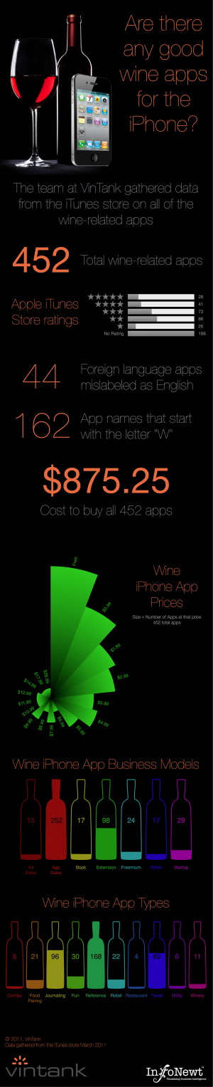
Two infographics InfoNewt (my company) designed recently for the great folks at VinTank.com, a think tank for the wine industry.  Are There Any Good Wine Apps for the iPhone? summarizes the highlights of the data that VinTank gathered from the iTunes Store.  Sorting through 452 wine apps is a lot for a consumer to figure out (intimidating!), so they broke them up by price, rating, business model and type of app.

We took it upon ourselves to evaluate all 452 wine related application available for the iPhone. That is more than six times the amount of wine related applications that was available on our last iPhone Report over a year ago. Each application went through an expansive 20-point inspection that surfaced strengths and weaknesses of their model, UEX, innovation, consumer value, winery value and much more.

You will also notice that we chose do a visual representation of all the data collected, because let’s face it, not only is our attention spans less with amount of content that requires our attention but also because infographics are pretty cool and definitely the trend to display deep rich amounts of numbers, information and data!

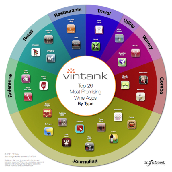
The second infographic displays the Top 26 Most Promising Wine Apps, as judged by VinTank.  These are grouped by type of app, and if you view the larger version you can click on any of the icons to be taken to the iTunes page to learn more about the app.

The team at VinTank obviously put a ton of effort into gathering data and evaluating all 452 apps so they could share this information with the public. 

After all that analysis it was clear to us that there were definitely leaders in the mobile space that showed the most promise. It is important to note that some of due to our deep reach within the wine and technology ecosphere, we have professional or personal relationships with a majority of the Top 26 that have been outlined. This however, does not change our view about how exciting it will be to see how all of them continue to improve their platforms and in fact, we excluded many other app companies that we also work with.

The Top 26 spectrum chart is an interactive version where you can learn more about each application and download their app directly should you choose to do so, or if you don’t already have it. Go ahead give it a try!

Even for data very limited to a specific target audience, an infographic is a fantastic tool to make the information interesting and easy to comprehend by the readers. 

Thanks to Paul and Evan for being great to work with.

Monday
Apr112011

Evolution of the Cell Phone #infographic

A cool infographic design, the Evolution of the Cell Phone by Zitron takes a light-hearted look at the timeline of phone features and the phones that first had each feature.  The second part of the infographic, Our Hopes and Dreams, takes a humorous stab at how the reality of our cell phones rarely lives up to our expectations (until the next Buzzword comes along!).

Friday
Apr012011

Microsoft's Growth of Mobile Marketing

I love to see the big companies experimenting with new media like infographics!  The Growth of Mobile Marketing and Tagging was published by Microsoft Tag last week, and explores the data behind mobile devices.

Sure, it seems like everyone’s got a cell phone – but what are the hard numbers? How many people have smart phones, and what demographic is the most active group in mobile socialization? (Surprise — it’s actually not teenagers!) Find out the statistics on the present (and future!) of mobile marketing in our new infographic

They also broke the graphics down into individual pieces (roughly) and created a presentation version for anyone that wants to use it on SlideShare:


Thanks Elliott for send me a link!