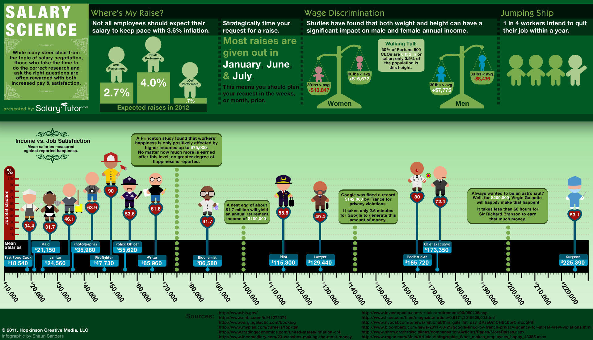
Job Growth at the 100 Best Companies
 Randy
Randy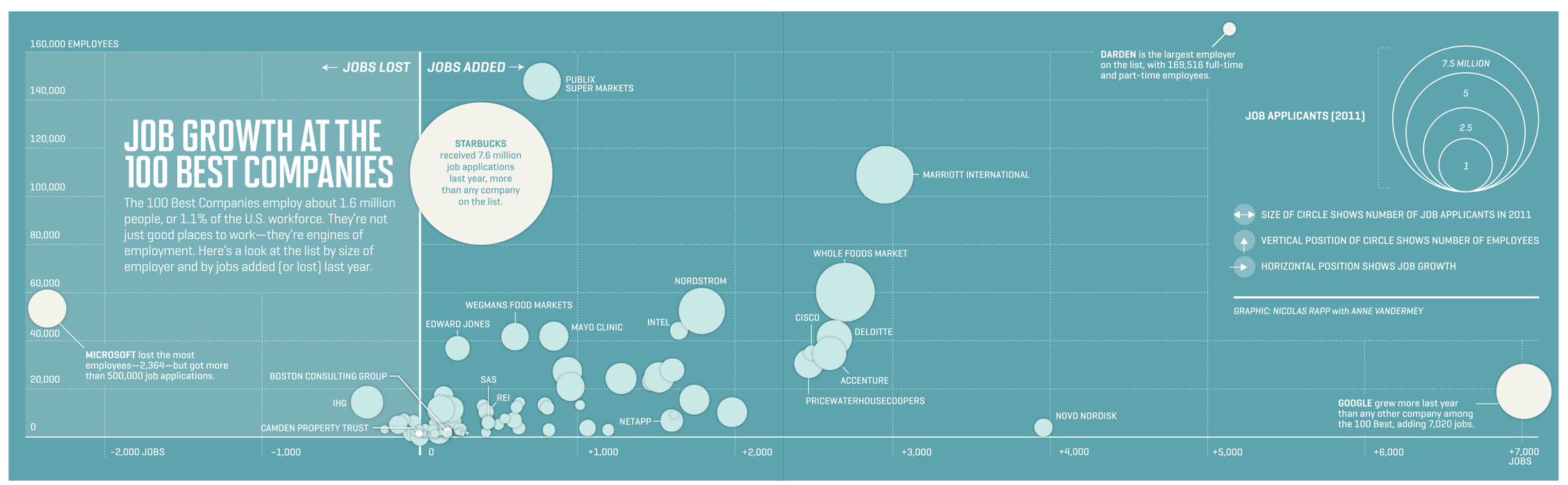
Designed by Nicolas Rapp, with Anne Vandermey (@Vandermy), Job Growth at the 100 Best Companies is a companion infographic for the Fortune feature article, 100 Best Companies to Work For.
Fat paychecks, sweet perks, fun colleagues, and over 70,000 jobs ready to be filled — these employers offer dream workplaces. Like Google, which reclaims the top spot this year to become a three-time champion. Meet this year’s top 100, network with the winners on LinkedIn, and more.
In the latest issue of Fortune Magazine.
This is a great Bubble Map visualization that shows the reader three different dimension of information: Job growth (or loss), total company employees and total job applications over the course of the last year.
I do wish that all of the bubbles had been identified in the infographic. There are many company bubbles unmarked, but the reader assumes they are a part of the Top 100 list. Just my personal preference, but I would have used the company logos instead of text to identify the bubbles too.
Head over to Nicolas’ site to see the full-size version: