About
Randy Krum
President of InfoNewt.
Data Visualization and Infographic Design

Infographic Design

Infographics Design | Presentations
Consulting | Data Visualizations

DFW DataViz Meetup

Join the DFW Data Visualization and Infographics Meetup Group if you're in the Dallas/Fort Worth area!

Search the Cool Infographics site

Custom Search

Subscriptions:


Feedburner

The Cool Infographics® Gallery:

How to add the
Cool Infographics button to your:

Cool Infographics iOS icon

- iPhone
- iPad
- iPod Touch


Read on Flipboard for iPad and iPhone

Featured in the Tech & Science category

Flipboard icon

Twitter Feed
From the Bookstore

Caffeine Poster

The Caffeine Poster infographic

Entries in LinkedIN (14)

Tuesday
Apr022013

Social Network Overload

Social Network Overload infographic

How often have you checked your social media accounts today? Feeling unplugged is a problem for many people.  Social Network Overload from mylife.com talks about how people are addicted to social media, and what they rather do than give up their Internet lifeline. 

Afraid you’re missing something important on your email, Facebook, Twitter, or other accounts? You are not alone. Two out of three people feel the same way. In the same survey, three out of five people wished there was a solution to monitor their various communication options.

Here’s an interesting infographic based on a survey by Harris which illustrates a growing trend—social media overload

The isometric illustrations of people and the data visualizations are fun, and the light-hearted data makes this one appealing to share.  The design is missing the URL to the infographic landing page, so that readers can find the original when they see thie infographic posted on other sites.

Found on The Undercover Recruiter and Visual Loop.

Tuesday
Feb122013

Breakdown of A Person's Google Results...and How to Look Better

Breakdown of a Person's Google Results: How People Look in Google- and How to Look Better infographic

When you type your name in Google, what comes up? Hopefully nothing negative. The Breakdown of A Person’s Google Results: How People Look in Google - and How to Look Better infographic from brandyourself.com tells you which of your profiles are going to show up higher in google. If your personal image needs a boost, use BrandYourself, a free website that allows you to create a positive image of yourself and land it on the top page of the Google search.

At BrandYourself, our goal is give our users and readers everything they need to put their best foot forward in Google.  Since we track the Google results of over 130K users we were able to analyze millions of results and found some really insightful information.

Want to look better in Google? Think twice about building your personal website on WordPress.

  • Bad First Impression: 1.5 Billion names are Searched everyday in Google but people generally don’t look great on their first page
  • If you want to look better, you need to choose your profiles wisely: For example, LinkedIn is the best social network for rankings, while WordPress is the highest ranking personal site builder. Even more interesting, popular pages like about.me really have trouble ranking high.
  • BrandYourself is effective: To date, we have helped people raise their favorite profiles over 250K positions higher in Google. People can expect to raise a profile over 20 positions, or 2 whole pages, by using our software. We are very proud of this.

We know not everyone loves looking at data as much as we do, so we put it in fun infographic form so you can enjoy it too. Let us know what you think!

This is a great informational design that shares some really valuable information.  I can attest to much of the information, and have the advantage of owning all 10 results on Google if you search for “Randy Krum”.  Go ahead…try it!

A couple recommendations I would make to improve the design:

  • There doesn’t seem to be a higher resolution version available, so some of the font sizes are too small to read.  Especially the Sources list and the design credit.
  • There’s some good data and values in here that would make a better impression if they were visualized
  • There should be a URL to the infographic landing page in the footer, so readers can find the original

Thanks to Patrick for sending in the link!

Thursday
Sep202012

Is Google+ a Ghost Town?

Is Google+ a Ghost Town? infographic

Google+, The newest trend? Or the newest flop? Umpf gets to the bottom of this mystery with a little research and reports it’s results with an infographic! The Google+, Ghost Town? infographic does more than just report the Google+ statistics, it compares them to other key social networks.

There’s been many articles written about how good, bad and indifferent Google+ is.  But our favourite debate is the ongoing It’s Really Popular Vs It’s A Ghost Town one.

So what’s the truth?  Our findings and infographic (see below) appear to suggest the latter: despite its large number of accounts, G+ is bottom of the list of social network users’ favoured channels.

Google, of course, claims it is fast-growing and really popular.  Why wouldn’t they? And, of course, there is research to support that argument. But does this chart, left, for example, which shows the rise in G+ unique visitors, tell the whole truth?

So, we decided to do our own research.  It is by no means exhaustive and is only meant as a snapshot view, so judge for yourself.

Certainly a trending topic lately, but also a really good infographic design.  Of course it’s framed in a Google+ news feed style layout.  Easy to read and colorful.  I like the color coding related to the different social network logos, even though some of those blue colors are hard to differentiate.

In the Users bar chart, I love the use of color, putting the data right in the bars and using the logos on the axis to eliminate any need for a legend.  Good data visualizations design!

In the “Users Likely to Share” I would have liked to see some sizing of the icons to match the data. Instead, they put the icon illustrations into rank order, continued the consistent color coding and clearly identified 1st, 2nd, 3rd, etc.

The section with all of the doughnut charts (reminiscent of the Google+ Circles icon) also continues the consistent color coding.  I’m sure it a rounding issue, but many of the charts only add up to 99.9% instead of 100%.

At the bottom, the two things missing are some type of copyright license as well as the URL linking back to the original infographic landing page.

Thanks to Jon for sending in the link!

Monday
Aug202012

ROI = Return On Infographics

ROI Return On Infographics


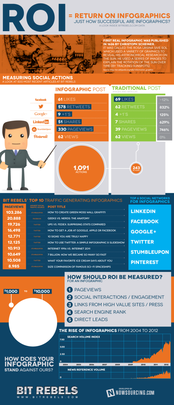
Infographics about infographics are always fun.  Return on Infographics by Bit Rebels and NowSourcing takes a look at some of Bit Rebels’ own data from releasing infographics as part of their marketing.

The impact of an infographic can be measured on many levels, which makes it all just a little bit more complex and complicated to present. With the help of NowSourcing, we have been able to produce an infographic that will compare the traffic and social action impact of an infographic post with a traditional post that does not involve an infographic. It’s through social media analytics that a clear image slowly emerges to tell a story that for some has just been a question without an answer.

They’re pretty clear about this, but remember that this design is completely based on internal data from Bit Rebels.  It may be a good indicator of infographics in general, but we don’t know for sure.

Bit Rebels has shared some fantastic data from their internal tracking, which will be of interest to the you, the readers of Cool Infographics.  However, the design makes a few mistakes, and we’re all here to learn how to make infographics designs better.

  • One of my pet peeves, the design messed up the size of the circles in the comparison table.  Based on the full-size infographic they released at 975 pixels wide, the smaller circle for 243 Actions is about 55 pixels in diameter.  Doing the match for the area of a circle, the diameter of the larger circle for 1,091 Actions should be about 117 pixels wide.  In the design, it’s actually about 256 pixels wide!  So instead of visually showing a shape roughly 4x larger, it’s actually showing a circle about 22x larger!  This is a “false visualization” and mis-represents the data.
  • Are these comparison data points an average or a total of the 500 posts?
  • How many infographic posts are compared to how many traditional posts?
  • Love the use of the actual logos from the social networks in the comparison table, and they should have continued that with the rest of the design instead of just text later in the design.
  • The blue bars behind the higher comparison value look like bar charts, but obviously don’t match the data.  They just fit the text, and have no visual relevance to the data.  An indicator icon or highlighting the entire column width would have been better than the bars.
  • Are the Top 6 Social Networks in rank order?  LinkedIN is the top social network for infographics???
  • The circles near the end of the design are also incorrect.  Instead of showing a 10x comparison to match the dollar values, the circles show an over 100x comparison!

Found on WebProNews, MediaBitro’s AllTwitter, and Visual.ly.  Thanks to everyone that also submitted it and tweeted links to it!

Page 1 2