About
Randy Krum
President of InfoNewt.
Data Visualization and Infographic Design

Infographic Design

Infographics Design | Presentations
Consulting | Data Visualizations

DFW DataViz Meetup

Join the DFW Data Visualization and Infographics Meetup Group if you're in the Dallas/Fort Worth area!

Search the Cool Infographics site

Custom Search

Subscriptions:


Feedburner

The Cool Infographics® Gallery:

How to add the
Cool Infographics button to your:

Cool Infographics iOS icon

- iPhone
- iPad
- iPod Touch


Read on Flipboard for iPad and iPhone

Featured in the Tech & Science category

Flipboard icon

Twitter Feed
From the Bookstore

Caffeine Poster

The Caffeine Poster infographic

Entries in Pinterest (8)

Thursday
Mar102016

The 2016 Social Media Image Sizes Cheat Sheet

The 2016 Social Media Image Sizes Cheat Sheet infographic

Sometimes, one image size doesn't fit all. The 2016 Social Media Image Sizes Cheat Sheet from Hub Spot will help you optimize your images for all of your social media sites.

When you're designing cover photos, graphics, and other social media assets, sometimes knowing the bare bones image dimensions isn't enough.

What if you wanted to place text or an arrow on your Facebook cover photo without it getting covered by the profile photo? And what about the shared link thumbnails on Facebook or in-stream photos on Twitter ... how big should those be?

These change so often, a current infographic guide like this is always helpful.

Friday
Dec042015

What Social Media Platforms Are Best Suited For Your Business

It doesn't matter if you have a well established business or a new one, everyone can benefit from learning to use social media better. But which platform is right for you? The What Social Media Platforms Are Best Suited For Your Business infographic from Quick Sprout helps you determine which platform your target audience uses so you can save yourself some time.

With all the social media sites available today, which ones should you leverage? In an ideal world, you would use them all. As a small business, however, you don’t have enough time and money to do so.

With your limited resources, which social media platform would you pick?

If you think Facebook and YouTube are your best bets because they are most popular, think again. Just because a site is popular doesn’t mean it is a good fit for you business.

To help you decide which social media platform is best suited for your business, I’ve created an infographic that explains what social sites you should be leveraging based on real data.

Good use of colors and logos to differentiate the different services. This infographic is a good example of the difference to readers between visualized data and text-only data. Readers' attention will gravitate to the visualized statistics, and any numbers shown as just text are often skipped and considered to be secondary information.

Thanks to Juntae for the link!

Tuesday
Apr022013

Social Network Overload

Social Network Overload infographic

How often have you checked your social media accounts today? Feeling unplugged is a problem for many people.  Social Network Overload from mylife.com talks about how people are addicted to social media, and what they rather do than give up their Internet lifeline. 

Afraid you’re missing something important on your email, Facebook, Twitter, or other accounts? You are not alone. Two out of three people feel the same way. In the same survey, three out of five people wished there was a solution to monitor their various communication options.

Here’s an interesting infographic based on a survey by Harris which illustrates a growing trend—social media overload

The isometric illustrations of people and the data visualizations are fun, and the light-hearted data makes this one appealing to share.  The design is missing the URL to the infographic landing page, so that readers can find the original when they see thie infographic posted on other sites.

Found on The Undercover Recruiter and Visual Loop.

Friday
Feb222013

Top 250 Internet Retailers Q3 2012 Update

Top 250 Internet Retailers Q3 2012 Update infographic

Top 250 Internet Retailers Q3 2012 Update infographic from the Campalyst blog

Back in May we published an infographic about Top 250 Internet Retailers’ presence on social media. The infographic was perceived really well by our readers, customers and the media; thanks a lot to all the people sharing it on Facebook, Twitter, Pinterest and their blogs!

Now we are happy to present you with the Q3 update! Spoiler: those were two incredible quarters for Pinterest! Amazing growth in terms of the number of brands building their presence on Pinterest and the size of their communities!

I like the color scheme and the variety of data visualizations used in this infographic.  Bars, icons, arcs and proportional circles.  The use of the Internet retailer logos in the circles is especially effective.

I wish the Social Media site logos had been used, especially in the first three sections.  I shouldn’t have to read the text and match the color to figure out what the visualization represents.  That’s too much work for the reader.  How many people does each of the people icons represent in the “How Many Followers Do They Have?” section?  The lines look “relatively right”, but the number of icons seems to have no relationship to the actual numbers shown.

The footer needs both a copyright statement (or Creative Commons license) and the infographic landing page URL so readers can find the original when they see this posted on other sites (like this one!).  Many bloggers are not good about linking back to your original site correctly, and you want your audience to be able to find it easily.

Found on Fresh Peel and Visual Loop


Monday
Aug202012

ROI = Return On Infographics

ROI Return On Infographics


Infographics about infographics are always fun.  Return on Infographics by Bit Rebels and NowSourcing takes a look at some of Bit Rebels’ own data from releasing infographics as part of their marketing.

The impact of an infographic can be measured on many levels, which makes it all just a little bit more complex and complicated to present. With the help of NowSourcing, we have been able to produce an infographic that will compare the traffic and social action impact of an infographic post with a traditional post that does not involve an infographic. It’s through social media analytics that a clear image slowly emerges to tell a story that for some has just been a question without an answer.

They’re pretty clear about this, but remember that this design is completely based on internal data from Bit Rebels.  It may be a good indicator of infographics in general, but we don’t know for sure.

Bit Rebels has shared some fantastic data from their internal tracking, which will be of interest to the you, the readers of Cool Infographics.  However, the design makes a few mistakes, and we’re all here to learn how to make infographics designs better.

  • One of my pet peeves, the design messed up the size of the circles in the comparison table.  Based on the full-size infographic they released at 975 pixels wide, the smaller circle for 243 Actions is about 55 pixels in diameter.  Doing the match for the area of a circle, the diameter of the larger circle for 1,091 Actions should be about 117 pixels wide.  In the design, it’s actually about 256 pixels wide!  So instead of visually showing a shape roughly 4x larger, it’s actually showing a circle about 22x larger!  This is a “false visualization” and mis-represents the data.
  • Are these comparison data points an average or a total of the 500 posts?
  • How many infographic posts are compared to how many traditional posts?
  • Love the use of the actual logos from the social networks in the comparison table, and they should have continued that with the rest of the design instead of just text later in the design.
  • The blue bars behind the higher comparison value look like bar charts, but obviously don’t match the data.  They just fit the text, and have no visual relevance to the data.  An indicator icon or highlighting the entire column width would have been better than the bars.
  • Are the Top 6 Social Networks in rank order?  LinkedIN is the top social network for infographics???
  • The circles near the end of the design are also incorrect.  Instead of showing a 10x comparison to match the dollar values, the circles show an over 100x comparison!

Found on WebProNews, MediaBitro’s AllTwitter, and Visual.ly.  Thanks to everyone that also submitted it and tweeted links to it!

Friday
Jun152012

200+ Infographic Resumes, an escalating trend

Pinterest Board of Infographic Visual Resumes
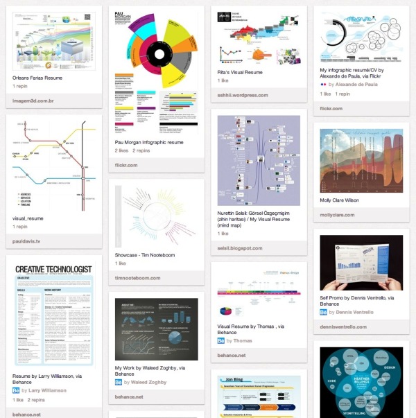
Pinterest Board of Infographic Resumes

Back in January of 2010, I posted 16 Infographic Resumes, A Visual Trend that highlighted the start of the trend of infographics and data visualization moving into resumes.  Why 16?  Because that’s how many good examples I could find at the time on the Internet to showcase the concept.  Two and a half years later, that post continues to be one of the most viewed blog posts on Cool Infographics with an average of 3,500 views every month.  A 2.5 year-old blog post!

Since then, the idea of infographic visual resumes has exploded.  I have continued to gather links to infographic resumes, and my collection is now over 200 examples of infographic resumes that have been published online.  Instead of trying to post them here on the blog like I did in 2010, I’m experimenting by creating a Pinterest Board dedicated to sharing Infographic Visual Resumes.  I will continue to add resumes and grow the board, so follow the board if you want to see new ones as they are addded.  If you know of any that I should include, add the link in the comments or send a link through the Contact form with “Infographic Resume” in the Subject line. 

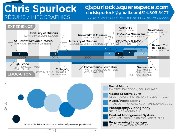
The Cinderella Story example is the Chris Spurlock resume shown below.  The story is that Chris was a graduating Journalism major at Missouri School of Journalism in early 2011, and created his infographic resume because he wanted to pursue data journalism as a career.  It was posted on the J-School blog, but quickly went viral on the Internet.  As a result, he was hired as an Infographic Design Editor for the Huffington Post!

Chris Spurlock infographic resume

I haven’t made any distintion between good and bad designs on the Pinterest board, because all of the designs can give you good ideas about types of data visualizations you can include in your own design.  The only distinction I have made is that they have to include some type of data visualization to be considered infographic.  There are many, many great graphic designer visual resumes that aren’t “infographic” so they aren’t included on the board.

Also, I have attempted to link each design back to the original owner’s site (like Chris’ resume above), but for many the public posting is on a portfolio site like Behance or Visual.ly.  If any of these should be linking to a different location, please send me a note through the Contact page, and I’ll get them linking to the correct places.

It’s definitely worth mentioning that there are a whole bunch of new online sites launching to capitalize on this growing trend.  The service they offer is to create an automatic infographic resume for you, usually based on your LinkedIN profile.  Vizualize.me, re.vu, Kinzaa, ResumUP and cvgram.me all create an infographic resume for you using their pre-designed templates.  I’ve tried to only include a couple examples from each service because 50 resumes based on the same template won’t provide you more inspiration to design your own.  My opinion is that these sites and templates are currently new enough to help your resume stand out, but very quickly the risk is that the templates will become recognized (like PowerPoint templates).

I’m planning a separate, future post about the best practices when designing your own infographic resume, but I wanted to shared the Pinterest Board with you as a resource for inspiration.

Please add a comment with your thoughts about the future of infographic resumes!

Monday
Jun112012

It's All About The Images

It's All About The Images infographic

Here’s some irony for you. It’s All About The Images infographic from MDG Advertising relays information visually about the importance of relaying information visually.  Yes, it’s very meta.

Some say image is everything, and that’s especially true on the Internet where the shift to visual optimization is playing an increasingly important role in the recent phenomenon of photo marketing. In light of their numerous benefits for brands of all kinds, MDG Advertising developed an insightful infographic that illustrates the influence of images on a company’s business, branding, search, and social media efforts. For insight on optimizing images for content and commerce, along with advice on image optimization techniques, take a look at the following infographic to see why images can help make success a snap.

In our world, this information is true for posting infographics as well as photo images.

Thanks for sending in the link!

Tuesday
May222012

A Marketer's Guide to Pinterest, Video and Infographic

The Marketer’s Guide to Pintrest infographic video from MDG Advertising illustrates this hot new trend with this video that builds on their static infographic Pin It To Win It!

MDG Advertising has produced an engaging video highlighting the facts, figures, and findings from its popular “Pin It To Win It” infographic.

The video details the social site’s demographics, growth, and potential to drive abundant traffic to company websites. Pinterest is especially popular with the most highly coveted markets—about 60 percent are female and 80 percent are in the 25 to 54 age demographic. Plus, Pinterest drives more referral traffic than Google+, LinkedIn, and YouTube combined.

The video goes on to cover the brands, both large and small, on board the pinboard phenomenon, such as Whole Foods, Etsy, West Elm, and Real Simple. These companies reflect the cooking, décor, and crafts interests that are prevalent among the Pinterest audience.

In addition, the video helps marketers navigate Pinterest’s features and terminology by demonstrating the “pin,” “repinning,” and “board.” It also shows how companies can leverage Pinterest for maximum response and referral traffic, whether by improving their image quality or promoting more than just a product line.

Only a couple companies have begun to leverage the research and time put into developing a static infographic, by using that same data to produce an infographic video that reaches a whole new audience.  It’s a very effective way to get the most out of the data research that was already done as part of designing the original infographic.

The most disappointing thing is that whoever did the video production got the data visualizations wrong.  Since when is 6 six times as big as 3?  And 27 only twice as big as 6?


3% and 7% sections of the stacked bar can’t be the same size.  In fact, 3% looks a little bit bigger to make room for the text.


Here’s the original static infographic, Pin It To Win It, where they got the data visualizations correct.  I’m guessing that the infographic designer was not involved in the video production.

Marketer's Guide to Pinterest infographic


Thanks to MDG Advertising for sending in the link!  Also found on Daily Infographic and The Infographic Showcase.