About
Randy Krum
President of InfoNewt.
Data Visualization and Infographic Design

Infographic Design

Infographics Design | Presentations
Consulting | Data Visualizations

DFW DataViz Meetup

Join the DFW Data Visualization and Infographics Meetup Group if you're in the Dallas/Fort Worth area!

Search the Cool Infographics site

Custom Search

Subscriptions:


Feedburner

The Cool Infographics® Gallery:

How to add the
Cool Infographics button to your:

Cool Infographics iOS icon

- iPhone
- iPad
- iPod Touch


Read on Flipboard for iPad and iPhone

Featured in the Tech & Science category

Flipboard icon

Twitter Feed
From the Bookstore

Caffeine Poster

The Caffeine Poster infographic

Entries in math (6)

Friday
May092014

Comics That Ask "What If?"

Randall Monroe, author of my favorite web comic XKCD, gave a great TEDTalk about answering science and math questions with his comics.  One of the best parts of this video, and the web comic series in general, is that he uses hand-drawn data visualizations and illustrations to answer them, which makes them easier to understand.

Web cartoonist Randall Munroe answers simple what-if questions (“what if you hit a baseball moving at the speed of light?”) using math, physics, logic and deadpan humor. In this charming talk, a reader’s question about Google’s data warehouse leads Munroe down a circuitous path to a hilariously over-detailed answer — in which, shhh, you might actually learn something.

Pre-order or watch for his new book, “What If?” to be released in September 2014!

Monday
Feb032014

The Beautiful Flow of Pi

Flow Of Life Flow Of Pi data visualization poster

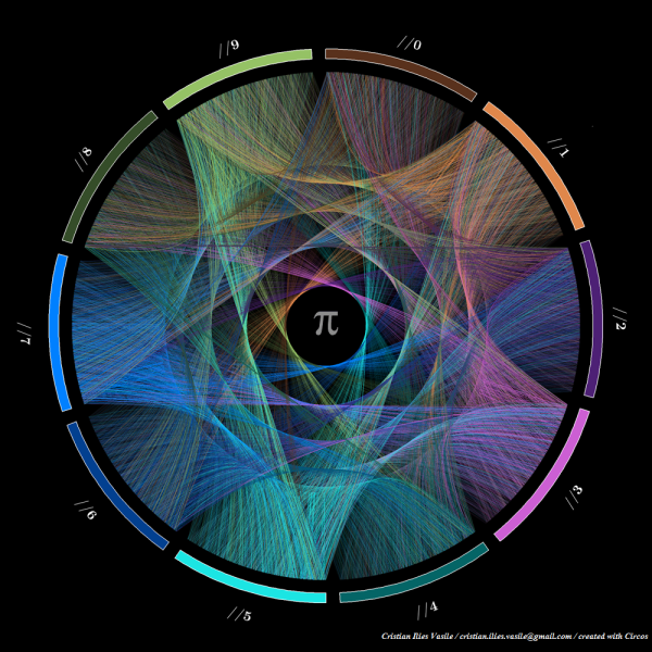
Flow Of Life Flow Of Pi.  Cristian Ilies Vasile designed this visualization of the first 1,000 digits of the mathematical constant pi using Circos to plot the sequence of digits…in a circular pattern of course!.  You can buy a print copy of the poster for $22 from Fine Art America.  Cristian has create a few different varieties of the artwork that you can see on his page.

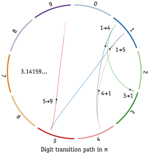
Starting with the first digit “3”, a connecting arc is drawn to each subsequent digit (3.14159265358979323846…).  Since the sequence is theorized to be a random sequence, it creates a beautiful visualization that appears evenly distributed among the digits.  Check out this explanation by Martin Krzywinski along with some of his own artwork.  He demostrates the sequence with this visualization of just the first five digits 3.14159…

I had not heard of Circos before, so I have now added a link to it on the Cool Infographics Tools page.

Thanks to Matt Baker for posting on Google+

Friday
Jul192013

Units of Measure Calendar

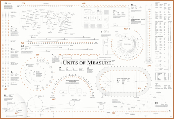
An intriguing calendar that shows the date by using units of measurements commonly used. Designed by the team at ACRE in Singapore, you can buy your own Unit of Measure Calendar poster. There are two editions, a blue and black version as well as a black and copper.  

The idea of creating a calendar was always at the top of our heads. However, we needed an idea that was sound, that made sense. We went back to our roots for that big idea, and we stumbled upon the fact our agency is named after a unit of measure.

Things began to click into gear and the team worked to create a calendar that would highlight 12 units of measure . This brought a lot of symmetry to our design philosophy which melds sense and practicality together. This craft-centric calendar is designed to be practically functional as well as aesthetically pleasing. 

I do wish the high-resolution version was available to view online, but we can only see the gallery images.


Dimensions: 990 × 680 mm (39 × 26.75 in)

Found on Fast Co Design

Friday
May242013

How Many Alien Civilizations are there in the Galaxy?

How May Alien Civilizations are There in the Galaxy? infographic

Very cool!  The How Many Alien Civilizations are there in the Galaxy? infographic from BBC was designed by Information is Beautiful to illustrate the Drake equation. The Drake equation is an equation used to calculate how many potential aliens may exist in the Milky Way Galaxy.

Today, we live in an age of exploration, where robots on Mars and planet-hunting telescopes are beginning to allow us to edge closer to an answer.

While we wait to establish contact, one technique we can use back on Earth is an equation that American astronomer Frank Drake formulated in the 1960s to calculate the number of detectable extraterrestrial civilizations may exist in the Milky Way galaxy.

It is not a rigorous equation, offering a wide range of possible answers. Instead it is more a tool used to help understand how many worlds might be out there and how those estimates change as missions like Kepler, a telescope that is currently searching for Earth-like planets, begin to discover more about our universe.

Until ground-based observations, space telescopes and planet-roving robots uncover any tell-tale signs of life, what better way to speculate on how many intelligent alien civilizations may exist than to explore the universe with our interactive version of the equation.

It’s actually an interactive infographic because it let’s the user change the assumptions and recalculate the results.  So if you only believe there is a 50% chance of plant life developing, change the assumption value and recalculate.

Found on FastCo Design.

Friday
Nov162012

Choosing the Right Line - The Science of Corners

Choosing the Right Line- The Science of Corners infographic

Choosing the Right Line- The Science of Corners infographic is a design about Motocross.  Motocrossgear.com takes the science of successfully navigating corners in motocross racing and brings it to the infographic world. 

Since the beginning of racing, riders have been faced with many choices on the track. The fastest rider is often the one who chooses the best lines on the track. Many factors exist when deciding which line to take through a corner. Use this visual guide to help you pick the fastest line.

Not a design based on a lot of data, this visual explanation relies more on diagrams to communicate the message.  In general, I really like the design style that reinforces the feel of motorcross, but in my opinion this could be a better design with less text.

Thanks to John for sending in the link!

Wednesday
Oct172012

Fast Fourier Transforms: An Infographic Study Guide

Fast Fourier Transforms: An Infographic Study Guide

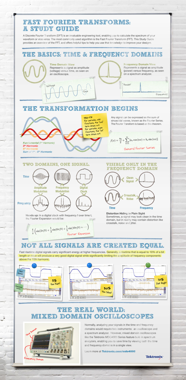
Fast Fourier Transforms: A Study Guide from Tektronix is a great example of using data visualization and infographic design principles to visually explain the math behind their oscilloscopes.

Most engineers don’t remember the complex algorithms and concepts of the Fast Fourier Transform (FFT) and Discrete Fourier Transform (DFT) that they learned in college. Instead of dusting off your textbooks, check out this Fast Fourier Transform visual from Tektronix. It boils down the key tips and practical knowledge for Engineers and their designs. With this visual, we hope you can skip digging up your old text books and get back to your designs.

The design does a good job of telling a story top-to-bottom.  Starting with the basics, moving into the more complicated math and finally applying the math to how the oscilloscope product works.

Definitely a design focused on their target audience, and not the general public.  However, using infographic design to simplify your message to customers is one of the most effective ways to clearly communicate your marketing message.  It’s more memorable to your audience when they come to a purchase decision, and communicating clearly builds your brand credibility with the subject.

At the bottom of the design, they should have included some type of license (copyright or Creative Commons) and the URL to the original infographic landing page.  Nothing wrong with listing the URL to the product page, but help readers interested in the information from the infographic find the original full-size version easily.

Thanks to Matt for sending in the link!