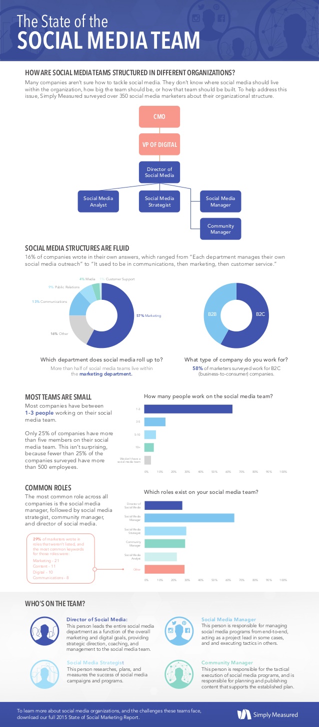
The State of the Social Marketing Team
The State of the Social Marketing Team is an infographic from a survey that SimplyMeasured put together and shared in the full 2015 State of Social Marketing report. This is the right way to use an infographic as the visual summary of deeper content hidden behind a registration wall.
Many companies are still trying to figure out how to tackle social media. They’re constantly asking themselves questions like, “Where should social media live in our organization?,” “How big should my team be?,” or “How should our social media team be built?”
To help address this common issue, we surveyed over 350 social media marketers about their team structures and compiled our findings into this infographic! More information from the survey (as well as a separate look at the pain points these marketers face), download a complimentary copy of our 2015 State of Social Marketing Report.
This is a really good infographic. Packed with good information and keeps the design simple and to the point. My only issue with the design is that some of the text is small and in light colors that are hard to read against the white background.
I noticed that SimplyMeasured posted the original infographic on SlideShare and then posted it in their blog by using the SlideShare infographic wrapper for sharing. SlideShare introduced the Infographics Player in 2013, but I haven't seen many people using it. The potential advantage is that most of the view metrics from mutliple sites are combined together in SlideShare. The potential disadvantge is that people go to SlideShare to view your infographic and never make it to your website.
Found on MarketingProfs
 companies,
  organization chart,
  social,
  social media,
  survey


