


Wednesday
Jul222009
Obama's Credit Card Statement

tagged  budget, money, presidential, taxes, wealth

![]()

Join the DFW Data Visualization and Infographics Meetup Group if you're in the Dallas/Fort Worth area!

The Cool Infographics® Gallery:
How to add the
Cool Infographics button to your:

- iPhone
- iPad
- iPod Touch
Read on Flipboard for iPad and iPhone
Featured in the Tech & Science category


Very detailed infographic from the Washington Post showing how the proposed stimulus package is broken out between ares of spending and tax cuts.
SOURCE: Congressional Budget Office | Reporting by Karen Yourish, graphic by Laura Stanton - The Washington Post - February 01, 2009The centerpiece of President Obama's domestic agenda is an $819 billion economic stimulus plan. The Senate will consider the measure this week, with an eye toward the amount of tax cuts and spending. Republicans and Democrats spar over what to consider a tax cut. An analysis by the nonpartisan Congressional Budget Office tallies the tax-cut portion to be significantly less than the one-third Democrats claim it to be.

I don't think I've ever posted about Wordle.net. So I thought this word cloud of President Barack Obama's inaugural address yesterday would be a good example.
Wordle is a toy for generating “word clouds” from text that you provide. The clouds give greater prominence to words that appear more frequently in the source text. You can tweak your clouds with different fonts, layouts, and color schemes.

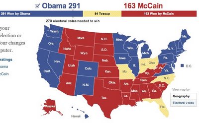
When your done playing, you can also see the NYTimes version of the map that includes the states that are leaning, but are not yet truly decided.


Also notice the mismatch between the newspaper endorsement and each state's "Red vs. Blue" alignment.
Thanks Garrett for the link!
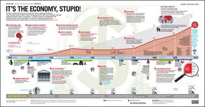
What most of the doom-and-gloom reports on our economy don’t provide is perspective—a historical survey of an economy that’s been through more than a few ups and downs in its day. Here’s a farsighted view of how our temperamental economic machine works, and a close-up of how it stands today.Thanks Adam!

"Death and Taxes:2009" is a representational poster of the federal discretionary budget; the amount of money that is spent at the discretion of your elected representatives in Congress. Basically, your federal income taxes. The data is from the President's budget request for 2009. It will be debated, amended, and approved by Congress by October 1st to begin the fiscal year.The Death and Taxes poster from 2007 was my initial post on Cool Infographics, so I'm very excited to see this update. Now the 2009 version is available to purchase as a poster here.
The poster provides a uniquely revealing look at our national priorities, that fluctuate yearly, according to the wishes of the President, the power of Congress, and the will of the people. If you pay taxes, then you have paid for a small part of everything in the poster.


First, I'm not pushing any particular political agenda. There's considerable debate around this chart, so I don't want to start any arguments. The debate isn't around the validity of the data, but about how it's being presented. The information is freely available from the U.S. Department of the Treasury and the Bureau of the Public Debt.
Second, I like that this chart takes a simple bar chart and adds a few more layers of information. At its root, this is a timeline of the increase in the national debt based on the federal budget by year. Then layered on top of that are the presidents in office that year, some color coding, the political party controlling the White House and highlights for record years.
Third, just to share the reasons for the debate. This is a great example of data being visualized with a specific agenda in mind. Obviously, this is a chart framed to make Republicans look bad, and Democrats look good. The debate centers around a few issues like programs started by one President will carry into the term of another President and more importantly that the political party controlling Congress actually has more impact on the federal budget than the President does.

A small poster from our friends at XPLANE,
How Obama Reinvented Campaign Finance Barack Obama is the first major candidate to decline participation in the public financing system for presidential campaigns. He’s found a more effective way to raise money — by leveraging the power of the American people through online Social Networks.Available as a PDF formatted for printing on 11x17 paper.

The World Freedom Atlas, offers many different views of the world. Developed by Zachary Forest Johnson, his blog is here. The one above is the Raw Political Rights Score (darker is better) based on data from the Freedom House. Offering a bunch of datasets from a number of different sources, the interface is fantastically easy to use. Depending on the dataset, you can also view the data by year from 1990-2006.

