About
Randy Krum
President of InfoNewt.
Data Visualization and Infographic Design

Infographic Design

Infographics Design | Presentations
Consulting | Data Visualizations

DFW DataViz Meetup

Join the DFW Data Visualization and Infographics Meetup Group if you're in the Dallas/Fort Worth area!

Search the Cool Infographics site

Custom Search

Subscriptions:


Feedburner

The Cool Infographics® Gallery:

How to add the
Cool Infographics button to your:

Cool Infographics iOS icon

- iPhone
- iPad
- iPod Touch


Read on Flipboard for iPad and iPhone

Featured in the Tech & Science category

Flipboard icon

Twitter Feed
From the Bookstore

Caffeine Poster

The Caffeine Poster infographic

Entries in press release (2)

Monday
Apr292013

What Guests Want...at Hotels

What Guests Want at Hotels infographic

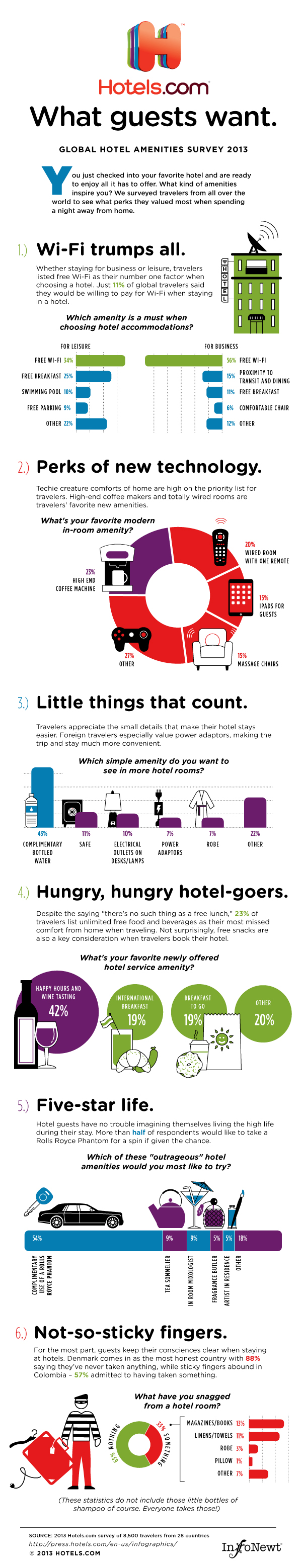
Hotels.com has released the 2013 version of their Global Hotel Amenities Survey, summarized in the infographic What Guests Want.  Part of an ongoing series from Hotels.com on their press site, the infographic takes a fun look at what hotel-stayers value most.  Apparently everyone wants free WiFi!

You just checked into your favorite hotel and are ready to enjoy all it has to offer. What kind of amenities inspire you? We surveyed travelers from all over the world to see what perks they valued most when spending a night away from home. 

The infographic is an additional content piece to the release of the complete survey, Global Travelers Want To Stay Connected And Comfy.  The Hotels.com press site is primarily targeted at an audience of hotel industry executives and the news media, and they maintain a dedicated infographics page.  The addition of the infographic to the press release helps to make the often dry survey data more engaging, and additional press releases were also published to highlight some of the hidden gems in the data: Danish Hotel Guests Most Honest; Americans Come In 23rd Place

Designed by Jeremy Yingling with InfoNewt, the infographic is essentially an executive summary of the much larger survey report that Hotels.com publishes each year.

I’ve posted a short, behind-the-scenes Q&A with Hotels.com about their experiences using infographics on the InfoNewt blog.

Monday
Feb072011

Fuel Poverty with the Over-60 Crowd in England

Click for larger image

EDITED by request of the source:

From Blueclawsearch.co.uk, a great use of infographics in your marketing strategy is in coordination with a press release to help communicate a message to your audience. 

The press release was of course sent out to the normal sources, but the infographic can have a life of its own.  The infographic has the additional ability to reach their audience directly, and be shared on the Internet in ways that a press release never would.

Here’s the press release that went out in conjunction with the infographic:

PRESS RELEASE for immediate release

DATE: 3rd February 2011

Blueclaw Highlights Study on Fuel Poverty Amongst Over 60s in England

This infographic created with the intention of providing a visual impact of how the elderly over 60s are coping in the freezing winter months. These figures are from a recent study on fuel poverty and the over 60s in England*.

Fuel poverty is a real and rising problem in England - 4.6 million people aged over 60 are worried about being to afford heating bills. Furthermore, 1 in 3 over 60’s had to resort to drastic measures to fend off the cold, such as going to a public library. Also according to the study, winter deaths between 2009 and 2010 have totalled more than 23,000.

Too many times and too often, statistics and data from important studies are ignored not because the findings are not urgent, but because most people find it hard to process numbers and jargon easily. AgeUK has recently done a study on how fuel poverty is affecting the over 60s in the UK. This infographic was designed by Blueclaw, to create a visual impact of the study. This social awareness campaign coincides with Fuel Poverty Awareness Day (11th February), a national awareness-raising media and public affairs campaign with an aim to urge MPs to focus their surgeries that week, on helping those who are in or at risk of fuel poverty.

*Study taken from: http://www.ageuk.org.uk/latest-press/archive/poorest-over-60s-twice-as-likely-to-dread-the-cold-as-the-richest-says-age-uk/
More info on Fuel Poverty Awareness Day: http://www.nea.org.uk/fuel-poverty-awareness-day-2011/

I do have a couple issues with the infographic design itself.  Why are the squares that are “2X and 3X as likely” the same size?  Why is 1/3” represented in a solid circle (looks like a pie chart, so it should show a 1/3 slice)?  The grid of 17 houses representing 1.7 million is 6 houses across, which is hard for most readers to comprehend.  We live in a base-10 world, so the grid should be 5 houses wide.