About
Randy Krum
President of InfoNewt.
Data Visualization and Infographic Design

Infographic Design

Infographics Design | Presentations
Consulting | Data Visualizations

DFW DataViz Meetup

Join the DFW Data Visualization and Infographics Meetup Group if you're in the Dallas/Fort Worth area!

Search the Cool Infographics site

Custom Search

Subscriptions:


Feedburner

The Cool Infographics® Gallery:

How to add the
Cool Infographics button to your:

Cool Infographics iOS icon

- iPhone
- iPad
- iPod Touch


Read on Flipboard for iPad and iPhone

Featured in the Tech & Science category

Flipboard icon

Twitter Feed
From the Bookstore

Caffeine Poster

The Caffeine Poster infographic

Entries in process (40)

Monday
Sep192011

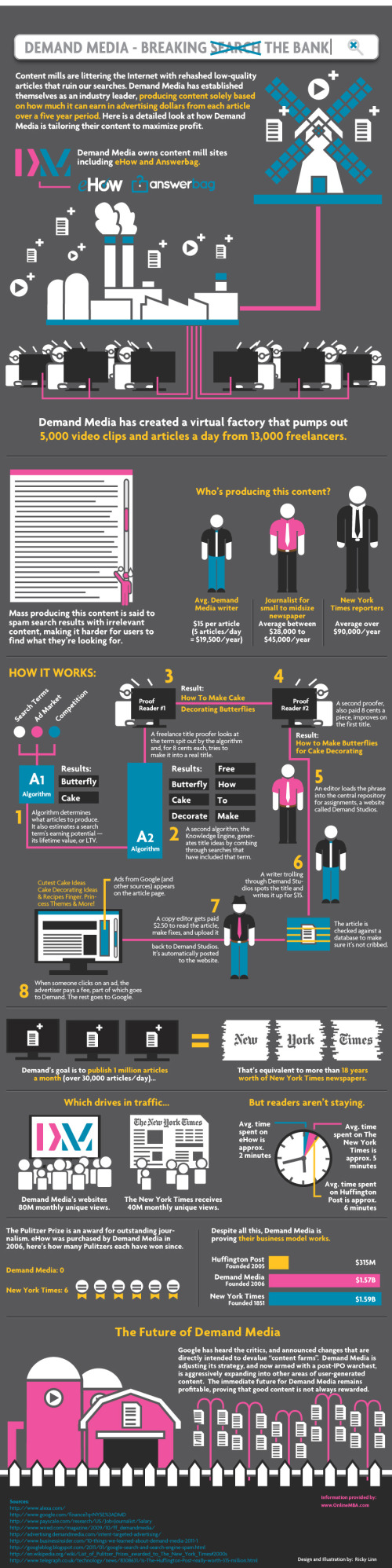
US/China Trade Infographic [Making-of Video]


Back in 2009 Jess Bachman designed the Visualizing the US/China Trade infographic for Mint.com.  This design uses a sankey diagram visual that has line widths representing the relative size of all the country values.

Like it or not, the US and China have a trading relationship that has global repercussions. The plastic US flags that say Made in China don’t tell the whole story. No, not everything is made in China. In fact the US manufactures and exports almost as much as China but it consumes a great deal more. Hence, the trade imbalance. What’s interesting is exactly what the US imports, stuff like machinery and toys and as much steel and iron as it does shoes. And what we export — high-tech stuff like airplanes and medical equipment and, for some reason, 7 billion dollars worth of oleaginous fruit which is used to make cooking oil, presumably for Chinese food.

A cool infographic all by itself, but even better is that Jess captured screen shots every 10 seconds automatically using Snagit (a process he calls flowcapping), and recently put them together into a behind-the-scenes video and blog post showing his design process.  10-hours of design work, compressed down into a couple minutes.  View the high-resolution version if you can so you can actually read what’s on the screen.  This is the short version.

And the longer, 7-minute version let’s you see even more details behind his process.

Jess (ByJess.net) is best known for his annual Death & Taxes infographic poster of the U.S. Federal Budget, and recently joined the team at Visual.ly as Creative Director.  Great job Jess, and thanks for sharing your process with the world!

Monday
May162011

Client Infographic: How Affiliate Marketing Works

How Affiliate Marketing Works


Recently, InfoNewt (my company) designed How Affiliate Marketing Works for Internet Marketing guru Rae Hoffman-Dolan and her site: Sugarrae.com.  You can see the high-resolution version here.

After spending over a decade in the Internet marketing industry, I think I often forget – and have failed to address – the most obvious question most folks new to the industry have about affiliate marketing.

When I appeared as a guest on Weapons of Mass Marketing earlier this week to discuss the topic of marketing affiliate programs, the hosts evidenced the importance of the often overlooked question by leading off their interview with a variation of it…

“How does affiliate marketing work?”

No numbers, no statistics, no data visualizations.  This infographic is visualizing a process, and I do many of these for clients.  Business processes, strategies, workflows, business models, flow charts and explanations of how things work.

In this case, characters on a simple path visualizes a process of 10 steps.  Way more interesting than a text numbered list in a blog post don’t you think?

You should follow Rae on Twitter: @sugarrae

Tuesday
May032011

Demand Media - Breaking the Bank

Demand Media - Breaking the Bank is a cool infographic published on OnlineMBA.com by designer Ricky Linn.

The content itself in interesting, and I remember reading the Wired article listed in the sources.  I like that the infographic combines the process flow of content creation, but also visualizes relevant statistics about how big and profitable Demand Media has become.  Overall it tells a good story.

Found on SiliconValleyWatcher.

Thursday
Mar242011

Google's Collateral Damage


Another cool flowchart-style infographic by Jess Bachman for SEOBook.com.  Google’s Collateral Damage visualizes how Google’s evolving search algorithm is impacting the Web.

Google’s PageRank worked well until people realized what drove search & how to optimize for it. But the web moves much faster than the colleges do. A million spam pages are created every hour! Thus Google’s relevancy algorithms have grown in complexity over the years.


Friday
Jul232010

Do You Need a New Logo?

A fun infographic from Watermark Design, Do You Need a New Logo? is a humorous decision chart.

“wink”

Wednesday
Apr212010

The Social Media Effect

This was the original infographic, The Social Media Effect, from InfographicWorld that inspired part of yesterday’s post, The Visual FAQ of SEO.  This infographic maps out the process of what happens when social media gets excited about your posted content.

A great example of why I started the Cool Infographics blog in the first place.  Create a great place to find inspiration to create your own infographics.

Monday
Oct122009

How to Crack a Master Lock [infographic]


Designed by Mark Edward Campos, this infographic takes the confusing instructions that have been on the Internet for years, and translates them into a simple graphic.  64,000 possible combinations reduced to less than 100 attempts.
This design project was born to understand the inner workings of the padlock, and to develop a notation system to engage the viewer and provide a guide to beat a pad lock.
Found on Gizmodo.

Wednesday
Nov262008

Welcome to the world baby...Processing


In my email yesterday I received a note announcing the release of Processing 1.0.  It's very exciting to see this project release to the world.  There have been many beta versions leading up to this release (162 versions in fact), but for those interested in creating your own infographics this is big news.  What is Processing, you ask?
Processing is an open source programming language and environment for people who want to program images, animation, and interactions. It is used by students, artists, designers, researchers, and hobbyists for learning, prototyping, and production. It is created to teach fundamentals of computer programming within a visual context and to serve as a software sketchbook and professional production tool. Processing is an alternative to proprietary software tools in the same domain.
Processing is free to download and available for GNU/Linux, Mac OS X, and Windows.
Some of the infographics I have highlighted here on Cool Infographics have been created with the earlier versions of Processing, and I'm hoping for more to come.

Thursday
Oct092008

Watercube, The Book


Watercube, is a new book by Ethel Baraona Pohl.  The book is about the National Aquatics Centre built in Beijing for the 2008 Olympics, and has some cool infographics inside.  Some of the graphics were contributed by architect César Reyes Nájera.  A review of the book can be found here on www.v2com.biz
WATERCUBE: The Book is a complete monographic publication about the National Swimming Center for the Beijing Olympics 2008. With an exhaustive description about the Watercube we present a detailed study of the project. The book makes an holistic approach to the project that starts with a brief description of urban and social changes that China has been experienced in the last decade. These facts have encouraged the construction boom that made possible these kind of projects occur in cities like Beijing.

 
This page compared the amount of steel used to built the Watercube to some of the most well known buildings around the world.
This page shows a comparison to the same set of buildings around the world, but shows the tons of CO2 produced due to the steel used in their construction.


This page is one of the years of the timeline leading up to the construction of the Watercube.

Here you can buy Watercube, by Ethel Baraona Pohl, on Amazon.com.

Special thanks to Ethel for sharing the images from her book, and allowing me to post them on Cool Infographics!

Wednesday
Sep242008

Mashup DJ Girl Talk


From Wired.com, how do you visualize a music mashup of 300 different songs?
In the modern laptop era, any monkey with Pro Tools can make a mashup. But Pittsburgh-based computer maestro Girl Talk (known to the IRS as Gregg Gillis) has turned the cut-and-paste process into a jams-packed jigsaw puzzle. His latest album, Feed the Animals (released digitally in June with hard copies out September 23), brims with 300 song snippets in just over 50 minutes (compared to around 250 in his previous effort). "People want to see the bar raised," Gillis says. Below, a beat-by-beat breakdown of a single track.
Thanks Daniel for the link!