


Tuesday
Jan292008
Golf Terms Explained
 Randy
Randy
Humorous infographic that visually explains some of the common golf terms from Beau and Alan Daniels at beaudaniels.com, where you can find a number of good examples of their infographic work.

![]()

Join the DFW Data Visualization and Infographics Meetup Group if you're in the Dallas/Fort Worth area!

The Cool Infographics® Gallery:
How to add the
Cool Infographics button to your:

- iPhone
- iPad
- iPod Touch
Read on Flipboard for iPad and iPhone
Featured in the Tech & Science category


Humorous infographic that visually explains some of the common golf terms from Beau and Alan Daniels at beaudaniels.com, where you can find a number of good examples of their infographic work.

From the Telegraph in the UK, the idea is to use a kite to help pull a ship across the ocean. by using the wind power at high altitudes the ship would save on energy consumption.
Its inventor, Stephan Wrage, a 34-year-old German engineer, claims the kite will significantly reduce carbon emissions, cutting diesel consumption by up to 20 per cent and saving £800 a day in fuel costs.Found on digg.com


Holiday Infoporn from Wired.com.Here's our theory: There is, in fact, a nonsupernatural Santa. It's a transnational corporation with one mission-critical fulfillment goal: Every kid who celebrates the holiday gets a toy on Christmas eve.
Check out the side-scrolling timeline at the bottom. I think they should have included Chinese New Year.
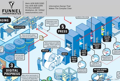

This is one of the example infographics from Funnel, Inc. I got a postcard from them offering infographic holiday cards, FREE while supplies last. You won't find the link on their website, but the direct URL is http://www.funnelinc.com/holiday. Order yours quick!
By the way, the example infographic above is "How Books are Made" and shows the entire process to print books at Webcrafters, Inc. in Madison, WI.

NodeTrix was a study of social networks by Nathalie Henry, Jean-Daniel Fekete, and Michael J. McGuffin from France and Canada. Natalie presented their results at the InfoVis conference in Sacramento, CA in November.
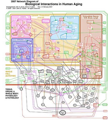
Created by John D. Furber at Legendary Pharmaceuticals, this is a visual representation of the biology behind aging using a network diagram. A large format image is available for printing here.
From VisualComplexity:John D. Furber of Legendary Pharmaceuticals has put together a visual model of aging referred to as 'The 2007 Network of Biological Interactions in Human Aging' that shows the interactions between various subcellular, cellular, extracellular matrix and organ system. This is a great representation of aging as it demonstrates no root cause but rather a network of problem areas that are interlinked. The goal of systems biology would be to flush this out in great detail allowing one to zoom in down to the specific genomic and proteomic components of aging. Systems biology would also pursue such a model to have a functional runtime component to it such that variables could be tweaked and changes introduced to predict impact elsewhere in the various biological networks.

A subject near and dear to my heart, I found this poster on Visual Complexity. This map "illustrates the intricate, interwoven relationship between businesses and their brands." The source appears to be 300million.com, which is a Marketing agency in the UK.
I love this map, and I thought this would be a good entry to the VizThink Mind Map Contest.
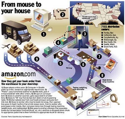
How does Amazon turn your online book order into a physical shipment to your doorstep? One of a handful of great infographics from Ron Oden on the ronoden.com site.

Silver Bullet Comics has an article for aspiring comic artists, but I found this little gem.
A very simple infographic demonstrating that characters much each have a distinctive shape that makes them recognizable even from a distance. Very similar to the “silhouette test” for good character drawings to be recognizable in silhouette.

XPLANE is a company whose whole purpose is professional infographics. They do a bunch of infographics for big and small companies, but also do a lot of work for Business 2.0 magazine (a favorite of mine). Check out David's post that Business 2.0 might be in trouble.
A number of infographics (called XPLANATIONS...I love it) are available free for download here.
David Grey is the CEO, and he also runs his own blog called Communication Nation.
