About
Randy Krum
President of InfoNewt.
Data Visualization and Infographic Design

Infographic Design

Infographics Design | Presentations
Consulting | Data Visualizations

DFW DataViz Meetup

Join the DFW Data Visualization and Infographics Meetup Group if you're in the Dallas/Fort Worth area!

Search the Cool Infographics site

Custom Search

Subscriptions:


Feedburner

The Cool Infographics® Gallery:

How to add the
Cool Infographics button to your:

Cool Infographics iOS icon

- iPhone
- iPad
- iPod Touch


Read on Flipboard for iPad and iPhone

Featured in the Tech & Science category

Flipboard icon

Twitter Feed
From the Bookstore

Caffeine Poster

The Caffeine Poster infographic

Entries in products (6)

Wednesday
Aug202014

Why are Superior's Cotton Threads 'Superior'?

Why are Superior's Cotton Threads 'Superior'? infographic

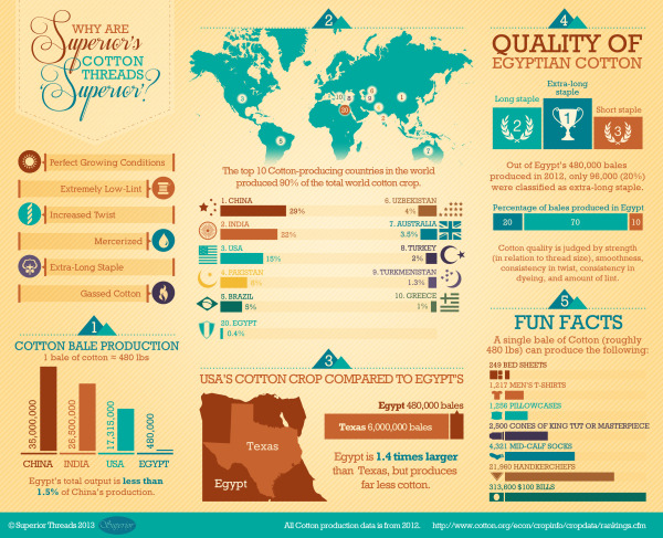
An infographic with information about Superior’s cotton from Egypt, Why are Superior’s Cotton Threads ‘Superior’? created by Superior Threads. This infographic focuses on comparing Egypt’s cotton to other cotton growing countries.

We created an infographic which explains why Egyptian-grown Cotton is so fantastic. Our Cotton threads are truly made from Cotton plants which are grown and harvested in Egypt.

Egyptian-grown extra-long staple Cotton

We put a lot of emphasis on ‘Egyptian-grown extra-long staple’ as a description for our Cotton threads. This is because the highest quality cotton available is Egyptian-grown extra-long staple Cotton when it comes to the textile/thread industry. ‘Extra-long staple’ means less lint and stronger thread. Egypt has the perfect growing conditions for Cotton and the result is a naturally strong and beautiful fiber.

The infographic gets straight to the point with answering its question about what makes Superior’s cotton so great. You can see in the text blurb above that Superior’s cotton comes from Egypt; however, it is not stated anywhere in the infographic.  So that information is lost when people share the infographic by itself.  Infographics take on a life of their own online, and all of your information needs to be included in that image file.

This is a great example for product companies.  Every product has a story about what consumer need it fills, or how it compares to the competition.  Companies should be using more infographic to help tell those stories to their potential customers. 

Thanks to Betsy for sending in the link!

Friday
Nov082013

Apple Release Patterns

Apple Total Release Patterns infographic

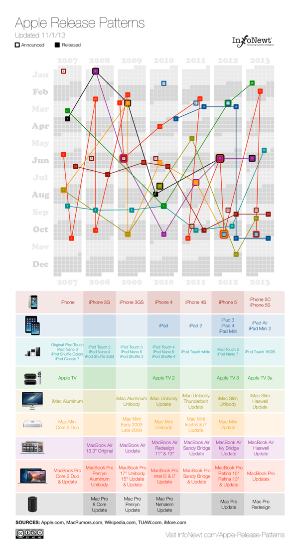
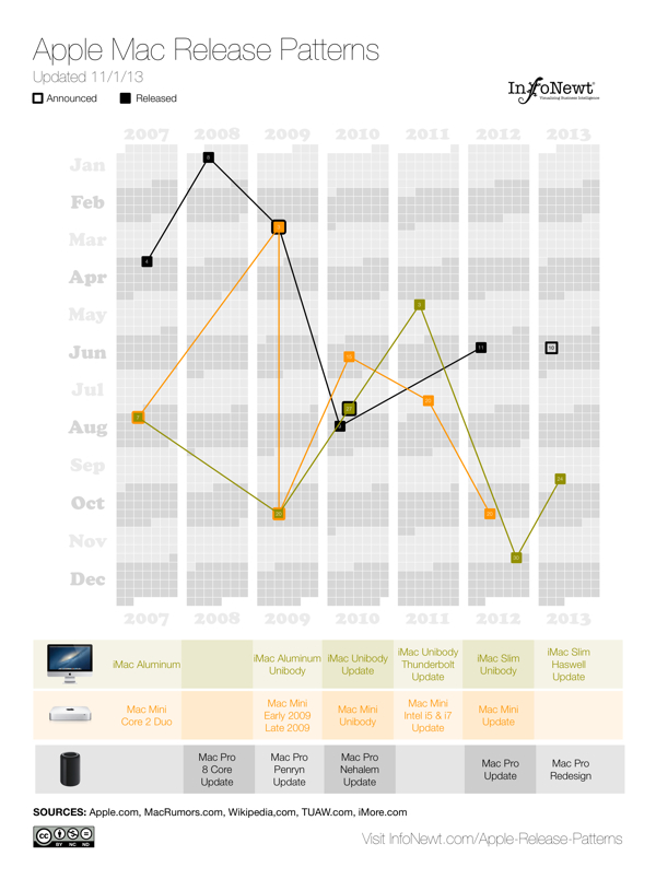
Apple Release Patterns is a new personal project of mine, and you can find the full-size original versions on a new, dedicated landing page on the InfoNewt.com site.  Every few months Apple releases a new product update or redesign, and the rumors start flying about what the upcoming product will be during the preceding weeks.  For better or worse, those speculations are often based on what was released in the same timeframe the prior year.

This data visualization lines up vertical columns for each year, starting with 2007.  I decided that anything further back wasn’t really relevant to Apple’s current practices.  Each product release is then mapped onto the calendar, showing a pattern (or lack of pattern) to the product releases.  If the product announcement was separate from the actual release date, I mapped that date as well.

This data was ripe for a visualization.  When I tried to look at the historical dates of product releases, the information was scattered across multiple sites, confusing and difficult to gather.  Some information was contradictory, which required further investigation.  So, the data topic itself was a good target for a clear, easy-to-understand visualization.  However, the design with all of the products was too complicated visually to perceive any defining patterns.  So, I created separate versions that break out the products into 3 categories, and those are much easier for readers to see the patterns.

Apple iOS Release Patterns infographic

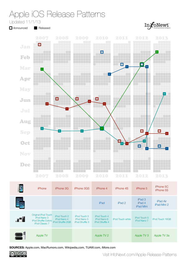
For iOS devices (iPod, iPad, iPhone and AppleTV) you can see the pattern shift in 2011 for most of the products to a Fall timeframe.  You can also see a recently consistent announcement date with the product release the following Friday.

Apple MacBook Release Patterns infographic

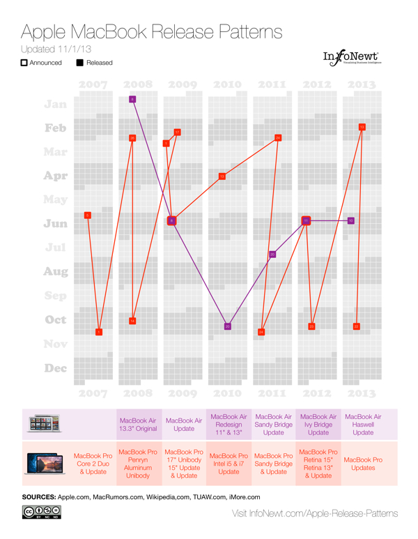
For Apple’s laptop line, the MacBooks, you can see the MacBook Air has become a regular release during the Worldwide Developers Conference (WWDC) in June, and the MacBook Pro gets fairly regular updates twice a year, usually just to update the internal specifications.

Apple Desktop Mac Release Patterns infographic

The desktop Mac line doesn’t seem to show much pattern at all.  They might get an update each year, but the timing is erratic.  Sometimes they are part of WWDC, sometimes part of the Fall iOS events, and sometimes completely on their own.

I’m going to keep updating these on the landing page as Apple releases new products in the future (upcoming iPad Mini 2 Retina and Mac Pro still need to start shipping this year).  I want these to become a valuable resource every time the Apple rumor mill heats up about the next product announcement.  If you use the embed code on the Apple Release Patterns landing page, your site will also display the updates automatically as they become available.

This is version 1.0.  I have some ideas and improvements I want to make in future versions, but I would love to hear your thoughts as well.  Post any suggestions or feedback in the comments below.

Friday
Aug032012

Celebrating their First $1,000,000 of Custom Made Products

Celebrating their First $1,000,000 of Custom Made Products infographic

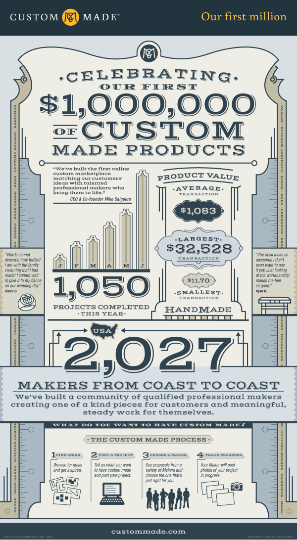
In its first six months CustomMade.com made their first million of custom products! They take their clients ideas and match them with professionals to get the job done.  Their Celebrating Our First $1,000,000 of Custom Made Products infographic shows their process and success. 

Over the first six months of 2012, we here at CustomMade have been thrilled to witness the growth of the first entirely custom online marketplace.  Our team has been constantly working to improve the site experience and our ability to match customer’s idea’s with the talented professional makers who can bring them to life.  Recently we paused for a moment and realized we were about to pass an important milestone for our marketplace – $1,000,000 worth of custom made products!

Along the way we’ve seen some amazing custom creations ranging from $32,000 custom kitchen cabinets to an $11 hand carved wooden pendant. We’ve seen rings made out of vinyl records, rings with amazing details from a family crest, and even an engagement ring in the shape of R2D2 (which any Star Wars fan would love).  Our makers have brought to life a children’s bed in the shape of a slipper, amazing custom humidors, and even a custom cat bunk bed!  You can browse all of our projects in progress on the site, or browse over 35,000 completed projects.

This work is being done by over 2,000 professional makers across the U.S. and Canada.  They include furniture makers, jewelers, ceramicists, glass blowers, metal workers, leather tanners, and much more.  These makers represent that true craftsmanship still exists today and that consumers are able to not just purchase an item off the shelf, but to create an heirloom that can be cherished for years to come.  We are proud to support these local makers and the products they create, and are looking forward to seeing what unique items they make next!

I love the classic, clothes-tailor style that dominates the overall design.

My biggest complaint with this design is the lack of data visualizations.  Big fonts are NOT data visualizations.  Visualization put the values into context for the reader by comparing them to another value so the reader can understand if a number really is big or small.

I love that the infographic itself was “Crafted by hand”, but in the spirit of the business, they should have given the designer credit by name.

Thanks to Zach for sending in the link!

Wednesday
Jun132012

The Value of Retail-Integrated eCommerce

The Value of Retail-Integrated eCommerce

What can Retail-Integrated eCommerce do for your brand? is a new infographic based on a research study from Shopatron.  

Retail-integrated eCommerce is a business model that allows branded manufacturers to sell directly to consumers and pass those orders to their retailers for delivery to the customer. According to March 2012 surveys answered by over 200 branded manufacturers and 1,300 retailers, retail-integrated eCommerce benefits branded manufacturers in the following ways.

This is obviously a design for a niche audience, but I can tell you from past experience that Branded eCommerce is a HUGE challenge.  A company makes products for the end user; however, their immediate customers are usually retail stores.  As soon as a product company starts trying to sell their products on their own website (cutting out the retail store), they suddenly become a competitor to all of the existing retail store customers.  The idea of Retail-Integrated eCommerce is a potential solution.

The statistics at the bottom of the infographic that explain this challenge (not visualized) are so important, I think they should have been visualized and highlighted at the top of the design.  This is the background information that makes the rest of the infographic relevant.

In 2012, 70% of retailers said they would reduce buying from brands that sell online directly to consumers, with 9% saying they would cease buying from that brand altogether.

This is a good design that doesn’t try to throw too much information at the reader.  Most of the important data points are clearly visualized with short descriptions.  The orange color scheme clearly identify the design with the Shopatron brand.

You can also download the PDF version here.

Tuesday
Nov222011

Crazy for Black Friday Deals


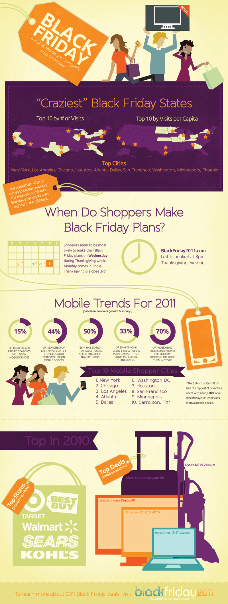
In honor of our upcoming shopping holiday, Crazy for Black Friday Deals from BradsDeals takes a look at some of the stats behind Black Friday (day after Thanksgiving) shoppers.

BradsDeals created a Crazy for Black Friday Deals infographic to illustrate historical Black Friday figures as well as the shopping trends and predictions for this year’s holiday.

If you live in Minnesota, congratulations, you live in the most Black Friday crazy state in the country. And while Black Friday fans in major cities like New York, Los Angeles and Chicago may be more likely to cruise Black Friday deals on their smart phones than shoppers in smaller towns, the Dallas suburb of Carrollton blows everyone out of the water with 60% of Black Friday searches happening on mobile devices. WOW.

I live near Carrollton, but I wouldn’t consider it a particularly tech-savvy area.  Apparently, they’re good with mobile shopping…who knew?

Of course, I get tons of Black Friday infographics submitted to the site, but I really liked the design of this one.  The information is visualized in a clear, easy-to-understand design. The visuals are simple and relate to the data.  Maps for cities, calendar for days shppers make plans, doughnut diagrams for percentages and silhouettes of top products.

On the other hand, there doesn’t seem to be a cohesive story to this infographic.  It’s a collection of disconnected data points about top cities, mobile trends, top products and when shoppers make plans.  Also, the design is missing a list of the data sources, the URL for readers to find the original posting, a copyright or creative commons claim and recognition of the designer.  Why should we trust any of these statistics?

Thanks to Amanda for sending in the link!

Monday
Nov212011

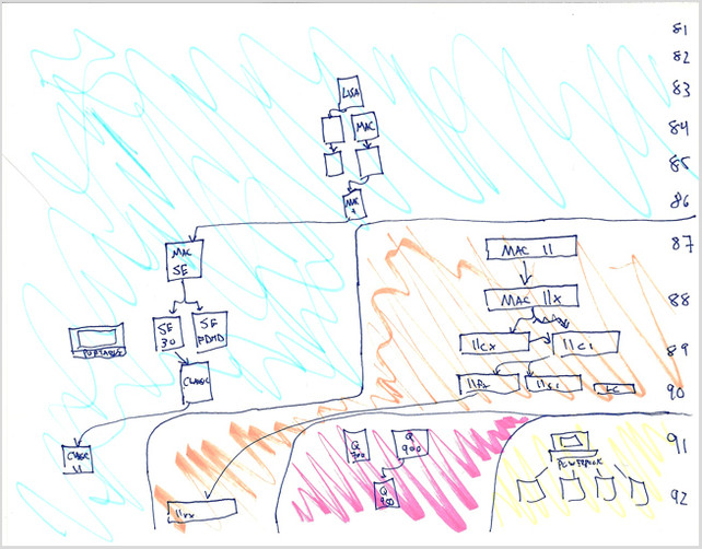
The Insanely Great History of Apple

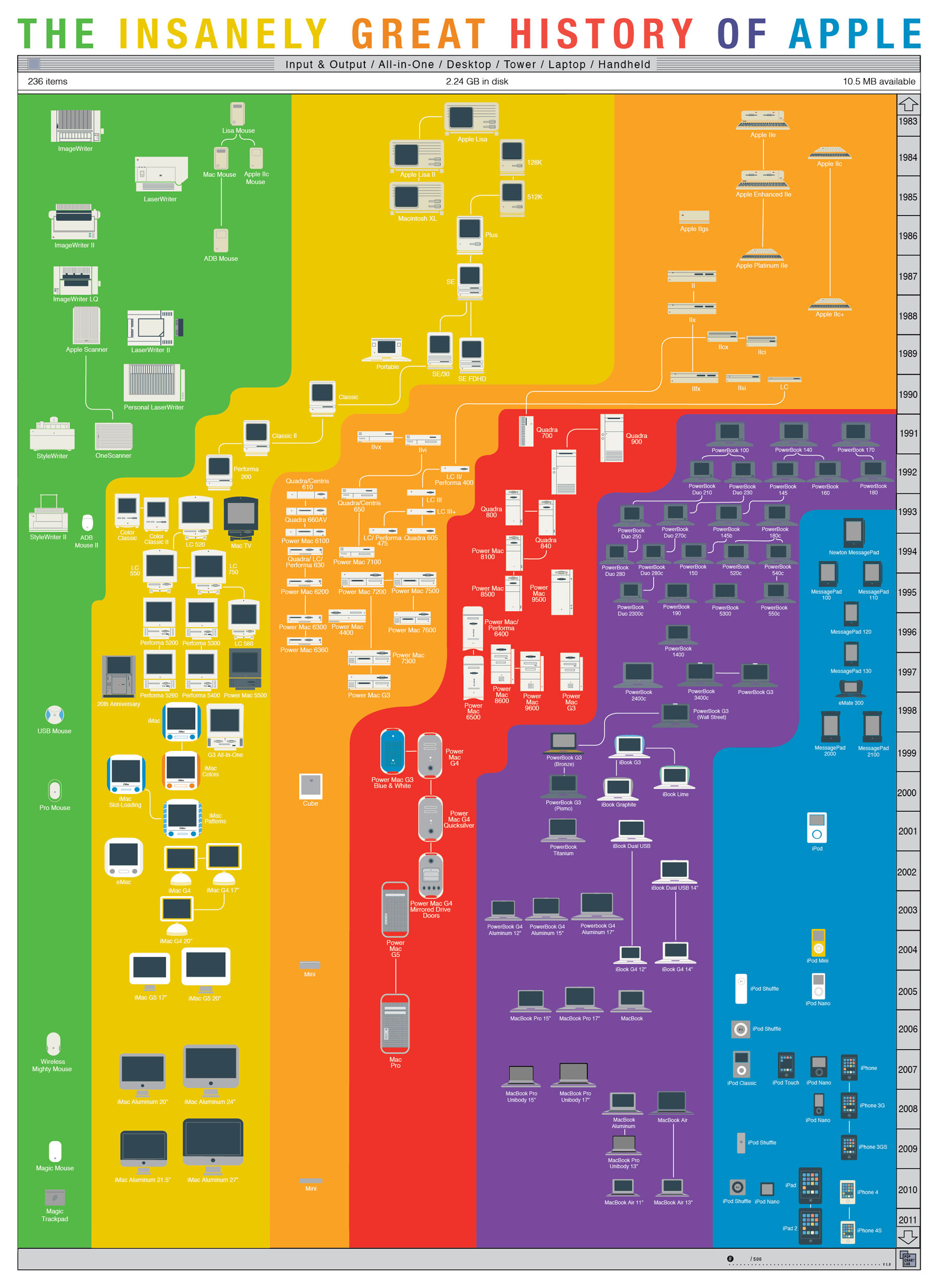
The Insanely Great History of Apple is a cool new poster from PopChartLabs.com, where you can purchase the $25, 18”x24” poster for yourself (and many other great ones).

The world’s most comprehensive mapping of Apple products, this print shows every computer released by Apple in the last thirty years, from the original Mac through the MacBook Air. Products are sorted according to type, including the connections between various form factors which have arisen as Apple has invented—and reinvented—insanely great products.

Found on VisualNews