About
Randy Krum
President of InfoNewt.
Data Visualization and Infographic Design

Infographic Design

Infographics Design | Presentations
Consulting | Data Visualizations

DFW DataViz Meetup

Join the DFW Data Visualization and Infographics Meetup Group if you're in the Dallas/Fort Worth area!

Search the Cool Infographics site

Custom Search

Subscriptions:


Feedburner

The Cool Infographics® Gallery:

How to add the
Cool Infographics button to your:

Cool Infographics iOS icon

- iPhone
- iPad
- iPod Touch


Read on Flipboard for iPad and iPhone

Featured in the Tech & Science category

Flipboard icon

Twitter Feed
From the Bookstore

Caffeine Poster

The Caffeine Poster infographic

Entries in scale (154)

Tuesday
Sep202011

The Internet of Things


Intel has designed a large infographic, The Internet of Things that explores the growing number of devices connected to the Internet since 1960 through predictions up to 2020.  (NOT to be confused with The Internet of Things infographic released by Cisco earlier this year with the same name)  High-Resolution PDF version, additional information and the data files are available here.

The Internet is evolving, again. Every day, billions of people connect to the Internet through billions of devices – PCs, smartphones and TVs to name just a few. While the PC remains at the centre of this evolution, Internet connectivity is now embedded into cars, fitness equipment, factory robots and vending machines. This smarter, connected world has the potential to change how we live.

We’re entering a new phase of Internet evolution. It is expanding much more rapidly than it has done in the last decade. Increasing numbers of everyday appliances are connecting to the Internet, their environment and to each other. Cars, fitness equipment, factory robots, retail signage and vending machines are becoming ‘smart’ thanks to tiny embedded computer processors and sensors, just like those in your laptop or mobile phone.

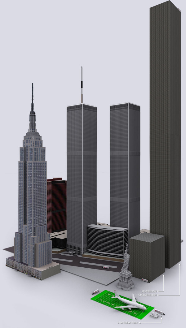
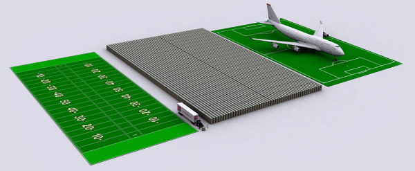
I have mixed feelings about this one.  It’s visually attractive, and would make a really nice printed poster.  The data is valuable and interesting, apparently gathered from a large number of disparate sources, but the URL listed at the bottom to view the sources didn’t work for me.

However, all of the colored lines aren’t actually connecting any events or actually combining to create a visualization of the values on the left side of the page.  While it visually implies the growing connections to the Internet and complexity, it doesn’t have any connection to the actual data.

I like the circle diagram at the bottom of the growing millions of PCs sold every day, but the “80% of of all PCs shipped today have Intel Inside” turned a fun, informative infographic into an ad and could turn off some readers.

Thanks to Emma for sending in the link!

Monday
Aug082011

Visualizing the U.S. Debt

The U.S. Debt Visualized is a great visualization of scale, and can be found at usdebt.kleptocracy.us, where you start with a single $100 bill, and start stacking them in orders of magnitude.  Stack them on pallets, start stacking the pallets and show them in comparison to other real-world items.

$114,500,000,000,000. - US unfunded liabilities
To the right you can see the pillar of cold hard $100 bills that dwarfs the
WTC & Empire State Building - both at one point world’s tallest buildings.
If you look carefully you can see the Statue of Liberty.

Numbers this large become too big to truly comprehend to many people, and I love visualizations like this one that put the unbelievable high numbers into context and scale.  Here’s one trillion dollars:

A visualization like this has a natural bias.  Whatever object the designer chooses to show in relation to the stack of bills can make the pile appear large or small in comparison.  In this example, the piles of money are truly staggering, but that’s all the reader can walk away with.  In it’s defense, this visualization isn’t trying to propose a solution, it’s just trying to make the viewer understand how big the number is.

Found on SeeWhatYouMean, VizWorld, Business Insider and Information Aesthetics.

Tuesday
Mar222011

The Radiation Dose Chart

The Radiation Dose Chart from XKCD.com is very cool.  Not part of the usual stream of comics, this is a more scientific chart from Randall Monroe helping to visualize the facts about radiation exposure.

There’s a lot of discussion of radiation from the Fukushima plants, along with comparisons to Three Mile Island and Chernobyl. Radiation levels are often described as “<X> times the normal level” or “<Y>% over the legal limit,” which can be pretty confusing.

Ellen, a friend of mine who’s a student at Reed and Senior Reactor Operator at the Reed Research Reactor, has been spending the last few days answering questions about radiation dosage virtually nonstop (I’ve actually seen her interrupt them with “brb, reactor”). She suggested a chart might help put different amounts of radiation into perspective, and so with her help, I put one together.

I’m not an expert in radiation and I’m sure I’ve got a lot of mistakes in here, but there’s so much wild misinformation out there that I figured a broad comparison of different types of dosages might be good anyway. I don’t include too much about the Fukushima reactor because the situation seems to be changing by the hour, but I hope the chart provides some helpful context.

Found on Bad Astronomy, Daring Fireball, FlowingData and VizWorld.

Friday
Feb182011

The 2011 Massachusetts Budget infographic poster

Jess Bachman, from ByJess.net,  has designed this new government budget poster of the 2011 Massachusetts Budget for The Pioneer Institute.

The most largest and most detailed visualization of a state budget ever, this 864 sq in poster (not for sale) compares hundreds of programs and expenditures from the billions down to the thousands of dollars.  If you really want to see how a state (like Massachusetts) spends it’s tax payers money, this is it.

The above graphic is a massive visual guide to the Massachsettes state budget. It presents hundreds of government departments, agencies, and programs in a visual format, proportionate in size to their funding level. The largest item is $15 billion, the smallest is $65 thousand.

Similar to his Death & Taxes poster of the Federal budget, the Massachusetts Budget poster is highly detailed, showing how spending for every department is broken down.


Although it’s not clear if The Pioneer Institute will make posters available for purchase, you can see the full detail online in this high-definition zoomable image.  (Check it out full-screen too!)


Monday
Jan172011

The Sequel Map - Is Part II Ever Better than the Original?


The Sequel Map, from BoxOfficeQuant.com is a cool chart of movie sequels showing how they compared to the original.  The location is based on the RottenTomatoes.com scores of the original and the sequel being plotted.  If the scores are the same, the movie would be exactly on the line, and any sequel with a score higher than the original is above the line.  The sizes of the bubbles represent the total box office receipts.

As evidence, all sequels with Rotten Tomatoes scores have been categorized below, with the originals’ scores on the X-axis, and the sequels’ scores on the Y. Films at the center line are sequels with the exact rating as the original; films above are sequels that have surpassed the original; films below, ones that fared worse.

Notes: Categorization of sequels is sometimes more art than science, so I’ve had to follow a few rules: I’ve only included the second film in any series, never third or following films. I haven’t included remakes or “reboots,” and I’m only presenting films which opened (at some time) in the US and have Rotten Tomatoes ratings.

And finally, it’s worth noting that the only two film/sequel combos to both score 100%, are the first two Toy Storys and the French films Jean de Florette / Manon des Sources.

Rotten Tomatoes ratings from RottenTomatoes.com. US Gross from www.the-numbers.com

I especially like turning the chart 45°, which puts the best score possible for a sequel to improve on the original at the top center of the chart.  If both the original and the sequel scored high, the bubbles are located towards the right instead of the top.  I’ve done this with a number of 2x2 quadrant charts for clients.

So, according to the chart, Star Trek II: The Wrath of Khan was the best sequel improvement over the original, and I would have to agree.

I’d love to see a version that plots the box office receipts on the X and Y axes so that it would show the instances where the sequel made more money than the original.  You could see more of the financial incentive behind making sequels, even if they’re generally rated lower than the original.

Found on VizWorld.com

Wednesday
Nov032010

How Coffee Affects the Global Economy


How Coffee Affects the Global Economy is a new infographic on Mint.com and designed by Column Five Media.

We don’t technically need coffee to survive (though many would argue just the opposite), yet this popular pick-me-up fuels not only our daily energy levels, but the global economy as well. The coffee industry thrives in countries like Brazil, Vietnam and Colombia: the world’s leading coffee exporters. Meanwhile, coffee drinkers around the world love their daily morning brew like no other drink. In the United States alone, we consume more than 66 billion cups of coffee per year. Some of us love our java so much, in fact, that we even observe a national coffee holiday, September 29.

There are a handful of statistics included that aren’t visualized, which does seem odd.  For example, “40% of this coffee is now gourmet” could easily have been visualized.

Thursday
Oct212010

Top 10 Most Expensive Cities to Live In 2010


I like this one, Top 10 Most Expensive Cities to Live In 2010, from www.homeloanfinder.com.au (Australian Mortgage Broker). $27 for a fast food meal?  $7,000 rent?!?

Love the city icons; they’re easier to recognize than the flags.  My only complaints are that the image sizes in the comparison table don’t look quite right.

Thanks to Fred for sending in the link!

Thursday
Oct142010

Map of Online Communities 2


This is one of my favorites.  xkcd has updated their Map of Online Communities for 2010!  This is an update from the original 2007 Map of Online Communities, and has changed quite a bit.

Communities rise and fall, and total membership numbers are no longer a good measure of a community’s current size and health.  This updated map uses sizes to represent total social activity in a community - that is, how much talking, playing, sharing or other socializing happens there.  This meant some comparing of apples and oranges, but I did my best and tried to be consistent.

You can also view the LARGE version, or pre-order the poster.

Tuesday
Sep282010

Homeschooling: By The Numbers infographic

Homeschooling: By The Numbers is a good infographic from the DegreeSearch.org blog.  Simple statistics with a very clean design, but varied use of data visualization styles (bars, scales, pies).

Homeschooled students generally achieve higher SAT scores in reading, math and writing; as well as, ranking in the 80th percentile for math, science, social studies, language and reading. This may be due to the higher level of education of fathers and mothers that stay home to teach their children. Most have some college, an associates degree, or a bachelors degree.

Found on the Daily Viz from Visual Loop

Tuesday
Sep142010

Your Lying Pants! (an infographic)

The Pants Size Chart is a great, simple infographic from The Style Blog on Esquire.com.

The devastating realization came in H&M. Specifically, in a pair of size 36 dress pants. I’d never bought pants at H&M before, and suddenly asked myself: how could a 36-inch waist suddenly be so damn tight?

I’ve never been slim — I played offensive line in high school — but I’m no cow either. (I’m happily a “Russell Crowe” body type.) So I immediately went across the street, bought a tailor’s measuring tape, and trudged from shop to shop, trying on various brands’ casual dress pants. It took just two hours to tear my self-esteem to smithereens and raise some serious questions about what I later learned is called “vanity sizing.”

Your pants have been deceiving you for years. And the lies are compounding:

Found on Chart Porn and Daring Fireball