About
Randy Krum
President of InfoNewt.
Data Visualization and Infographic Design

Infographic Design

Infographics Design | Presentations
Consulting | Data Visualizations

DFW DataViz Meetup

Join the DFW Data Visualization and Infographics Meetup Group if you're in the Dallas/Fort Worth area!

Search the Cool Infographics site

Custom Search

Subscriptions:


Feedburner

The Cool Infographics® Gallery:

How to add the
Cool Infographics button to your:

Cool Infographics iOS icon

- iPhone
- iPad
- iPod Touch


Read on Flipboard for iPad and iPhone

Featured in the Tech & Science category

Flipboard icon

Twitter Feed
From the Bookstore

Caffeine Poster

The Caffeine Poster infographic

Entries in Shipping (3)

Monday
Dec112017

2017 Shipping Deadlines

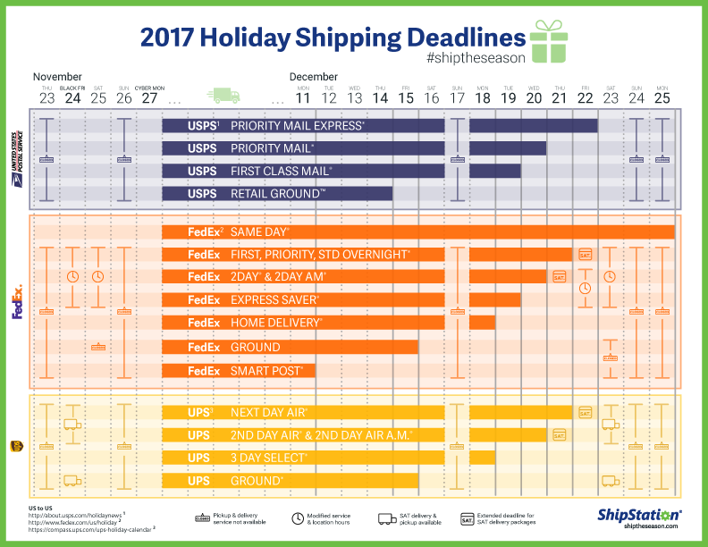
2017 Shipping Deadlines infographic

Tis the season for shipping! The 2017 Shipping Deadlines infographic from Ship Station will help you get your last minute presents to their destination on time!

Holiday shopping season is approaching, so get your team ready — because shipping is coming. As an online merchant, you need to know the holiday shipping deadlines for carriers and services to get your packages delivered by Christmas weekend. Knowing these cut-off dates will help you set accurate shipping costs, offer available services, instill trust in your online customers, and help them shop on time!

My only hesitation with this design, is it's similarity to Gantt chart. The highlighted periods are all of the acceptable shipping dates, but visually it seems to imply the shipping duration of the different services.

Thanks to Margie for sending in the link!

Thursday
Jul062017

Game of Thrones: How Much to Ship Daenerys’ Army?

How Much Would it Cost to Ship Daenerys’ Army? infographic

The team at 1st Move International has calculated How Much Would it Cost to Ship Daenerys’ Army?

The new season of Game of Thrones is on the horizon and *spoiler alert* what this means is we’ll finally get to find out what will happen when Daenerys and her vast army reach the shores of Westeros.

When season six reached its climax, we were left on a tantalising cliff-hanger as Daenerys, complete with three dragons and the backing of both the Unsullied and Dothraki armies, set sail from Meereen in a bid to claim the Iron Throne. It was Ms Targaryen’s sizeable armada, however, that piqued our interest. Shipping large quantities of items is something we specialise in here at 1st Move, and this got us thinking about the logistical efforts behind sending several armies and personnel across the Narrow Sea from Essos to Westeros.

So, we put our heads together and channelled our inner Game of Thrones geekiness to find out what would need moving and just how much this would cost…

Good use of simple white colors on top of the underlying photographs. If you use photos in your infographic design, you want to keep all of the other information in simple colors.

This would be much better if they had visualized the data. Quantities, weights or currency amounts. Visualize the data!

Tuesday
Aug162016

Animated and Interactive Global Shipping Visualization

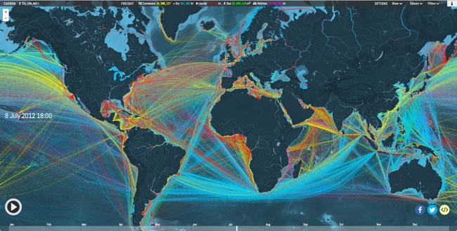
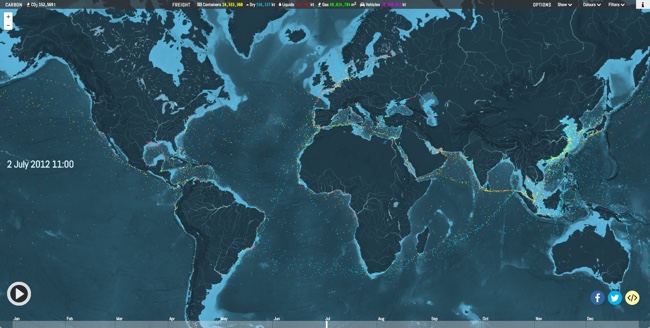
This is a fantastic detailed animated and interactive data visualization of the world's Global Shipping Traffic.

You can see movements of the global merchant fleet over the course of 2012, overlaid on a bathymetric map. You can also see a few statistics such as a counter for emitted CO2 (in thousand tonnes) and maximum freight carried by represented vessels (varying units).

The merchant fleet is divided into five categories, each of which has a filter and a CO2 and freight counter for the hour shown on the clock. The ship types and units are as follows:

  • Container (e.g. manufactured goods): number of container slots equivalent to 20 feet (i.e. a 40-foot container takes two slots)
  • Dry bulk (e.g. coal, aggregates): combined weight of cargo, fuel, water, provisions, passengers and crew a vessel can carry, measured in thousand tonnes
  • Tanker (e.g. oil, chemicals): same as dry bulk
  • Gas bulk (e.g. liquified natural gas): capacity for gases, measured in cubic metres
  • Vehicles (e.g. cars): same as dry bulk

The map was created by Kiln based on data from the UCL Energy Institute (UCL EI)

You can hide the route lines and just watch the ship dots move over time. It's mezmerizing!

Thanks to Jim Hopkinson and Bill Gates for sharing on Twitter!

You can see the interactive version embedded here, or click here to take you to the full-size original site: