About
Randy Krum
President of InfoNewt.
Data Visualization and Infographic Design

Infographic Design

Infographics Design | Presentations
Consulting | Data Visualizations

DFW DataViz Meetup

Join the DFW Data Visualization and Infographics Meetup Group if you're in the Dallas/Fort Worth area!

Search the Cool Infographics site

Custom Search

Subscriptions:


Feedburner

The Cool Infographics® Gallery:

How to add the
Cool Infographics button to your:

Cool Infographics iOS icon

- iPhone
- iPad
- iPod Touch


Read on Flipboard for iPad and iPhone

Featured in the Tech & Science category

Flipboard icon

Twitter Feed
From the Bookstore

Caffeine Poster

The Caffeine Poster infographic

Entries in social (50)

Friday
May032013

The Foursquare Visualizer

The Foursquare Visualizer interactive infographic

Foursquare has release a new Foursquare Visualizer, that creates an interactive data visualization of your own activity for the last 12 months.  I included the images from my own history.

At Foursquare, we’ve always known how very special our community is. Today, April 16 (4/4^2), marks the fourth annual 4sqDay. Each year, we take this opportunity to thank our amazing community for all that they do.

…take a peek back into your own history at foursquare.com/visualizeme. It’s just our small way of saying, “Thanks! We think you’re awesome.”

There are a handful of different visualizations of your own history of check-ins available.  The connection circle (shown above) is the best looking.  Other visuals include a Timeline and Categories.

Found on the Foursquare blog


Tuesday
Jan292013

How Social Sites Make Money

How Social Sites Make Money infographic

The number of social media followers are growing. But how do the sites make a profit? How Social Sites Make Money infographic from usbundles.com tells you which social media websites make money with ads, or paying customers, or mobile apps, or affiliates.

We turn to social media services to stay connected more and more each day. But even with hordes of devoted followers, how do these social sites manage to turn a profit?

Here’s a quick look at which revenue streams help major social networking companies go from social service to successful business.

Nice use of a Venn Diagram.

The doughnut charts aren’t accurate.  Like the designer eye-balled them instead of doing the calculation.  For example, the 71% doughnut is actually visualizing a value of 66.6% (2/3).

Found on http://socialtimes.com/how-social-sites-make-money_b91551

Thursday
Jan172013

The Cheetah Animated Infographic

The Cheetah Animated Infographic

The Cheetah infographic introduces to you nature’s speed machine from Jacob O’Neal (jacobneal.com). Learn about how each body part is important to the Cheetah and why you don’t want to be on this mammal’s menu.

Did you know that cheetahs can accelerate from 0 to 60 MPH faster than a Ferrari? The amazing cheetah is the perfect example of natural specialization. They’re made for speed. Such a beautiful animal deserves a closer look!

This is definitely a cool infographic design!  I really like this use of the animated GIF image file format.  Seriously!  I REALLY like this design.  Animated GIFs have been used and abused for decades, but the use of animation here is done in a way that is very visually appealing.  It actually adds to the value of the content, and catches your attention.

One issue with animated GIF image file infographics is social sharing.  Not all social media and photo sharing services can support the animated format, so you also need a static JPG image as a backup for anyone that want to share with those service.

Thanks to Chris for sending in the link!

Tuesday
Jan082013

The Ultimate Complete Final Social Media Sizing Cheat Sheet

The Ultimate Complete Final Social Media Sizing Cheat Sheet infographic


The Ultimate Complete Final Social Media Sizing Cheat Sheet by LunaMetrics is a huge (and very long) informational infographic that shows the readers all of the important image sizing requirements for the major social networks.

In June of this year, we published an infographic listing all of the sizing information for images on Facebook, Twitter, Google+, and Pinterest. It was a wildly successful piece of content, totally blowing our expectations out of the water. Unfortunately, while its popularity has flourished, nearly every social network instituted changes to their image sizes, rendering most of the information on the infographic out of date.

We knew we needed to update the information on the cheat sheet, but we weren’t comfortable with simply adjusting one or two figures on the blog post and leaving it as-is. We’d also received a lot of feedback, both on the design and information it contained. We decided to redesign the entire sheet and incorporate a few more social networks.

We also decided to permanently redirect the old sheet here, so that shared tweets, pins, likes, and so on, would lead to the correct sizing dimensions. Additionally, as sizing changes are implemented across social networks, we’ll actively update this sheet – meaning that if you use the embed code at the bottom to share this sheet on your own site, the image will automatically update with changes as they are rolled out. No more out-of-date information.

I love that all of the sizes are shown in correctly proportional rectangles!  Based on their claim, this infographic should also update correctly as they revise it to match the ongiong changes from all of the social networks.  

Some color of the official logos of the different social media networks at each section break would have been helpful to the reader.  The light typeface used at each section break is hard to distinguish from the rest of the design.

Found on Social Media and Social Good

Thursday
Sep202012

Is Google+ a Ghost Town?

Is Google+ a Ghost Town? infographic

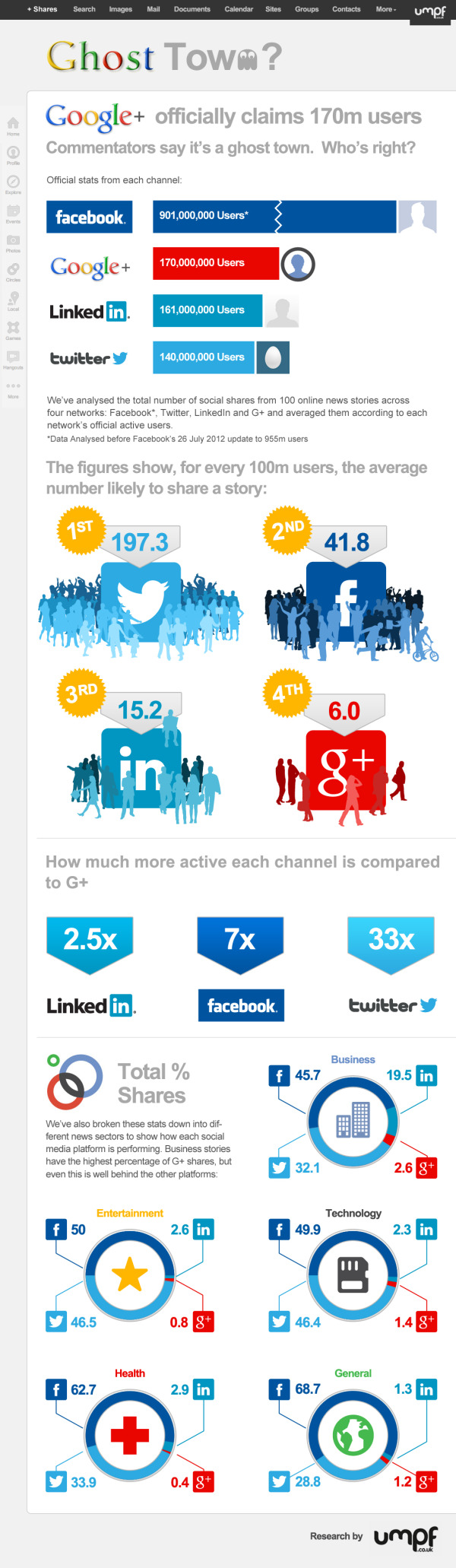
Google+, The newest trend? Or the newest flop? Umpf gets to the bottom of this mystery with a little research and reports it’s results with an infographic! The Google+, Ghost Town? infographic does more than just report the Google+ statistics, it compares them to other key social networks.

There’s been many articles written about how good, bad and indifferent Google+ is.  But our favourite debate is the ongoing It’s Really Popular Vs It’s A Ghost Town one.

So what’s the truth?  Our findings and infographic (see below) appear to suggest the latter: despite its large number of accounts, G+ is bottom of the list of social network users’ favoured channels.

Google, of course, claims it is fast-growing and really popular.  Why wouldn’t they? And, of course, there is research to support that argument. But does this chart, left, for example, which shows the rise in G+ unique visitors, tell the whole truth?

So, we decided to do our own research.  It is by no means exhaustive and is only meant as a snapshot view, so judge for yourself.

Certainly a trending topic lately, but also a really good infographic design.  Of course it’s framed in a Google+ news feed style layout.  Easy to read and colorful.  I like the color coding related to the different social network logos, even though some of those blue colors are hard to differentiate.

In the Users bar chart, I love the use of color, putting the data right in the bars and using the logos on the axis to eliminate any need for a legend.  Good data visualizations design!

In the “Users Likely to Share” I would have liked to see some sizing of the icons to match the data. Instead, they put the icon illustrations into rank order, continued the consistent color coding and clearly identified 1st, 2nd, 3rd, etc.

The section with all of the doughnut charts (reminiscent of the Google+ Circles icon) also continues the consistent color coding.  I’m sure it a rounding issue, but many of the charts only add up to 99.9% instead of 100%.

At the bottom, the two things missing are some type of copyright license as well as the URL linking back to the original infographic landing page.

Thanks to Jon for sending in the link!

Monday
Apr092012

CSR and Sustainability Report: Volvo Shaping the Future of Transport

Volvo’s new infographic puts their 2011 CSR (Corporate Social Responsibility) and Sustainability Report into a tidy, easy to read design! Shaping the Future of Transport focuses on Volvo’s environmental, economic, and social responsibility.

All you need to know about the Volvo Group’ CSR and Sustainability Report 2011.

The Volvo Group’s vision is to become world leader in sustainable transport solutions.  We’re convinced that efficient transport is crucial for societal and economic development.  We have the skills, resources and global reach to shape the future of transport.

This is a fantastic use of an infographic as a corporate communication tool.  Volvo is using this infographic as an awareness tool to put their Sustainability Report in front of more readers and broaden the awareness of their efforts.  It’s designed as a top-level overview, and if the reader wants more information, they know how to find the full report.

The illustrations obviously represent the varied forms of transport that Volvo is involved in, and my only criticism is that the design is mostly text.  They list locations, percentages, company historical events and other statistics about Volvo that should all be data visualizations.  At they bottom, they should include the URL to the original landing page, and a copyright statement.

On the original landing page, the whole infographic is a link to their online Sustainability Report front page, but it would have been nice for them to use an HTML Image Map to make the separate statistics and call-outs link to the specific, related web pages in the report.

Thanks to Gustaf for sending in the link!

Monday
Feb132012

The Social Brand Value of the World's Leading Brands

The Social Brand Value of the World’s Leading Brands infographic from Sociagility.

In November 2011, we looked at the social brand value of 50 of the world’s leading brands, creating a revised top 50 ranking according to their social media performance, as measured by our PRINT Index™ KPI.

The PRINT system compares brands on five key dimensions or ‘attributes’ of social media performance – popularity, receptiveness, interaction, network reach and trust – across multiple platforms. The Sociagility Top 50 report analyses the social brand value of the world’s leading brands and the competitive influences that determine their social media performance. Here’s a visual representation of just some of the report highlights.

I really like both the topic, and the design of this infographic.  The colors are bright, and appealing.  In the Top 20 Brand Leaders, I suggest that using the actual brand logos would have made the bar chart easier to understand.  It’s interesting that beyond the first section, the actual values aren’t shown along with the visualizations. I really like the circles comparison of the three attributes of each brand.

Also, “Legends are Evil”.  The color coding by market is at least a secondary level of data, but the legend still makes the reader work harder by looking back-and-forth to understand the meaning behind the colors.  It’s even harder as you move down the infographic, because the color coding continues, but the legend is way up near the top.  You could put icons or the text into the color bars themselves, and the reader would figure out the color coding scheme. 

At the bottom, a copyright and the URL of the original infographic would make it easier for readers to find the original posting.  Some credit to the designer would be nice as well.

Found on DR4WARD.

Tuesday
Dec132011

Social Media Stats of the Day


This is a LONG one, but a good one based on statistics recently published in AdAge.  Social Media Stats of the Day from Dream Systems Media visualizes some fo the recent stats about Favebook Twitter and general Social Media usage.

Saw an article on Social Media stats the other day on AdAge by Sarah Evans (awesome list of stats she compiled) and of course, me being who I am, I wanted to visualize the data. So enjoy! I used several of these statistics in my recent SMX Social Media Scottsdale presentation on SoLoMo – Checking into the real world.

- Mat Siltala

I really like the coloring in this design that visually ties the data to the Facebook and Twitter brands instantly for the readers.  Although, big fonts don’t make a data visualization, and a number of percentages included could easily have been visualized as simple pie charts or stacked bar charts.  I do think there is too much text in the design, but I can appreciate how specific you have to be when describing the research data and where it came from.

Nice job Mat!

Tuesday
Nov012011

The Life Cycle of a Web Page on StumbleUpon


StumbleUpon.com has shared a number of the differetn stats behind it’s social sharing service in the infographic The Life Cycle of a Web Page on StumbleUpon.  Designed by Column Five Media, the infographic focuses on the half-life of a link and the length of time users view pages and interact with StumbleUpon.  This information shows that the half-life of a StumbleUpon link is much longer than other social media sites that were shared by bit.ly in September.

You may have heard the stat that StumbleUpon drives more traffic referrals than any other social media site. We wanted to shed some light on this by describing the lifecycle of a web page in StumbleUpon, especially how long you could expect the average web page to keep getting visitors.

StumbleUpon doesn’t get as many mentions in the media as Facebook and Twitter, but the data indicates that they have more referrals than those two combined.  I see that here on the Cool Infographics blog occassionally.  When one of my posts is picked up in StumbleUpon is usually gets thousands of stumbles.

Found on Visual News and Fast Company Design.

Thursday
Oct202011

The Socially Optimized Business


Attributes of a Socially Optimized Business is a new, visual XPLANATION from the Dachis Group after acquiring the XPLANE company.  You can view it in SlideShare (they should have put it into Prezi), or download the high-resolution PDF.

What’s a Social Business? It’s a business alive with energy and big ideas. It’s collaborative, authentic, customer-centric, trusted, open and real-time.

And it’s about time. After decades of mechanistic, process-oriented management dogma, progressive organizations are waking up to the disturbing truth that they’ve squeezed all the creativity out of their business. But when companies embrace organic, passionate, socially-savvy initiatives, they blossom. That’s Social Business.

This would make a great poster!