About
Randy Krum
President of InfoNewt.
Data Visualization and Infographic Design

Infographic Design

Infographics Design | Presentations
Consulting | Data Visualizations

DFW DataViz Meetup

Join the DFW Data Visualization and Infographics Meetup Group if you're in the Dallas/Fort Worth area!

Search the Cool Infographics site

Custom Search

Subscriptions:


Feedburner

The Cool Infographics® Gallery:

How to add the
Cool Infographics button to your:

Cool Infographics iOS icon

- iPhone
- iPad
- iPod Touch


Read on Flipboard for iPad and iPhone

Featured in the Tech & Science category

Flipboard icon

Twitter Feed
From the Bookstore

Caffeine Poster

The Caffeine Poster infographic

Entries in Story (4)

Wednesday
Aug032016

Very Few Americans Nominated Trump and Clinton

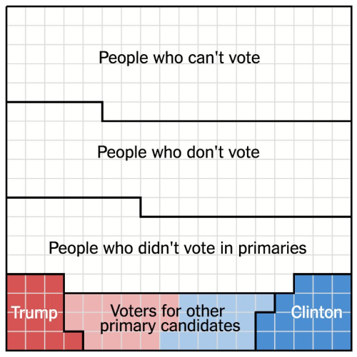
Designed by Alicia Parlapiano and Adam Pearce for the New York Times, this short series of data visualizations tell a very clear story about how Only 9% of America Chose Trump and Clinton as the Nominees For the 2016 Presidential election.

The United States is home to 324 million people. Each square here represents 1 million people.

103 million of them are children, noncitizens or ineligible felons, and they do not have the right to vote.

88 million eligible adults do not vote at all, even in general elections.

An additional 73 million did not vote in the primaries this year, but will most likely vote in the general election.

The remaining 60 million people voted in the primaries: about 30 million each for Republicans and Democrats.

But half of the primary voters chose other candidates. Just 14 percent of eligible adults — 9 percent of the whole nation — voted for either Mr. Trump or Mrs. Clinton.

Mr. Trump and Mrs. Clinton will be working to win the votes of these three groups. Polls suggest they will be separated by just a handful of squares.

If you follow the news headlines, you might think a majority of Americans are in favor of one of our two Presidential nominees, but that would be a misunderstanding of election and population statistics.

This is a fantastic example of storytelling with data, and walking the audience through the data insight step-by-step.

Found on FlowingData


Tuesday
May242016

Massive Infographic of Star Wars A New Hope

Star Wars A New Hope Infographic

This is a massive infographic depicting the entire story of Star Wars IV: A New Hope. Printed it measures 123m long (over 400ft). Online this infographic is 1,024 pixels wide by 465,152 pixels long! Designed by illustrator and graphic novelist Martin Panchaud, it was designed in Adobe Illustrator CC.

SWANH.NET is an adaptation of Star Wars Episode IV in a style that was inspired by infographics. One story in one piece of 123 meters length.

It was created with Adobe Illustrator CC in 2016. Its exact measures are: 1024 x 465152 px / 27 x 12307 cm / 10.6 x 4845.3-inch

This long ribbon reminds the ancient Chinese script rolls that had to be rolled in and rolled out simultaneously in order to be read. I like this stretch between ages, cultures, and technologies.

However, internet likes short stories and summaries, quickly understandable contents. With my work I aimed to create a contrast to that.

These are only a few small pieces. You go immediately to the SWANH site to view the entire, fantastic infographic!


Martin also posted a number of great images as a Making Of feature to show the development process of the infographic.

Wednesday
Jan062016

Christmas Quiz: 10 Most Popular Stories

Christmas Quiz: 10 Most Popular Stories infographic

How well do you think you know your Christmas stories? Especially now immediately after the holidays?  Take the Christmas Quiz: 10 Most Popular Stories by Unplag and see how many you can guess right! 

Have you ever resorted to the Internet for Christmas must-do lists? Obviously, this thing can stand you in good stead to timely cope with holiday chores. Aside from stocking stuffers and holiday menus, you need to take care of leisure time activities too. So, why not add a quiz with the most popular Christmas stories to your list? Unplag created the one especially for you! It’s high time to remember the admired plots and characters and find out if you can guess all of them.

The creators of this infographic were quite creative. They told 10 of the most popular Christmas stories with a minimal amount of icons and illustrations! Do you think they choose the right ones? Would you have told the stories differently? Either way, this infographic is a fun holiday quiz to play with family and friends. 

Thanks to Anastasia for sending in the link!

Monday
Feb022015

The Anatomy of the Perfect Sales Presentation

The Anatomy of the Perfect Sales Presentation infographic

Good infographics tell stories to the audience, and you sales presentations should too. The Anatomy of the Perfect Sales Presentation from Clemence Lepers (@PPTPOP) uses an infographic story to help people learn to tell better stories with PowerPoint. Very meta isn’t it?

You’re not gonna like it, but if you’re willing to start making some solid sales presentations that’ll help you generate more business, you’ll have to print the next sentence in your brain. Nobody cares about you. I repeat, nobody cares about you.  People care about how YOU can solve their problems and deliver the outcomes they are interested in. To grab prospects attention and close more sales, you need to bring consistent, clear solutions to their problems.

Easier said than done, right?

To help you with that, I’ve created an infographic that breaks down the key elements of a highly effective sales presentation. Follow them, and you’ll be set to get your value proposition across, communicate a compelling message and convert more prospects.

There’s a structure to a story, no matter what medium is being used to tell it. Don’t just throw your data and talking points into an infographic (or a presentation). Tell a story that makes your data meaningful to the audience.