About
Randy Krum
President of InfoNewt.
Data Visualization and Infographic Design

Infographic Design

Infographics Design | Presentations
Consulting | Data Visualizations

DFW DataViz Meetup

Join the DFW Data Visualization and Infographics Meetup Group if you're in the Dallas/Fort Worth area!

Search the Cool Infographics site

Custom Search

Subscriptions:


Feedburner

The Cool Infographics® Gallery:

How to add the
Cool Infographics button to your:

Cool Infographics iOS icon

- iPhone
- iPad
- iPod Touch


Read on Flipboard for iPad and iPhone

Featured in the Tech & Science category

Flipboard icon

Twitter Feed
From the Bookstore

Caffeine Poster

The Caffeine Poster infographic

Entries in technology (26)

Wednesday
Jun132012

Digital Anatomy of the Affluent Male

Digital Anatomy of the Affluent Male infographic

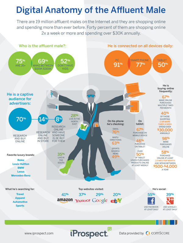
Busy busy busy! The affluent male is always searching online! The Digital Anatomy of the Affluent Male from iprospect.com describes who the affluent male is and what he searches for.

There are 19 million affluent males on the Interent and they are shopping online and spending more than ever before.  Forty percent of them are shopping online 2x a week or more and spending over $30k annually.

I really like the design style and the colors on this one.  The correctly-highlighted map in his pocket and the cowboy boot are a nice touch.

The data visualizations do a good job, but there are a bunch of statistics that aren’t visualized and are left just in text.  Visually, this makes these other statistics less important because they didn’t warrant being visualized.  The favorite brands could use the actual logos, and the “What he’s searching for” could use some icons.

From an SEO perspective, the URL at the bottom really should be the landing page address, and once you get to the landing page, there aren’t any social sharing buttons so you are left to your own to figure out how to share it.

Also available as a PDF download.

Thanks to Douglas for sending in the link!

Monday
Jun042012

Digital Technology in Your Car

Digital Technology in Your Car

Here is an infographic from Allianz called Digital Technology in Your Car that illustrates current technology in our cars to keep us safe and entertain us.

Digital technology has transformed and continues to transform every aspect of our lives. In the motor industry, technology developed throughout the years has enhanced our safety and comfort. The introduction of modern safety mechanisms such as lane departure warning and brake assist systems as well as iphone applications such as Driver Reviver and Car Butler has seen technology faithfully assisting drivers in times of need. With technology advancing and disseminating at a rapid rate, Global Positioning System units have already become a staple accessory in Australian cars.

There’s not much in the way of data visualizations in this one, but it does tell a good story about the history of new technology in your car, and what’s coming soon.  There’s too much text, but the use of icons and illustrations helps the story.  

I’m not sure what all the dead space at the bottom is.  Plenty of room for the copyright, company logo, URL to the original landing page and even a mention of the designer.

Bring on the self-driving cars!

Thanks to Sandra for sending in the link!

Wednesday
May302012

How Mobile Technology is Changing World Travel

How Mobile Technology is Changing World Travel

Do you use your smartphone to help make traveling easier? If you do, then your part of a huge growing trend. The How Mobile Technology is Changing World Travel infographic from MyDestination.com shares some interesting statistics when it comes to traveling. 

Back in 1903 when the Wright Brothers first took flight in their first fixed winged aircraft, little could anyone have imagined what travel would become. Fast forward to 2012 and the internet has revolutionised travel – along with communication – with the birth of the smartphone. But just how much as this palm-held device influenced and changed our travelling habits? And just how far has travel–based mobile technology still got to go?

There’s a lot of information gathered from many different sources in this one, which is one reason it’s so long.  The use of mobile devices to plan your travel and the use of them during your travel are definitely growing, and this infographic does a great job of helping the readers get some basic understanding of what’s going on.

A few issues with the data visualization designs though:

  • The doughnut charts at the top are hard to read because the edges are so thin.  A thicker area around the circles would have been easier to see.
  • How can the UK have 129% Mobile Penetration?  By definition that number can’t be higher than 100%.
  • The visualization using the airplane silhouette is challenging.  There should be 10 windows to easily visualize the 74%.  Readers think in tens, and it’s hard to understand a portion of six windows.  I’ll bet the 54% color fill is close, but I have no way to figure out if it’s accurate.
  • Again, readers think in tens, so don’t show the “…traffic for 78% of travel sites” as a visualization of seven computer monitors, use ten.
  • At the bottom should be a copyright, and the URL to the original infographic landing page

My Destination is also asking readers for suggestions for their next infographic design:

Are you an avid smartphone user abroad? Can’t imagine life without Facebook on the move? Don’t have a smartphone and not intending on caving in? We want to hear from you! Whether you are embracing the mobile travel revolution or just love travel, we want to know what is getting you talking. We’re also on the lookout for ideas for our next infographic special. Email hq.socialmedia@mydestination.com with any suggestions or tweet us @MyDestination using #TravAndTech.

Thanks to Oli for sending in the link!

Tuesday
May012012

Following The White Rabbit

Following the White Rabbit Android Developer infographic

Who is the mastermind behind your favorite android application? Do you wonder what kind of music they like? The Following the White Rabbit infographic from Startapp.com gives us the low down on what kinds of people are behind Android applications based on a survey they did in March 2012.

Have you ever wondered what kind of people make Android applications? Well wonder no more! We at StartApp decided to investigate this in depth by creating a special Android developer survey which we sent out to all of our Android developers who kindly participated in the survey! Therefore, we are now very proud to present our first infographic that explores everything from the companies Android developers work for to the music they listen to and everything in between. Let us know what you think!

This is a cool infographic that does a good job with the visualizations.  With survey data, it’s a challenge to visualize the results correctly.  Some survey answers add up to 100%, but some questions are asked where the respondent can “check all that apply” so these answers are separate.  The pie charts in the coffee cups, the doughnut charts  and the stacked bar are examples of survey questions that add up to 100% (except the stacked bar adds up to 101% due to rounding, so they should have displayed the tens decimal place).

“What App Markets do you use?” and “What OS’s Do You Develop Apps for?” are some of the multiple answer questions, so the answers are displayed as separate bars or doughnut charts with the appropriate logos.  A couple results are displayed with the wrong type of graphic.  “How Many Apps Have You Published so far?” and “What Would Be Your Preferred Pastime” should both be shown adding up to 100%.

The overall design is a bit crowded with a lot of visual noise, but the statistics are easy to understand.  The coffee-brown color and the overlapping visualizations give the visual impression of working late nights and juggling many details, just like an app coder does.

At the bottom, there should be a copyright statement and the URL to find the original infographic landing page.

Found on Infographic Journal

Thursday
Apr122012

IT Infirmity: What's Ailing Your IT Department on 2012?

Is your IT department feeling a little under the weather? Send it to the IT Infirmity! The What’s Ailing Your IT Department infographic from ViaWest is their first infographic!

What do CIOs rank as their biggest IT aches and pains? What are the average salaries of employees within IT departments? What is the impact of ITtention Deficit - the inability to focus on your core business?  Find out in this infographic from ViaWest.

I really like this design, but the data visualizations need help.  It’s obviously a promotional piece for ViaWest, but there’s nothing wrong with using an infographic that way.  They have also made a high-resolution PDF available.

The story reads very easily from top-to-bottom with clearly separated sections. The icons for each sections are also amusing and keep the overall tone light-hearted.

The only issues I have with the design are the data visualizations. 

  • Don’t put 51% on top of a bunch of people icons, and not highlight 51% of the icons to go along with the numerical value. 
  • The two bars showing the data created before and after 2009 are actually two parts of the whole 100%, so this should be shown as a stacked bar.  Why is this shown as two separate bars?
  • Both of the office tower icon visuals in ITrauma would be easier to understand if they were a single row of building icons.  The 93% is hard to understand visually since you can’t visually tell that 13% of the last building is shaded.  In fact, it doesn’t look to me like the last building is shaded properly.
  • At the bottom, there should be a copyright statement
  • The design should also include the URL to find the original, high-resolution image on the ViaWest site so when people see this infographic shared on other sites, they can find the original.

Thanks to Todd for sending in the link!

Thursday
Apr052012

The Fiction to Reality Timeline

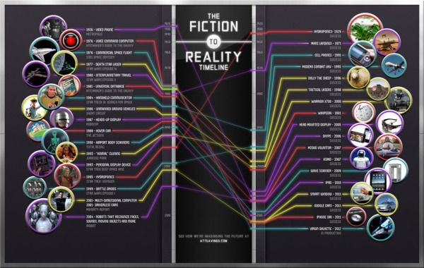
The Fiction to Reality Timeline infographic from attsavings.com brings all of cool gadgets from the future in movies into the present.  Anything is possible!

Do you remember “Star Trek” and all the great gadgets the crew members used in each episode? Or the fancy gizmos from “The Jetsons” or “Minority Report?” Ever wonder when, or if, we’ll invent technology like what we’ve seen in the fictional universe? Satisfy your craving for fictional tech with The Fiction to Reality Timeline.

Although I disagree that some of their actual technology references are the first time certain technologies have appeared in the modern world, the overall message is clear.  Things like Heads-Up Displays have been around in fighter cockpits for much longer, and the iPad wasn’t the first portable display device, just the first mainstream commercially successful device.

I couldn’t figure out if the line colors had any meaning.  Are they color-coded to match some type of category?

Where’s my flying car?!?

Thanks to Ryan for sending the link!

Page 1 2 3