About
Randy Krum
President of InfoNewt.
Data Visualization and Infographic Design

Infographic Design

Infographics Design | Presentations
Consulting | Data Visualizations

DFW DataViz Meetup

Join the DFW Data Visualization and Infographics Meetup Group if you're in the Dallas/Fort Worth area!

Search the Cool Infographics site

Custom Search

Subscriptions:


Feedburner

The Cool Infographics® Gallery:

How to add the
Cool Infographics button to your:

Cool Infographics iOS icon

- iPhone
- iPad
- iPod Touch


Read on Flipboard for iPad and iPhone

Featured in the Tech & Science category

Flipboard icon

Twitter Feed
From the Bookstore

Caffeine Poster

The Caffeine Poster infographic

Entries in time (40)

Tuesday
Apr222008

One Day Poem Pavilion


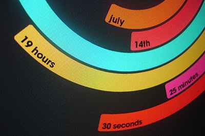
Sort of crossing the line between infographics and art. A very cool project called the One Day Poem, from Experimental Typography. The geodesic structure is aligned to the sun, and perforated in a very specific pattern to show different parts of the poem over the course of a day, and even a different poem at different times of the year.

The specific arrangements of the perforations reveal different poems according to the solar calendar: a theme of new-life during the summer solstice. During summer solstice, the poem will contain the theme of “new life”. During winter solstice, the poem will be on “reflection and the passing of time.”
Found on digg.com

Thursday
Apr172008

The Growth of Wal*Mart


Great video found on blog.kiwitobes.com that show the store expansion of Wal*Mart starting with the first store in 1962. Based on the publicly available data on freebase.com.

Sunday
Mar022008

What if...


Craig Robinson, from flipflopflyin.com, has created a graphic showing many of the different paths/branches his life could have taken. Clicking on each character icon reveals text describing the event or deviation from actual events.

Who hasn't at one time or another wondered how their life could've gone in other directions if different events had occurred or different choices been made? These are the ways my life could've deviated from its actual path (the top row).
" Craig dies at the age of 34, killed by an angry swan" I found incredibly funny.

Found on NiXLOG.

Wednesday
Feb202008

Family Movement Map


Cool infographic project on Flickr, this map of the living room tracks the movements of a family over the course of only one hour on Christmas Day in 2006. Posted on Flickr by The Bumblebee.

Thanks Oliver for sending me the link.

Sunday
Jan062008

Cool Color Fading Calendar


I don't think this is an actual product, but a concept from the mind of designer Shi Yuan
from his website. The ink is light sensitive, so it fades slowly over the course of a day, eventually disappearing by the end of the day.

Found on Sawse

Sunday
Dec022007

Disneyland Wait Time


Traveling in California this last week kept me from being able to post. But here's a real-life infographic from Disneyland in Anaheim, CA. At the entrance to each separate attraction, is a posted wait time estimate, but they are all combined on this information board in the center of the park.

Not willing to wait an hour for the new Finding Nemo Submarine Voyage? Pick a handful of other rides that you can get through in the same amount of time and maximize the money you spent getting into the park.

Wednesday
Oct312007

Stranger Than Fiction

This video is the introduction to the movie Stranger Than Fiction, full of infographics. It's been around for a while, but I thought I would share it too.

Saturday
Oct062007

Flight Patterns


The images at Flight Patterns are really cool, but the videos are awesome (I think my favorite is the color coded)! Created by Aaron Koblin at UCLA, he took the daily flight data from the FAA and plotted the flight paths over the U.S. over time.

Found on Visual Complexity.

Thursday
Oct042007

Breathing Earth


Breathing Earth is a cool website that displays international statistics in real-time, similar in concept to Poodwaddle.com's World Counter. Breathing Earth focuses on carbon dioxide emissions by country and adds population, births and deaths.

Welcome to Breathing Earth. This presentation displays the carbon dioxide emission levels of every country in the world, as well as their birth and death rates - all in real-time. Though considerable effort has been taken to ensure that the presentation uses the most accurate and up-to-date data available, please remember that this is just a simulation.
Breathing Earth was created by David Bleja (aka Stillwater), whose home website is stillwater-microcosm.net

Found on SimpleComplexity.net

Monday
Oct012007

The Polar Clock


The Polar Clock, from Pixel Breaker, version 3 is now out as a screen saver for Mac and Windows. It's also available as a Mac OS X Widget.

I don't know why, but I love this clock. I'm mesmerized watching the seconds going around. With a little practice, you can visualize the time. I won't say this is the best way to visualize the time, but it's definitely fascinating.

Page 1 ... 1 2 3 4