About
Randy Krum
President of InfoNewt.
Data Visualization and Infographic Design

Infographic Design

Infographics Design | Presentations
Consulting | Data Visualizations

DFW DataViz Meetup

Join the DFW Data Visualization and Infographics Meetup Group if you're in the Dallas/Fort Worth area!

Search the Cool Infographics site

Custom Search

Subscriptions:


Feedburner

The Cool Infographics® Gallery:

How to add the
Cool Infographics button to your:

Cool Infographics iOS icon

- iPhone
- iPad
- iPod Touch


Read on Flipboard for iPad and iPhone

Featured in the Tech & Science category

Flipboard icon

Twitter Feed
From the Bookstore

Caffeine Poster

The Caffeine Poster infographic

Entries in time (40)

Tuesday
Nov062012

Daylight Savings Time Explained

Daylight Savings Time Explained infographic

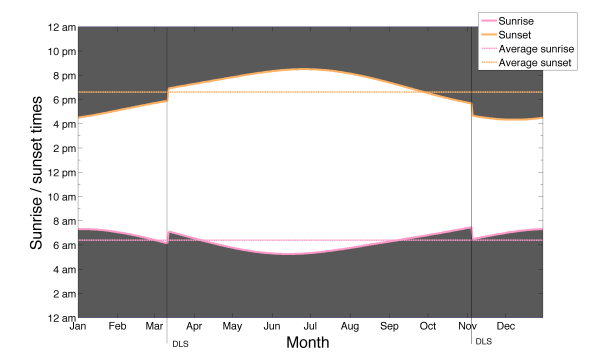
Daylight Savings Time Explained designed by a Visual.ly member under the name Germanium, visually explains the end result of recognizing Daylight Savings Time.  DST is used mostly in North America and Europe, while most of the world does not change their clocks.

I tried to come up with the reason for the daylight saving time change by just looking at the data for sunset and sunrise times. The figure represents sunset and sunrise times thought the year. It shows that the daylight saving time change marked by the lines (DLS) is keeping the sunrise time pretty much constant throughout the whole year, while making the sunset time change a lot. The spread of sunrise times as measured by the standard deviation is 42 minutes, which means that the sunrise time changes within that range the whole year, while the standard deviation for the sunset times is 1:30 hours. Whatever the argument for doing this is, it’s pretty clear that reason is to keep the sunrise time constant.

By visualizing the daylight hours, the reader can see the pattern.  Both the change in total hours, and the impact of daylight hours on their normal day.

The reasoning for DST is very controversial, but now we can see the impact clearly.

Thursday
Nov012012

Finding the Productivity Sweet Spot at Work

Finding the Productivity Sweet Spot infographic


The Finding the Productivity Sweet Spot infographic from NICE.com takes a close look at how employees waste their time online at work, but offers a better solution to manage employee productivity.  Don’t cut off Internet to your employees!  Instead, manage their personal time online to a reasonable level and everyone wins!

Everyone wastes a bit of time at work, and some of the key sources may surprise you. It’s not just the internet that can cost employers time at work. Read our infographic on time wasting at work to understand if fantasy football or facebook causes us to procrastinate more.

There is an ideal balance of non-work activity that keeps people refeshed and employees engaged. It’s just unrealistic to expect 100% efficiency through the day. Distractions at work existed before the Internet. The key for companies is to manage these time wasters at work to an ideal level. 

Designed by InfoNewt, the infographic walks the reader through a 3-part story…


  1. How much time is being wasted at work?
  2. What are employees doing during this wasted time?
  3. What’s the ideal amount of time to let employees have personal time online?


 Big thanks to the team at NICE!

Wednesday
Feb222012

Tea & Biscuit Dunking Guide

The Tea and Biscuit infographic from Green Hat Design in the UK shows avid dunkers of biscuits the proper timing to keep their favorite snacks in the tea or coffee to conquer floppage and avoid the disappointment of contamination!  Also available as a high-resolution PDF.

This biscuit infographic is based on 8 of our favourite UK brands which helps us (and others) to get the best out of his (or her) biccy when dunking it in hot tea or coffee, while at the same time assisting the user to avoid… floppage. That unfortunate moment that the biscuit suddenly gives way and contaminates your beverage. Nasty. We feel many could actually benefit from such details. I know it has changed my life.

This one is a fun topic.  Apparently the biscuits in the UK are so hard you have to dunk them to eat them…  :)

The radial design works well to show three values for each biscuit, and is easy for the reader to compare them.  The illustrations work well, even though readers in the U.S. (myself included) won’t recognize any of the biscuits.

A couple things are missing from a Marketing Infographic design perspective.  It needs a title!  I made up the “Tea & Biscuit Dunking Guide” because it didn’t have a good title of its own.  There should be some type of license statement, and in this case I would suggest Creative Commons.

The PDF file is hosted on the Green Hat Design site, but the infographic isn’t displayed anywhere.  t’sI hard to share a PDF compared to how easy it is to share an image file online.  It REALLY needs it’s own official landing page on the Green Hat Design site to display the infographic, and be the one place you want everyone else (like this blog) to link to.  They had uploaded it to visual.ly, and I linked to it there, but that shouldn’t be the primary landing page if they want to drive traffic to their site and awareness to their brand.

Thanks to Steve for sending in the infographic!

Monday
Mar142011

Moviebarcodes: Whole Movies at a Single Glance

Moviebarcodes is a tumblr blog from an unknown author that posts these images generated from different movies.  Each frame of the movie is stretched tall and thin to create this single image from an entire movie.  The one above is from The Matrix, and you can see the green tint they used every time they were “in the Matrix”.

From Wired:

The person behind MovieBarcode, who wouldn’t reveal their identity or what they do for a living, told Wired.co.uk that the creative process can take a few hours on the slightly aged machine they are being processed on, “depending on the length of the movie and the quality of the outcome”.

Movies on the blog are chosen “due to the expected result, not for the movies themselves”. Besides colourful movies, the blog author prefers “movies with long shots such as Kubrick, Hitchcock and Weerasethakul, which can result in unique and interesting moviebarcodes”.

Although, some of them don’t seem to reveal anything interesting, a few of these did give some insights into the movie visuals.

They spent a lot of time at sea in Jaws:


The Dark Knight was a very dark, almost colorless movie:


Kung Fu Panda was very colorful:


You can see the time spent in the digital, neon-blue world of TRON (1982):


Found on Wired.co.uk, VisualJournalism, FlowingData and Chart Porn.

Monday
Feb282011

Visualizing Daily Activities With Media Wheel


I really like the Media Wheel for Visualizing Daily Activities from Hill Holiday.  The wheel visualizes how people consumer different types of media over the course of a day.  For example, DVD/Video is mostly consumed in the evening and Newspaper is mostly consumed in the morning.  each slice is a different type of media, and the consumption levels are shown by how bright the colors are at that time of day.

For a media planning project, we needed to find a simple way to illustrate how people in a particular segment engage with different media. After some experimentation, we came up with this “media wheel” chart that summarizes 216 data points from a media spreadsheet.  

Read their blog post, they included a good description of how they normalized the data and created the media wheel.  They also gave credit to the designer, Eric Fensternheim, which is always nice to see.

The wheel graph itself was built by hand in Adobe Illustrator. Each data point’s value relative to the highest in its row is tied to the corresponding level of color transparency.

Design: Eric Fensterheim, media design intern.

Wednesday
Feb092011

The Doctor Who Infographic

Very cool overview Infographic History of Doctor Who, with some fantastic illustrations, by Bob Canada (@bob_canada on Twitter).  The world of Doctor Who is incredibly complex, but this infographic gives new viewers the basics.


Here’s everything you’ve ever wanted to know about the Doctor, but were afraid to ask. Click here to see a super-sized version so you can better read the text.

This piece took quite a while to finish. I worked on it a little at a time over several days. There was a lot of moving around of elements and a lot of text editing to get everything to fit in an efficient manner. Hopefully there aren’t any glaring errors in the information.

Laid out entirely in InDesign. All the Doctors, the Sonics and the TARDIS were drawn in InDesign as well.


You can tell from the illustrations that the hair was iconic for each Doctor.  You could probably identify each doctor in silhouette by the hair alone!

Wednesday
Aug112010

Time Travel in Popular Movies and TV infographic

I couldn’t believe that I hadn’t posted this one by David McCandless from InformationIsBeautiful.net.  Timelines: Time Travel in Popular Film and TV is one of my favorites, and you can tell how much effort went into the design and getting the details right.

Here’s a visualisation of time travel plots in various films and TV programs. I had a lot of fun doing this!

This is a straight data visualisation, rather than information design. That is, it’s not particularly useful, nor useable, nor meaningful. The inspiration was the coolness of the idea, really. I was excited to see what shape all the plots would make, and whether it could be shaped into something beautiful.

What I really love about this image, though, is the idea that this information has never been seen before. Despite the fact that it exists, in some way,somewhere, wrapped in various plots, it’s never been given form. I have to say, it was a joy to untangle it all :)

David, I would love to help design one for Dr. Who!


Friday
Apr092010

An Infographic About Making an Infographic...

An infographic from Brandon Oxendine showing how his time is divided between activities when working on designing an infographic.  Brandon, try spending more time drooling…

You can see more on Brandon’s blog.

Wednesday
Sep092009

Balance Your Media Diet (The Media Pyramid Infographic)

From Wired Magazine's "New Rules for Highly Evolved Humans" section of the August 2009 issue.
Practicing good nutrition keeps your mind sharp, your body fit, and your life long. The same could be said for consuming media. (Seriously, knowledge is power.) When you add it all up, the average American spends roughly nine hours a day glued to some kind of screen, and like your diet, quality is as important as quantity. Here areWired's suggested servings for optimal media health.
Found on Nathan's Flowingdata.com

Monday
Aug242009

Big Bang Briefly [video]

A new video on YouTube that visually tries to help explain the Big Bang and the creation of the universe.  Narrated by Dr. Janna Levin.  Maybe a little more on the visual illustration side than infographic, but still good.

"We made this video about the Big Bang because the theory is important and amazing, but often misunderstood.

This video was produced without any funding from any outside sources. It was put together with donated creative time from a group with a desire to further public cognition of science

Science has many amazing stories to tell, this is the first. The Big Bang Briefly."
 Found on VizWorld.com