About
Randy Krum
President of InfoNewt.
Data Visualization and Infographic Design

Infographic Design

Infographics Design | Presentations
Consulting | Data Visualizations

DFW DataViz Meetup

Join the DFW Data Visualization and Infographics Meetup Group if you're in the Dallas/Fort Worth area!

Search the Cool Infographics site

Custom Search

Subscriptions:


Feedburner

The Cool Infographics® Gallery:

How to add the
Cool Infographics button to your:

Cool Infographics iOS icon

- iPhone
- iPad
- iPod Touch


Read on Flipboard for iPad and iPhone

Featured in the Tech & Science category

Flipboard icon

Twitter Feed
From the Bookstore

Caffeine Poster

The Caffeine Poster infographic

Entries in Media (5)

Wednesday
Mar272013

What Works in Rich Media Mobile Advertising?

Celtra’s What Works in Rich Media Mobile Advertising? infographic provides marketers with a baseline for ad performance, helping them plan successful and effective mobile campaigns.

Celtra Inc, the industry leader for rich media advertising and analytics across mobile devices, has today unveiled a new infographic that highlights front-line advertising industry trends from the company’s first quarterly Mobile Rich Media Monitor Report.
The data behind the infographic indicates that a well designed rich media experience that uses a store locator, games or social media has a direct and positive impact on consumer engagement and return on investment. In fact, rich media mobile advertisements drive double-digit engagement rates (12.8 percent on average) across all devices types, platforms and ad placements.
Celtra’s infographic hones in on several key metrics including engagement rate, expand rate and click-through rate. The data also provides an in-depth look at ad feature performance for mobile rich media campaigns.

This design is the first in a quarterly series planned by Celtra to be released with their quarterly Rich Media Monitor Report.  Each one will highlight a different insight from the information that Celtra publishes in the report.

It’s a clear design that walks the reader through the data and the conclusions step-by-step.  There’s a lot of data included, but the data visualizations are easy to understand.

Thanks to Caitlin for sending in the link!


Tuesday
Aug142012

The Lifespan of Storage Media

Crashplan has just released The Lifespan of Storage Media, a comprehensive guide to how long your data will last.  Designed by Mike Wirth with InfoNewt, this infographic compares the expected lifespans of popular media types used over the last 100 years to save different kinds of information: computer data, photos, videos and audio.  Do your 8-tracks still play?

As each new form of data storage comes on the scene, the market is at first enamored with its compactness, convenience and hoped-for data longevity. But invariably, the reality of physical vulnerability and a limited lifespan remains. Eventually, all media fails, but Cloud backup is forever.

This was a fantastic project to work on, and the data research was the most challenging piece.  We had to find data to support both an average expected life and an extended “with extreme care” life.  We certainly found some contradictory data sources, and ultimately used data we felt was the most commonly accepted in the industry.

Do you have old computer backups burned to CDs, tapes or even hard drives on your shelf?  Don’t count on being able to read the data from them too much longer!  The short lifespan for many of these types of media that people use everyday to archive their personal photos and videos was most surprising.

Thanks to the team at Crashplan for a great project!

Tuesday
Jun192012

11 Steps To Voice-Over Success

11 Steps To Voice-Over Success

Interested in trying to make money as an audio voice-over actor?  Thanks to 11 Steps to Voice-Over Success infographic from Voices.com, now you know how to get started!

Voice over actors give life to animation works, enlighten us through film narration and bring energy to radio commercials. The industry is estimated to be worth $12.3 billion worldwide, and is growing because of new digital mediums such as mobile radio, apps with audio podcasting. If you’re interested in voice acting, learn the 11 steps to voice-over success in this amazing infographic.

This design combines a process flow, some data visualizations, some illustrations and text descriptions in an easy to follow layout.  The large colored blocks for each step resemble following a board game path to make it simple for the reader to follow the process.

I think the design could have reduced the amount text much further.  I think there’s too much detail included to be quick to digest for the readers.  At the bottom there should have been the URL link to the original, full-size infographic (in addition to the Voices.com front page) and a copyright statement.

This design visualizes an 11-step process, and a good comparison would be the 10-step process design for How Affiliate Marketing Works I designed last year.  My approach was to give the reader the basics of the process, and then let them go to the website to get more details.  This design attempts to give the reader more complete information about each step of the process.  What do you think?

Thanks to Ashley for sending in the link!

Thursday
Jan122012

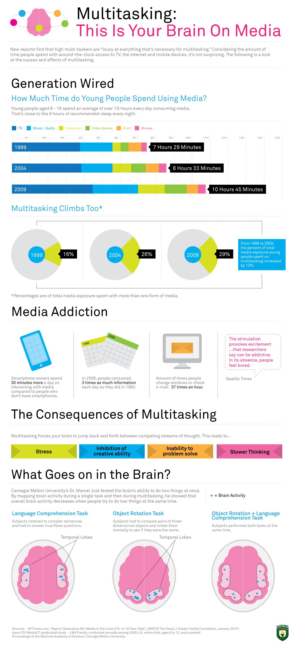
Multitasking: This Is Your Brain On Media

From Rasmussen College, Multitasking: This Is Your Brain On Media is a cool infographic design that looks at some of the research behind multitasking.

New reports find that multi-taskers are “lousy at everything that’s necessary for multi-tasking.” Considering the amount of time people spend with around-the-clock access to TV, the Internet and mobile devices, it’s not surprising.This infographic looks at the causes and effects of multi-tasking.

From a design perspective, I like the clean look with a simple color palate that is easy on the eyes.  The statistics in the Media Addiction section could have been visualized to make them easier to comprehend.  Without visualizations, this section feel less important compared to the rest of the data.

I love the brain diagrams.  I’m sure there are hundreds of pages of reports from this research, but this simple visual tells the story quickly to the reader.  The design is missing the URL to the original landing page, a copyright (or Creative Commons) statement and listing the designer.

Found on Infographics Journal

Wednesday
Feb092011

The Doctor Who Infographic

Very cool overview Infographic History of Doctor Who, with some fantastic illustrations, by Bob Canada (@bob_canada on Twitter).  The world of Doctor Who is incredibly complex, but this infographic gives new viewers the basics.


Here’s everything you’ve ever wanted to know about the Doctor, but were afraid to ask. Click here to see a super-sized version so you can better read the text.

This piece took quite a while to finish. I worked on it a little at a time over several days. There was a lot of moving around of elements and a lot of text editing to get everything to fit in an efficient manner. Hopefully there aren’t any glaring errors in the information.

Laid out entirely in InDesign. All the Doctors, the Sonics and the TARDIS were drawn in InDesign as well.


You can tell from the illustrations that the hair was iconic for each Doctor.  You could probably identify each doctor in silhouette by the hair alone!