About
Randy Krum
President of InfoNewt.
Data Visualization and Infographic Design

Infographic Design

Infographics Design | Presentations
Consulting | Data Visualizations

DFW DataViz Meetup

Join the DFW Data Visualization and Infographics Meetup Group if you're in the Dallas/Fort Worth area!

Search the Cool Infographics site

Custom Search

Subscriptions:


Feedburner

The Cool Infographics® Gallery:

How to add the
Cool Infographics button to your:

Cool Infographics iOS icon

- iPhone
- iPad
- iPod Touch


Read on Flipboard for iPad and iPhone

Featured in the Tech & Science category

Flipboard icon

Twitter Feed
From the Bookstore

Caffeine Poster

The Caffeine Poster infographic

Entries in timelime (2)

Tuesday
Jun062017

The Sci-Fi Timeline

The Sci-Fi Timeline

The Sci-fi genre contains some fantastic and horrifying ideas about the future, but how far away are they? The Sci-Fi Timeline created by Glow places classic sci-fi movies and games on a very long timeline.

We're all used to seeing movies and games set in the future, but often the date can seem a bit abstract.

We've brought together some of our favourites to show yo the timeline and where they all fit. There were some surprises!

See for yourself, and decide if the writers got it right!

Thanks to David for the link!

Monday
Nov072016

Visual History of US Population

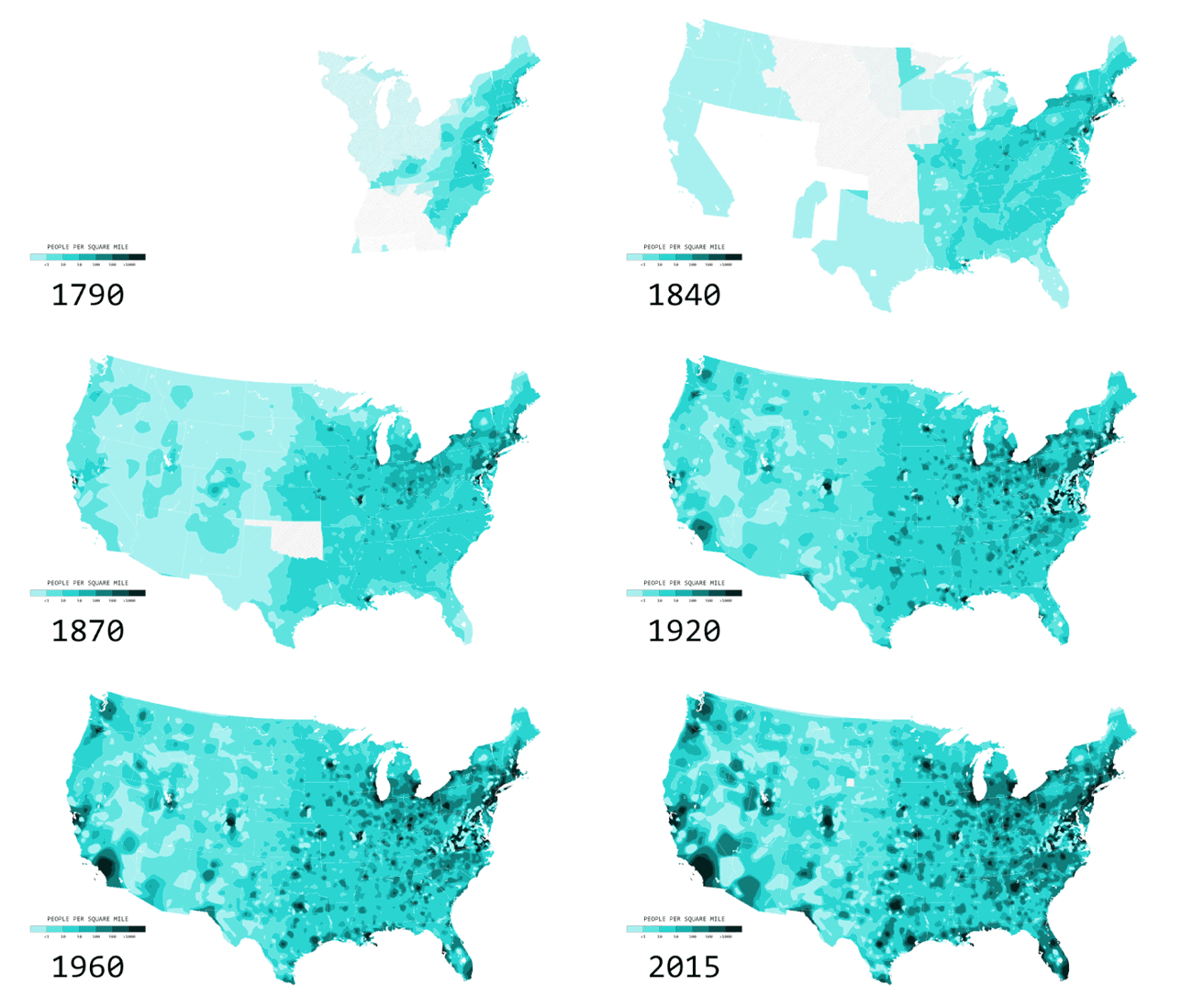
Nathan Yau from FlowingData has created a cool, new animated data visualization, Two Centuries of Population, Animated. The visualization shows the growth and spread of 

You’ve likely seen the population density map of the United States in one form or another. A lot of people per square mile reside in big cities, fewer people reside in suburban areas, and a lot fewer people reside in rural areas. Cities weren’t always cities though. Rural wasn’t always rural. If you look at people per square mile over a couple of centuries, you get a better idea of how the country developed.

The animated map above shows population density by decade, going back to 1790 and up to recent estimates for 2015. The time in between each time period represents a smoothed transition. This is approximate, but it gives a better idea of how the distribution of population changed.

Nerd Notes:


  • Nathan used R to generate the maps and FFmpeg to string the images into a video.
  • Data are originally from the Census Bureau but made much more accessible by NHGIS.