A complete music video made of infographics! It’s pretty good too! The song is “Remind Me” by Royksopp, and the video continuously blends one infographic into the next. Let’s hope real life is more than a series of graphics about the choices we make.
Another one for the "real world" infographics. This t-shirt from ThinkGeek will detect WiFi 802.11b or 802.11g wireless networks and display their signal strength on the front of the shirt. A great Christmas present for the geek in your family, for only $30.
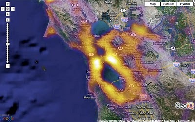
From CraigStats, the image above shows the population per square mile in the San Francisco area as a pseudo heat map. The site also has combined the apartment listings on Craig's List with Google maps to create pseudo heat maps showing the areas with the most apartments.
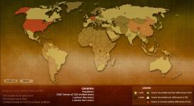
Breathing Earth is a cool website that displays international statistics in real-time, similar in concept to Poodwaddle.com's World Counter. Breathing Earth focuses on carbon dioxide emissions by country and adds population, births and deaths.
Welcome to Breathing Earth. This presentation displays the carbon dioxide emission levels of every country in the world, as well as their birth and death rates - all in real-time. Though considerable effort has been taken to ensure that the presentation uses the most accurate and up-to-date data available, please remember that this is just a simulation.
Breathing Earth was created by David Bleja (aka Stillwater), whose home website is stillwater-microcosm.net
O'Reilly has created a poster showing the 50-year history of computer languages from 1954 to 2004, available as a PDF. They have also been giving away copies of the posters at O'Reilly conferences. I love the links shown where older languages split or combined to create the newer languages over time.
I look back around 1990 when I was programming in college and see Fortran V, C++ and the birth of Visual Basic. I remember having to convince my engineering professors to let me program assignments in C++ instead of Fortran.
The original diagram was created by Éric Lévénez. Although O'Reilly is not updating the poster, Eric is keeping his original diagram up to date on levenez.com.
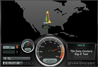
Speedtest.net does a great job showing you the data while testing your own internet connection speed. From locating a test server on the map, to animating the speedometer as the test runs. Without much text at all explaining what's going on, you understand the test, and the results.
Then you get the code to embed your results (see below) into a blog post, email or website. How fast is your connection?
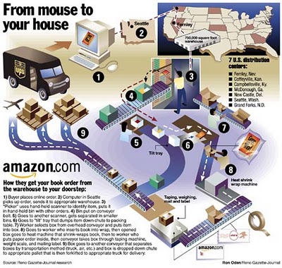
How does Amazon turn your online book order into a physical shipment to your doorstep? One of a handful of great infographics from Ron Oden on the ronoden.com site.
Check this one out! The graphic above is an embedded object from searchCrystal that lets you search multiple sources for images (or other forms of information). I've preloaded it to search for "inforgraphics" from GoogleImages, Flickr, AskImages, YahooImages and MSNImages. When you dig a little deeper, you can choose the different sources you are searching from, save searches, share results with others, etc.
The arrangement shows the overlap of the results from multiple sites. Simple navigation like scrolling over images enlarges them, and clicking takes you to the source image.
Also works for video, blogs, tags, news, etc...blah, blah, blah. We only care about images don't we?
Three design firms took on the challenge of re-designing the Bloomberg terminal interface, and the results were fantastic. The challenge came from Portfolio.com. The original article is here, but the fantasy terminals are here with an interactive interface that lets you highlight and zoom in on particular features. The design above is from thehappycorp.com and is my personal favorite.
Bloomberg claims to be constantly improving their interface design, but it still looks like runs on DOS and is straight out of the 80's.


 Randy
Randy