About
Randy Krum
President of InfoNewt.
Data Visualization and Infographic Design

Infographic Design

Infographics Design | Presentations
Consulting | Data Visualizations

DFW DataViz Meetup

Join the DFW Data Visualization and Infographics Meetup Group if you're in the Dallas/Fort Worth area!

Search the Cool Infographics site

Custom Search

Subscriptions:


Feedburner

The Cool Infographics® Gallery:

How to add the
Cool Infographics button to your:

Cool Infographics iOS icon

- iPhone
- iPad
- iPod Touch


Read on Flipboard for iPad and iPhone

Featured in the Tech & Science category

Flipboard icon

Twitter Feed
From the Bookstore

Caffeine Poster

The Caffeine Poster infographic

Entries in web (190)

Wednesday
Sep052007

Marumushi News Map


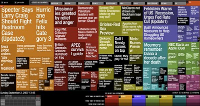
Marumushi.com has a fantastic News Map using the treemap visualization style. This is one of the best implementations of a treemap that I have found. Updated every 6 hours, it groups news stories (from the Google news aggregator) by overall category (technology, world, sports, etc.). You can choose to show the news map from 11 different countries, and the color shading of each block represents how old that particular news story is. Hovering your mouse over any square shows the whole title, and clicking takes you directly to the story.

Thursday
Aug302007

What does 16 Million colors look like?


From David Naylor's blog, a color map that includes all 16.8 million RGB colors.

Tuesday
Aug282007

A Day of Diggs


This one is really interesting. Stamen Design took one day of digg.com and visualized the user activity. The explanation is really cool, and can be found here on content.stamen.com. Stamen works with Digg on a number of the tools available in Digg Labs.

Red dots represent people that have been on Digg for a while, yellow is a good mix, and blue is new users. So when a story is predominantly blue, it represents a story that is attracting a bunch of new users to Digg.

Thursday
Aug162007

Periodic Table of Visualization


This table is a must-see site for anyone who works creating visualizations. This website from visual-literacy.org has grouped visual methods into six categories (like Concept Visualization and Metaphor Visualization), and made it interactive so when you move your mouse over one of the specific methods it shows you an example.

This is a great resource to help inspire you to visualize your data in new ways. I find that I like trying to visualize the same data in a couple different ways to find out which works best at communicating the data to others. Ironically it's missing the visual method of laying out data into a periodic table!

Sunday
Aug122007

Starship Dimensions


As a follow-up to my earlier post on the Starship Comparison Poster, the Starship Dimensions website has a much more extensive library of sci-fi ships all shown to scale. There are so many here that the website is broken up into different pages from small scale up to "Big" scale. Click on the tabs across the top to pick a scale (100X, 10X, 1X, etc.).

Fantastic resource. Jeff Russell has done a great job accumulating the images and tracking down their relative sizes.

Saturday
Aug112007

XPLANE offers XPLANATIONS


XPLANE is a company whose whole purpose is professional infographics. They do a bunch of infographics for big and small companies, but also do a lot of work for Business 2.0 magazine (a favorite of mine). Check out David's post that Business 2.0 might be in trouble.

A number of infographics (called XPLANATIONS...I love it) are available free for download here.

David Grey is the CEO, and he also runs his own blog called Communication Nation.

Wednesday
Aug082007

2008 Presidential Campaign Finances


This interactive infographic from the New York Times website is really impressive. Using weekly data reported by the Federal Election Commission, it plots the contributions on a map of the U.S. and sizes the bubbles based on contributions from that city. It has data from every week since January 1st, so it will also "play" and animated version showing the contribution as time progresses (similar to the Trendalyzer that Google purchased from GapMinder).

You can also search for specific contributors to see which candidate campaigns they have contributed to, and how much they gave.

Sunday
Aug052007

Periodic Table of the Internet


Wellington Grey has created a graphic representing some of the internet's most popular sites in a familiar layout. The Periodic Table of the Internet groups the most popular sites on the web in categories like Search Engines, Aggregators, Operating Systems, Blogs, Social Networking, etc. Each individual block links to its respective site.

Friday
Jul272007

Web Trend Map 2007 v2


Our friends over at InformationArchitects.com have updated their WebTrends poster showing the...

...200 most successful websites on the web, ordered by category, proximity, success, popularity and perspective. We have done it again – and better. Upon popular demand – here is iA’s next Web Trend Map:
Thanks to Brian Johnson from the Microsoft Mac BU for pointing this one out.

Sunday
Jul222007

Jonathan Harris TED Talks 2007

Jonathan Harris is working on some cool, interesting, fascinating but weird stuff. This is his presentation at TED 2007 about We Are Fine and his new project Universe. You can see this on the TED site here.

Universe is now live at universe.daylife.com, and you can enter a news topic and watch it graphically associate all of the relevant stories in the media about that topic. This would be really cool for consumer products too, but sadly that doesn't exist.

The TED Talks are now available on iTunes as free video podcasts. I've been watching some older ones from 2002-2007.

Page 1 ... 15 16 17 18 19