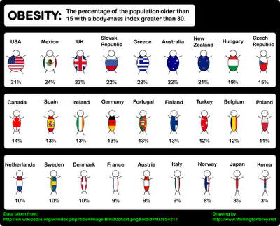
About
Randy Krum
President of InfoNewt.
Data Visualization and Infographic Design

Infographic Design

Infographics Design | Presentations
Consulting | Data Visualizations

DFW DataViz Meetup

Join the DFW Data Visualization and Infographics Meetup Group if you're in the Dallas/Fort Worth area!

Search the Cool Infographics site

Custom Search

Subscriptions:


Feedburner

The Cool Infographics® Gallery:

How to add the
Cool Infographics button to your:

Cool Infographics iOS icon

- iPhone
- iPad
- iPod Touch


Read on Flipboard for iPad and iPhone

Featured in the Tech & Science category

Flipboard icon

Twitter Feed
From the Bookstore

Caffeine Poster

The Caffeine Poster infographic

Entries in world (200)

Monday
Sep172007

Human Trafficking

Found on VisualComplexity.com, this disturbing poster examines global human trafficking.

"It depicts each country's level of involvement (from Very High to Very Low) as either a country of destination or origin. The project concentrates on the smuggling of people from one country to another - mainly illegally. In many cases these people are forced to do work that is illegal, such as prostitution or child labor."
The poster was created by Taulant Bushi, and the original image is here.

Sunday
Sep162007

The Elegant Universe


Following my earlier post on Imagining the Tenth Dimension, I found that NOVA has put the entire 3-hour show The Elegant Universe on their website.


The show is full of different visual methods to visual strings, gravity, the scale of particles and multiple dimensions. Brian Greene really did a fantastic job with this show based on his book on the same name.

Friday
Sep072007

The Cosmic Calendar


This last December was the 10th anniversary of Carl Sagan's death. One of his most popular episodes of Cosmos was titled The Dragons of Eden where he first described his Cosmic Calendar. This website from discovery.com has a simple image showing the Cosmic Calendar as Carl described it. A few websites are selling posters of the Cosmic Calendar, like AllPosters.com.

The premise is that if you compress the entire history of the universe into a calendar year, homo sapiens only exist in the last 6 minutes, and the last second represents the last 400+ years of human history.

You can see Cosmos, and hear Carl describe it on YouTube here:

Sunday
Sep022007

World Population Density


This is a prime example of how seeing the data visually is better than reading numbers. Here is a population density map from Wikipedia.

We have heard that China and India have most of the human population in the world, but here you can really see and understand how much. Reading that China's population is four times that of the U.S. is much harder than really seeing it on a map.

The Wikipedia page on World Population has some other great information too.

Sunday
Sep022007

World Clock Counter


You've seen these counters on highway billboards and other websites before. The World Clock from poodwaddle.com combines many of these counters together into one dashboard.

I've added a smaller version to the bottom of the right pane here on on the blog.

Sunday
Aug262007

Bodies in the Solar System


Another great infographic on kokogiak.com showing the relative size of large objects (88 of them, at least over 200 miles in diameter) in our solar system. The largest (of course) being the sun down to the smallest, which is Davida, an asteroid 203 miles in diameter.

Monday
Aug132007

World Drinking Map


From drinkingmap.com, this map shows the legal drinking age by country. For the vast majority of the world 18 is the legal age. There are only a few countries like the U.S. that have a drinking age as high as 21.

Friday
Aug102007

World's Most Dangerous Drugs


Another good one from Healthbolt. Color coded by class, and ranked by overall harm to the human body.

Tuesday
Aug072007

World Fatness


Another good one from Wellington Grey. Obesity across the world shown visually. The size of the little person’s body represents the percentage of people in that country with a body-mass index over 30.

Wow…are we fat or what? Are you going to finish those fries?

Sunday
Aug052007

The Coming Water Wars


Another graphic from Jonathan Harris from his time at Princeton with the International Networks Archive. It's a couple years old, but absolutely still relevant. I believe this is from around 2003.

Added: Recently popular on Digg.com

Page 1 ... 16 17 18 19 20