About
Randy Krum
President of InfoNewt.
Data Visualization and Infographic Design

Infographic Design

Infographics Design | Presentations
Consulting | Data Visualizations

DFW DataViz Meetup

Join the DFW Data Visualization and Infographics Meetup Group if you're in the Dallas/Fort Worth area!

Search the Cool Infographics site

Custom Search

Subscriptions:


Feedburner

The Cool Infographics® Gallery:

How to add the
Cool Infographics button to your:

Cool Infographics iOS icon

- iPhone
- iPad
- iPod Touch


Read on Flipboard for iPad and iPhone

Featured in the Tech & Science category

Flipboard icon

Twitter Feed
From the Bookstore

Caffeine Poster

The Caffeine Poster infographic

« The influence of Josef Müller-Brockmann Typography | Main | The Rush to Wind Farms! »
Tuesday
Sep302008

A Year of Heavy Loses


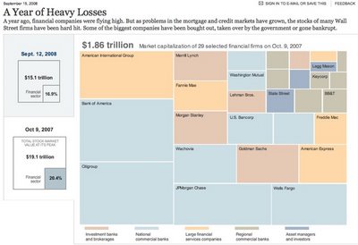
Over at Nytimes.com, they have a good treemap showing the drop in market capitalization over the past year of most of the big financial firms on Wall Street.  It's a little bit interactive, in that when you hover your mouse over any box, you will see more details.

Found on infosthetics.com

PrintView Printer Friendly Version

EmailEmail Article to Friend

Reader Comments (1)

I can only imagine the computing prowess of their team. And they keep coming up with top quality graphics. Amazing.

October 7, 2008 | Unregistered CommenterParka
Editor Permission Required
While we are migrating to a new site design, you must have editing permission for this entry in order to post comments.