About
Randy Krum
President of InfoNewt.
Data Visualization and Infographic Design

Infographic Design

Infographics Design | Presentations
Consulting | Data Visualizations

DFW DataViz Meetup

Join the DFW Data Visualization and Infographics Meetup Group if you're in the Dallas/Fort Worth area!

Search the Cool Infographics site

Custom Search

Subscriptions:


Feedburner

The Cool Infographics® Gallery:

How to add the
Cool Infographics button to your:

Cool Infographics iOS icon

- iPhone
- iPad
- iPod Touch


Read on Flipboard for iPad and iPhone

Featured in the Tech & Science category

Flipboard icon

Twitter Feed
From the Bookstore

Caffeine Poster

The Caffeine Poster infographic

« Create Your Own Personal Infograph | Main | What Font Do I Use? - a Typeface Decision Flowchart »
Monday
May032010

Lies, Damned Lies and Statistics (about TEDTalks)

Very funny video from TEDActive, by Sebastian Wernicke that analyses the best and worst of TEDTalks using statistics and word analysis.

In a brilliantly tongue-in-cheek analysis, Sebastian Wernicke turns the tools of statistical analysis on TEDTalks, to come up with a metric for creating “the optimum TEDTalk” based on user ratings. How do you rate it? “Jaw-dropping”? “Unconvincing”? Or just plain “Funny”?

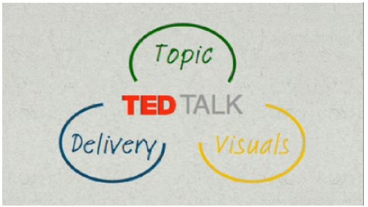
Found on ILoveCharts.tumblr.com

PrintView Printer Friendly Version

EmailEmail Article to Friend

Reader Comments (1)

This is very informative. It's a bit inappropriate for me to discuss about my concerns here in your website. Message me if you have time.

Thanks

Grace
March 15, 2012 | Unregistered CommenterArdham Grace
Editor Permission Required
While we are migrating to a new site design, you must have editing permission for this entry in order to post comments.