About
Randy Krum
President of InfoNewt.
Data Visualization and Infographic Design

Infographic Design

Infographics Design | Presentations
Consulting | Data Visualizations

DFW DataViz Meetup

Join the DFW Data Visualization and Infographics Meetup Group if you're in the Dallas/Fort Worth area!

Search the Cool Infographics site

Custom Search

Subscriptions:


Feedburner

The Cool Infographics® Gallery:

How to add the
Cool Infographics button to your:

Cool Infographics iOS icon

- iPhone
- iPad
- iPod Touch


Read on Flipboard for iPad and iPhone

Featured in the Tech & Science category

Flipboard icon

Twitter Feed
From the Bookstore

Caffeine Poster

The Caffeine Poster infographic

« The Supernatural Sprawl of True Blood | Main | Honda Accord: 30 Years of U.S. Production »
Wednesday
Oct032012

How-Many Guide to Kitchen Conversions

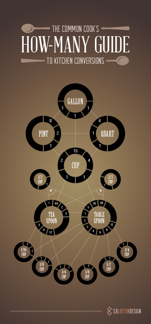
Common Cook's How-Many Guide to Kitchen Conversions infographic


Designed by Shannon Lattin at S.B. Lattin Design, the Common Cook's How-Many Guide to Kitchen Conversions is a super-helpful infographic design.  Very quickly the reader can lookup to the conversions between many of the most common recipe measurements.

If your kitchen drawers are anything like ours, you never have the right measuring implement for the recipe you’re tackling. Keep this chart on hand, and the next time you find yourself asking “How many…” you’ll know just what to do.

This design is an excellent example of "tell one story really well."  It's a clear and simple design that is quick and easy for the reader to understand.  

Found on Visual.ly

Nice job Shannon!

PrintView Printer Friendly Version

EmailEmail Article to Friend

Reader Comments (6)

The rest of the civilized world uses something that makes this infographic obsolete. It's called the Metric System.
October 3, 2012 | Unregistered CommenterMihai
Great. I don't remember some of the conversions here.thanks for the share.
As visually pleasing as this is, a conversion table is surely clearer.
Also I've got to agree with Mihai on Metric.
October 10, 2012 | Unregistered CommenterWill
this infograph is wrong especially the teaspoon! wow, 10 tablespoons make 2/3 of a cup and by this chart two teaspoons make the same amount?
October 25, 2012 | Unregistered CommenterJessica Z
I guess Jessica didn't notice the plus sign, 10 tablespoons + 2 teaspoons = 2/3 cup. Personally I think this is quicker than a conversion chart, especially when it comes to the 1/3 and 2/3 cups, but I'm more of a visual person. My only slight complaint is that the 1's look like 7's, but that's not a mistake people are likely to make.
November 13, 2012 | Unregistered CommenterBrian
thanks for sharing, this post is very informative for mee so keep it up and nice to meet you
June 3, 2015 | Unregistered Commenterzohaib
Editor Permission Required
While we are migrating to a new site design, you must have editing permission for this entry in order to post comments.