About
Randy Krum
President of InfoNewt.
Data Visualization and Infographic Design

Infographic Design

Infographics Design | Presentations
Consulting | Data Visualizations

DFW DataViz Meetup

Join the DFW Data Visualization and Infographics Meetup Group if you're in the Dallas/Fort Worth area!

Search the Cool Infographics site

Custom Search

Subscriptions:


Feedburner

The Cool Infographics® Gallery:

How to add the
Cool Infographics button to your:

Cool Infographics iOS icon

- iPhone
- iPad
- iPod Touch


Read on Flipboard for iPad and iPhone

Featured in the Tech & Science category

Flipboard icon

Twitter Feed
From the Bookstore

Caffeine Poster

The Caffeine Poster infographic

Entries in kitchen (5)

Monday
Mar272017

The Ultimate Guide to Buying a Juicer

The Ultimate Guide to Buying a Juicer infographic from Juice Producer introduces you to the benefits for juicing and helps you decide what types of juicer is best for you.

Here is our happy infographic guide to buying a juicer, the things you might want to look out for and things to avoid to get the juicer that is going to be right for you.

Simple icons and illustrations create a very informative infographic for readers. An informative infographic is much more likely to be shared than one that feels like an advertisement. It also builds credibility for the publisher, Juice Producer, by being an expert in the industry and sharing easy-to-understand information.

However, there are a couple things I would change. 

  • Minimize the text. Paragraphs are too much for an infographic
  • Include the URL. Where can readers find the original full-size version?
  • Better color choices. Yellow text on the orange backgrounds are very hard to read

Thanks to Dave for sending in the link!

Monday
May092016

Kitchen Trends to Consider and Avoid

Kitchen Trends to Consider and Avoid infographic

Kitchen Trends to Consider (and Avoid) for Your Remodel is a comprehensive infographic from The Home Depot, covering the current kitchen design trends and top reasons to remodel your own.

A kitchen makeover can seem daunting and out of reach, but simple updates to cabinets, countertops, and colors can help an old and ignored kitchen feel fresh, fashionable, and, best of all, functional.

The following infographic from The Home Depot gives expert designer Kerrie Kelly’s tips on the hottest trends in new cabinets, countertops, colors and accents, and pointers for how to take your kitchen from drab to fab. Kelly’s design advice (don’t be afraid of color!) as well as warnings against what to avoid (go easy on the patterns), will give you all the latest in kitchen remodel trends. From the light, airy look of white cabinets, to the natural, organic look of elements like limestone and forestry, there is a trendy style for every taste.

And if keeping up with DIY television shows isn’t enough reason to get started, we’ve got three essential reasons for you to roll up your sleeves and get moving on your kitchen renovation. An updated kitchen affects your biggest investment — your home — as well as your quality of life. (Hint: Did you know that 90 percent of people report a greater desire to be home after a remodel?) Read the infographic for more reasons to get started, and visit this remodel planning guide for actionable ideas and advice.

Generally, I recommend against using photos in an infographic design, but the use of photos here is crucial to communicating the different design trends and kitchen looks. The combination fo photos with simple, one-color data visualizations works very well, and clearly communicates the different aspects of each design and function.

This is also a fantastic case-study in choosing an infographic topic that is compatible and related to your business. This isn't an advertisement for Home Depot, linking to specific products on their site. Instead, it's informative to consumers and actionable information they use to make their own purchase decisions. The information included is valuable to everyone that has a kitchen, and is likely to be shared often.

Thanks to The Daily Meal for sharing the infographic!


Tuesday
Mar102015

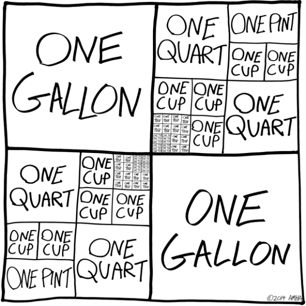
Baking Units Demystified

Baking Units Demystified infographic

Memorizing cooking unit conversions can be frustrating. Most of us just have a cheat sheet on the refrigerator that tells us that 1 Gallon= 4 Quarts. Well thanks to Andrew M.H. Alexander you might want to replace those boring magnets with the Baking Units Demystified infographic!

Infographics should simplify information and make it easier to understand without “dumbing it down.” This is a perfect example of showing the measuring relationships to make them easy to understand and even remember.

Found on Flowing Data.

Wednesday
Feb052014

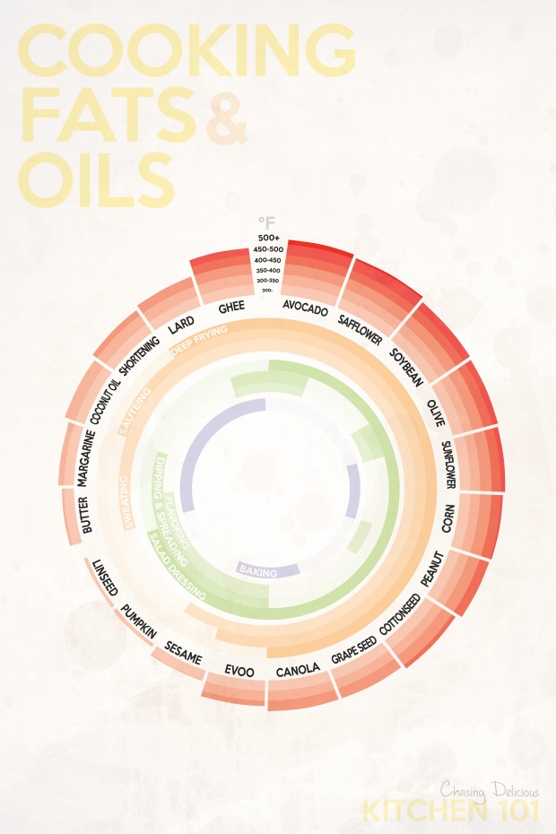
The Best Temperatures for Cooking Fats & Oils

The Best Temperatures for Cooking Fats & Oils infographic

What a great topic for an infographic!  Different oils have different smoking points. and the Kitchen 101: Cooking Fats & Oils infographic from Chasing Delicious helps you make sense of them.

When it comes to cooking and baking, there is no shortage of fats and oils. Plants, flowers, seeds, nuts, animal fat, and milk almost all seem to end up as a cooking oil or fat at one point in time or another. And today, a trip down the oil isle makes it clear just how many choices exist. But can they all be used interchangeably? And if not, what do you have to take into consideration?

The answer to the first question is a big no. And to answer the second question, you must take in to consideration four main aspects of a cooking oil or fat: 1. smoking point, 2. flavor, 3. how it interacts with other ingredients, and 4. its nutritional value.

No, you can’t just trade out EVOO for peanut oil and expect the same results on the stove!

The circular bar chart is easy to understand for the audience, and the color gradients make comparisons simple between the different oils and fats.  The light colors used in the center arcs make the text hard to read though.  Available as small printed posters, this infographic would make a great addition to any kitchen.

Found on Lifehacker

Wednesday
Oct032012

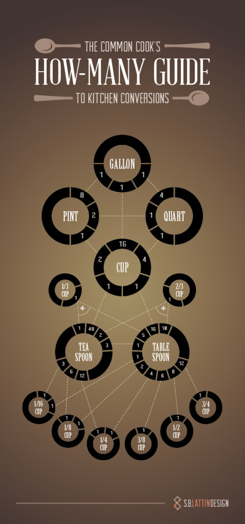
How-Many Guide to Kitchen Conversions

Common Cook's How-Many Guide to Kitchen Conversions infographic


Designed by Shannon Lattin at S.B. Lattin Design, the Common Cook's How-Many Guide to Kitchen Conversions is a super-helpful infographic design.  Very quickly the reader can lookup to the conversions between many of the most common recipe measurements.

If your kitchen drawers are anything like ours, you never have the right measuring implement for the recipe you’re tackling. Keep this chart on hand, and the next time you find yourself asking “How many…” you’ll know just what to do.

This design is an excellent example of "tell one story really well."  It's a clear and simple design that is quick and easy for the reader to understand.  

Found on Visual.ly

Nice job Shannon!