About
Randy Krum
President of InfoNewt.
Data Visualization and Infographic Design

Infographic Design

Infographics Design | Presentations
Consulting | Data Visualizations

DFW DataViz Meetup

Join the DFW Data Visualization and Infographics Meetup Group if you're in the Dallas/Fort Worth area!

Search the Cool Infographics site

Custom Search

Subscriptions:


Feedburner

The Cool Infographics® Gallery:

How to add the
Cool Infographics button to your:

Cool Infographics iOS icon

- iPhone
- iPad
- iPod Touch


Read on Flipboard for iPad and iPhone

Featured in the Tech & Science category

Flipboard icon

Twitter Feed
From the Bookstore

Caffeine Poster

The Caffeine Poster infographic

« Evolution of the English Alphabet | Main | Creating Clickable Social Cards »
Wednesday
Apr182018

Animated Visualization of First Leaf Appearance

Animated Visualization of First Leaf Appearance

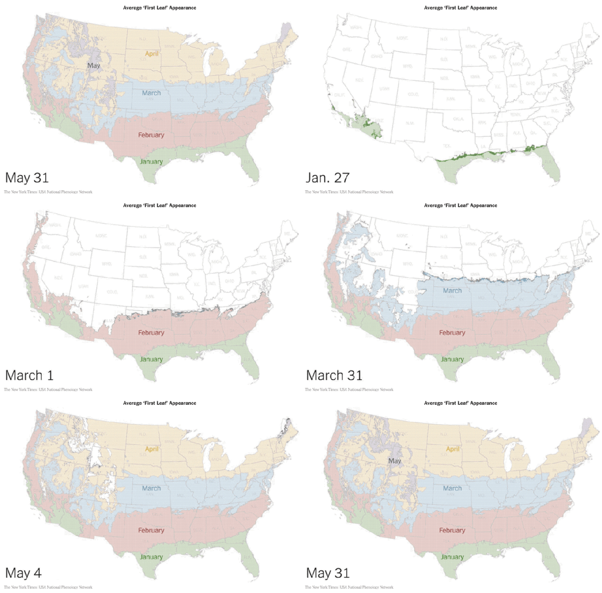
Spring is coming! Jeremy White at the NY Times has animated data from the USA National Phenology Network showing the average dates of "first leaf" across the U.S.

In some cases, an animated data visualziation is better at communicating the data to the audience than a static design. This animation clearly shows the progression of Spring across the country and you can understand the data within seconds.

PrintView Printer Friendly Version

EmailEmail Article to Friend

Reader Comments (3)

it't too fast!
April 18, 2018 | Unregistered CommenterGerhard
Its true, very fast!
April 27, 2018 | Unregistered CommenterParaguaian
good information
May 9, 2018 | Unregistered Commenterberry
Editor Permission Required
While we are migrating to a new site design, you must have editing permission for this entry in order to post comments.