About
Randy Krum
President of InfoNewt.
Data Visualization and Infographic Design

Infographic Design

Infographics Design | Presentations
Consulting | Data Visualizations

DFW DataViz Meetup

Join the DFW Data Visualization and Infographics Meetup Group if you're in the Dallas/Fort Worth area!

Search the Cool Infographics site

Custom Search

Subscriptions:


Feedburner

The Cool Infographics® Gallery:

How to add the
Cool Infographics button to your:

Cool Infographics iOS icon

- iPhone
- iPad
- iPod Touch


Read on Flipboard for iPad and iPhone

Featured in the Tech & Science category

Flipboard icon

Twitter Feed
From the Bookstore

Caffeine Poster

The Caffeine Poster infographic

Entries in client (45)

Tuesday
Nov022010

Client Infographic: The Empowered E-Patient


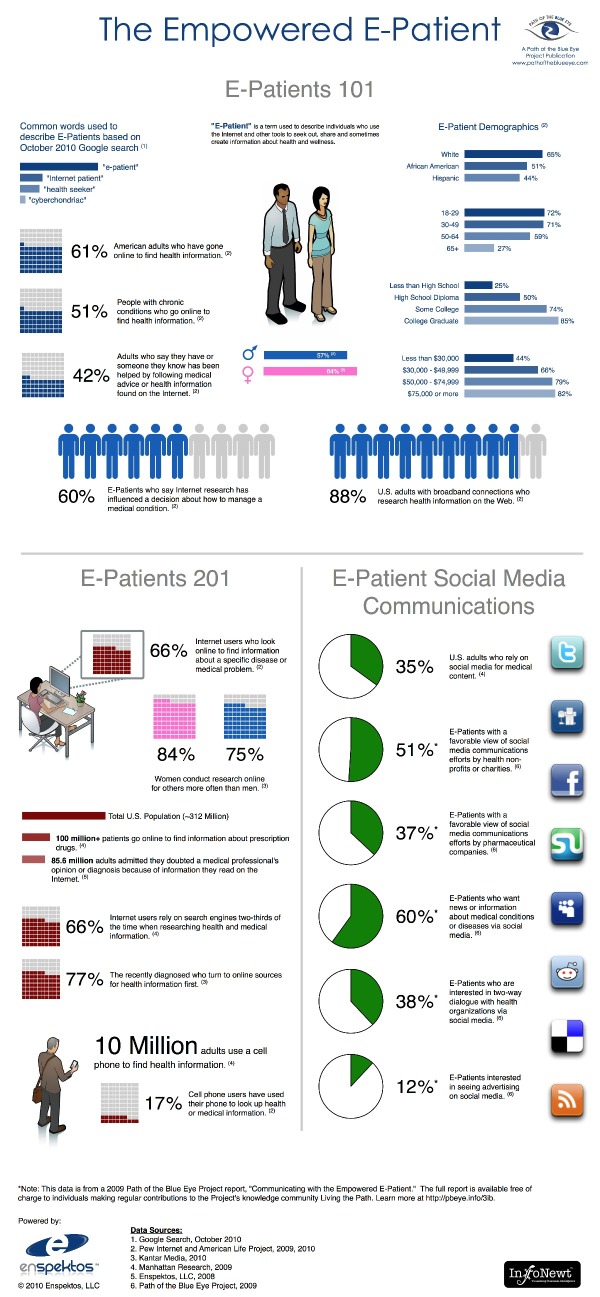
The Empowered E-Patient is a recent project InfoNewt (my company) did for the Path of the Blue Eye Project.  The statistics are compelling, and certainly support that e-patients are now mainstream.

In 2000, the Pew Internet and American Life Project found that 25% of Americans searched online for health information.  Today, 61% rely on the Web for medical and health content.  Americans’ growing reliance on Dr. Google and Nurse Yahoo! has led to profound changes in how health organizations and providers relate to and communicate with consumers.

Notably, this infographic provides information on e-patient social media communications from a Project-produced research report, “Communicating with the Empowered E-Patient.”  This report is available free of charge to individuals making regular contributions to the Project’s knowledge community, Living the Path.  Learn more about how to access this report here.


One of the challenges was defining not only what is an e-patient, but also what is the correct term to refer to these people looking up medical information online.  We ended up using Google to determine which terms are used most commonly, and the title ‘e-patient” was clearly the term used most often.

Thanks to Fard and the team at Enspektos.com.  There’s much more information available at the Path of the Blue Eye Project.

Wednesday
Oct272010

Client Infographic: The Visual History of Halloween

The Visual History of Halloween infographic poster


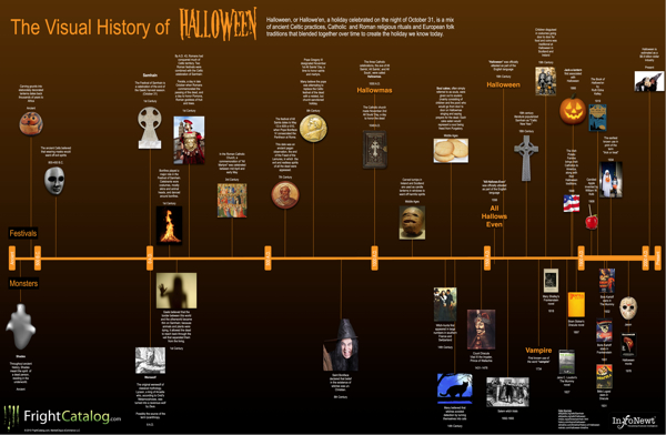
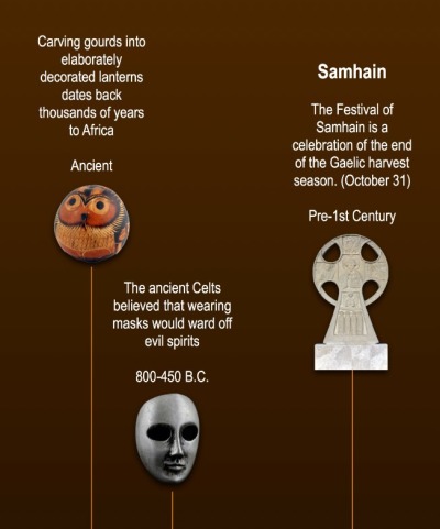
Parties, Costumes, Food, Ghosts, Vampires, Witches, Jack-O-Lanterns…oh my!  Halloween is one of the world’s favorite holidays, and The Visual History of Halloween brings all of the diverse history and influences together at last.  Estimated as a $6.9 Billion industry today, Halloween is actually the combination of at least six different festivals and celebrations from hundreds (even thousands) of years ago.  Click HERE to see the high-resolution version.

InfoNewt (my company) designed this one mainly focused on the historical foundation of Halloween.  I’m sure a completely separate timeline could be made just covering the last 100 years of commercializing Halloween, but I tried to stay away from most of that with this one.

This was actually a very fun project, and a perfect topic for an infographic because the information available is so diverse and scattered.  Of course, when you talk about history going back this far, there is also disagreement on what really happened.  So, I plotted the most commonly accepted events and dates I could find.  I had to pull from a handful of different sites to get all of the pieces to fit together.


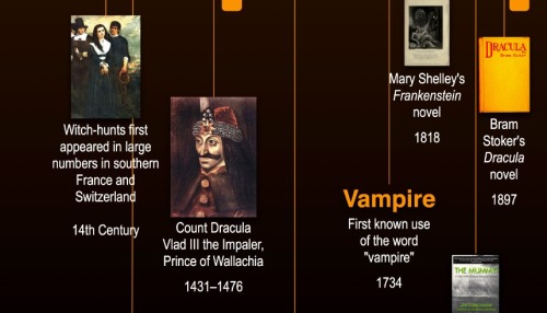
Ghosts, werewolves and witches have a long history.  It’s not until much more recent times that many of the other monsters we relate to Halloween appear.  Count Dracula, vampires, Dr. Frankenstein’s monster, The Mummy, Jason and all of the horror movie villains appear in the last 300 years.


My time to complete this project was short, but I believe I captured the most critical events in history.  Wouldn’t this make a great poster?

A big thanks to Erick and the team at FrightCatalog.com

Friday
Oct082010

Client Infographic: Tech Upgrades for Geeks

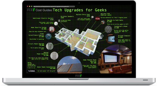
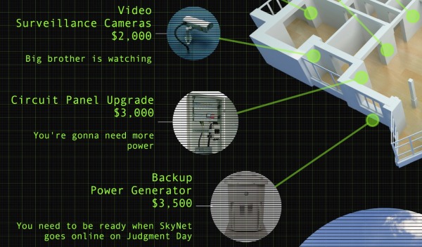
A new infographic for Fixr.com designed by InfoNewt (my company), the Tech Upgrades for Geeks looks at a handful of home improvements that anyone can do to their house to upgrade their technology quotient.  Upgrades range from small ($100) to large ($82,000), and the images surrounding the floor plan are sized appropriately.


Most of the data comes from the Fixr.com Cost Guides, but some of the projects can be DIY, so the costs are just for parts (like the keyless entry pads).  

A big thanks to Raul, Andres and everyone at Fixr.com 

…excuse me while I go setup Good Eats in the kitchen.

Thursday
Sep232010

Client Infographic: The Good News for Online Degrees


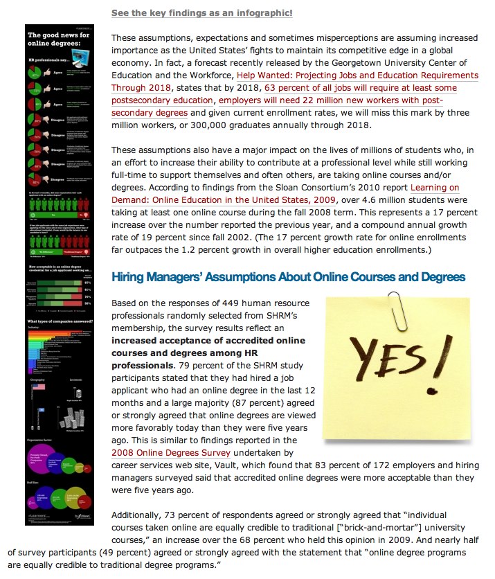
Good News for Online Degrees is a recent project InfoNewt (my company) designed for elearners.com to visualize the results of a survey of Human Resources professionals worldwide.

The results are good, as online degrees continue to gain credibility and popularity.  Designed as a companion infographic to the article “How Employers View Online Degrees” on the elearners.com website, the visual not only supports the article, but also stands on its own for posting on blogs.

I used a blend of pie charts, bar charts, circles and images to tell a story as you move down the visual.  The different visuals help separate the different questions that were asked in the survey, but always include the actual numbers as well.  For survey results, you want to be as transparent as possible by citing the source material, repeating the questions that were asked and using specific numbers to validate your visuals.

Personally, the most interesting results are in the stacked bar chart in the middle.  Online degrees have dramatically different levels of acceptance based on what level of role the applicant is applying for.

Available as a high-resolution GIF and PDF from the elearners.com site.

Cheers to Helen and everyone at elearners.com!

Thursday
Aug262010

Client Infographic: Beware Work-At-Home Scams!

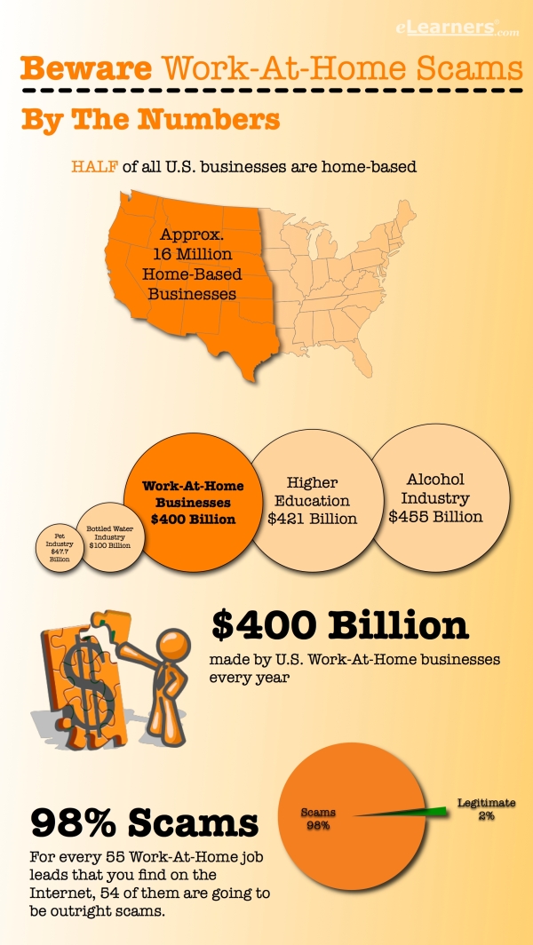
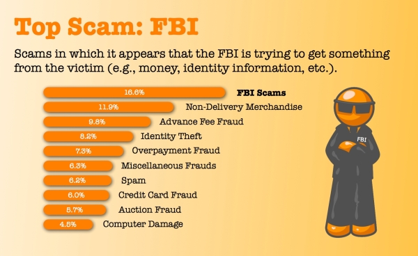
Beware Work-At-Home Scams is a recent project InfoNewt (my company) designed for elearners.com to visualize how prolific work-at-home scams are, which jobs to avoid and how individuals can protect themselves.

The data is actually fairly difficult to find and very dry.  I had to read through a number of reports from the FTC, the SBA, the IC3 (I had never heard of the Internet Crime Complaint Center!) and other news reports.  Even after reading through those reports, there was very little hard data.  To create the infographic, I needed to use the figure of Orange Man as a character figure to help visualize the information.


Done in OmniGraffle, I think the topic was a perfect example of when an infographic is really useful.  Information that is incredibly difficult for consumers to find (let alone understand), so it wouldn’t normally reach the general public.

Feedback?

You can help Digg It! 

Page 1 ... 1 2 3 4 5