About
Randy Krum
President of InfoNewt.
Data Visualization and Infographic Design

Infographic Design

Infographics Design | Presentations
Consulting | Data Visualizations

DFW DataViz Meetup

Join the DFW Data Visualization and Infographics Meetup Group if you're in the Dallas/Fort Worth area!

Search the Cool Infographics site

Custom Search

Subscriptions:


Feedburner

The Cool Infographics® Gallery:

How to add the
Cool Infographics button to your:

Cool Infographics iOS icon

- iPhone
- iPad
- iPod Touch


Read on Flipboard for iPad and iPhone

Featured in the Tech & Science category

Flipboard icon

Twitter Feed
From the Bookstore

Caffeine Poster

The Caffeine Poster infographic

Entries in client (45)

Thursday
Nov012012

Finding the Productivity Sweet Spot at Work

Finding the Productivity Sweet Spot infographic


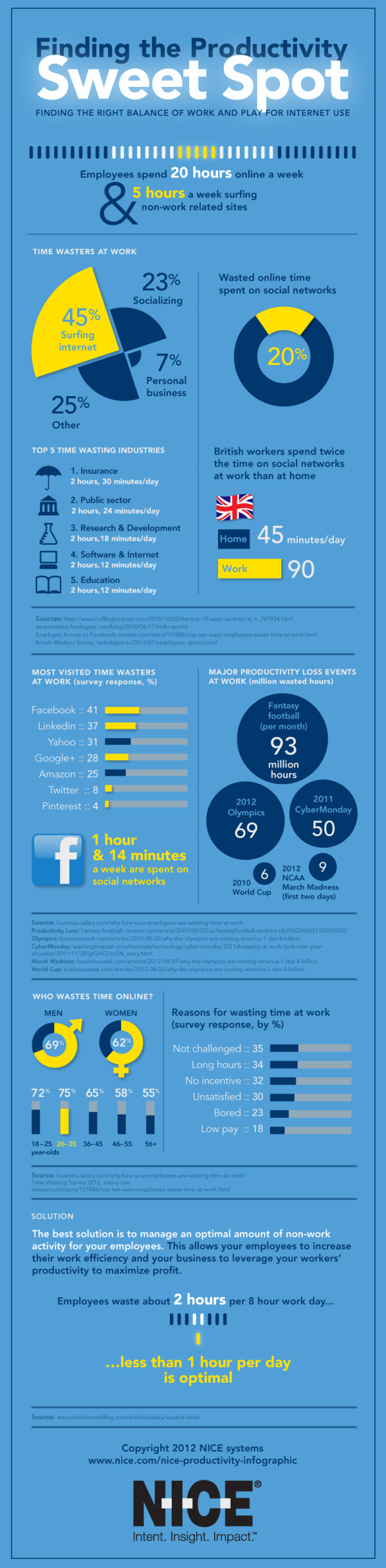
The Finding the Productivity Sweet Spot infographic from NICE.com takes a close look at how employees waste their time online at work, but offers a better solution to manage employee productivity.  Don’t cut off Internet to your employees!  Instead, manage their personal time online to a reasonable level and everyone wins!

Everyone wastes a bit of time at work, and some of the key sources may surprise you. It’s not just the internet that can cost employers time at work. Read our infographic on time wasting at work to understand if fantasy football or facebook causes us to procrastinate more.

There is an ideal balance of non-work activity that keeps people refeshed and employees engaged. It’s just unrealistic to expect 100% efficiency through the day. Distractions at work existed before the Internet. The key for companies is to manage these time wasters at work to an ideal level. 

Designed by InfoNewt, the infographic walks the reader through a 3-part story…


  1. How much time is being wasted at work?
  2. What are employees doing during this wasted time?
  3. What’s the ideal amount of time to let employees have personal time online?


 Big thanks to the team at NICE!

Monday
Oct012012

Honda Accord: 30 Years of U.S. Production

Honda Accord 30 Years of American Craftmanship infographic

Honda Accord: 30 Years of American Craftmanship is a large infographic from Honda America that was released as part of the release of the new 2013 model design of the Honda Accord in August.  Designed by Jeremy Yingling with InfoNewt (my company) this is a very brand specific, marketing-style infographic.

IN 2012, HONDA WILL MARK 30 YEARS OF ACCORD PRODUCTION IN THE UNITED STATES.

The first Japanese nameplate manufactured in the U.S., the second-generation Accord first rolled off the Marysville, Ohio assembly line in November of 1982. In the 30 years since, more than nine million U.S.-built1 Accords have helped define American manufacturing craftsmanship. The all-new 2013 Honda Accord will once again redefine space efficiency and driving joy in the midsize class, signaling the start of Honda’s next three-decade chapter of building the Accord in America. 

The 2013 model becomes the ninth major design generation of the Accord.  This gave us the opportunity to highlight differences each major model design has brought to the Accord over the last 30 years.  The design visualizes the major technical specifications, the major advancements included in the Accord and shows the multi-year periods that each design generation was available.  The eye-catching color-waterfall shows the available exterior colors available for every model year, and the milestones along the left-side of the design show the progression to reach a cumulative total over 9 million Accords produced in 2012 coming out of the manufacturing plant in Marysville, OH.

Honda has done a great job of utilizing this one infographic design in a handful of different ways.  The infographic was initially used as 9’ banners at the Honda press events, and included in the press kits provided to everyone invited to attend.  Honda has now released the infographic online on the Honda News page on Flickr, making the design available to everyone.

Wednesday
Sep192012

Sip Statistics 2012

Sip Statistics 2012 infographic

A great way to wrap up the summer, the Sip Statistics infographic was a joint design project with Hotels.comTGIFriday’s and InfoNewt (my company).

The Hotels.com® Sip StatisticsTM uses data from T.G.I. Friday’s to help travelers do as the locals do and follow their drink-clinations by identifying favorite drinks in popular cities. T.G.I. Friday’s has also provided cool new summer drink recipes below to keep that summer feeling going all year round. 

The design combines Hotels.com Average Daily Room Rate information from the top U.S. cities with the geographic popularity of TGIFriday’s top summer drinks in those same cities.  A fun, engaging way to share some internal information only available from these two companies.

The room rates are clearly compared in rank order with the bar graph linked to the map locations, and the most popular drinks are also shown in rank order for each city using both unique drink galss icons and color coding.  The icons and color coding are carried down the design to the recipe section, where the drink content proportions are shown with a pie chart visualization.

Thanks to the teams at both Hotels.com and TGIFriday’s!

Monday
Aug272012

The Visual History of Swimwear

The History of Swimwear Swimsuits infographic by Backyard Ocean

The History of Swimwear infographic is a visual timeline from Backyard Ocean that shows the evolution of the swimsuit over the last 150 years.

The swimsuit: a symbol of stylish summer fun. Parade it on the beach or in the privacy of your above ground pool at home. Swimwear’s history has grown from cavemen furs to science fiction fancies. Artsy, classy, conservative or sexy, the swimsuit is an icon of summer style and fashion. Backyard Ocean takes a breath from swimming to see just how the swimsuit has changed through time. CLICK on the image to enlarge!

The History of Swimwear Swimsuits infographic by Backyard Ocean

This is a design by Jeremy Yingling with InfoNewt (my company).  Each model on the timeline has an illustration showing off the fashions, and represents either a new suit design or a famous example from TV & movies.  My favorite part is the associated pie chart visualizing the amount of skin coverage for each swimsuit (or lack thereof).

The design also plots the amount of skin coverage over time, the evolution of the “thong” and how skin exposure does not automatically equate to higher sex appeal.

Thanks to the team at Backyard Ocean! 

Friday
Aug172012

The Awesome Tower of Beer!

Roth IRA The Awesome Tower of Beer infographic


The High Life in a new infographic from RothIRA.com that visualizes the awesome tower of beer you could buy if you were to save just $1 per day starting at age 25.

Getting older has its benefits—how about all the beer you can drink? All it takes is a dollar a day (and a really, really large fridge).

Want to learn more about a Roth IRA?

Designed by InfoNewt (my company), this design follows the strategy of telling one story really well.  There are hundreds of charts online showing the power of compound interest and why people should invest early for retirement.  We took a different approach to put the power of those savings into terms that young adults are more likely to relate to…BEER!

Thanks to the team at RothIRA.com for being great to work with!

Tuesday
Aug142012

The Lifespan of Storage Media

Crashplan has just released The Lifespan of Storage Media, a comprehensive guide to how long your data will last.  Designed by Mike Wirth with InfoNewt, this infographic compares the expected lifespans of popular media types used over the last 100 years to save different kinds of information: computer data, photos, videos and audio.  Do your 8-tracks still play?

As each new form of data storage comes on the scene, the market is at first enamored with its compactness, convenience and hoped-for data longevity. But invariably, the reality of physical vulnerability and a limited lifespan remains. Eventually, all media fails, but Cloud backup is forever.

This was a fantastic project to work on, and the data research was the most challenging piece.  We had to find data to support both an average expected life and an extended “with extreme care” life.  We certainly found some contradictory data sources, and ultimately used data we felt was the most commonly accepted in the industry.

Do you have old computer backups burned to CDs, tapes or even hard drives on your shelf?  Don’t count on being able to read the data from them too much longer!  The short lifespan for many of these types of media that people use everyday to archive their personal photos and videos was most surprising.

Thanks to the team at Crashplan for a great project!

Friday
Jun292012

The Massive Challenge of Search Engine Complexity

Search Engine Complexity Infographic
Courtesy Stone Temple Consulting

The complexity of generating Search results online is HUGE.  The What’s So Hard About Search? infographic from SEO expert Eric Enge at Stone Temple Consulting takes a look at the massive numbers involved with indexing and searching the Web.

Building a search engine is a very complex task. I often find myself trying to justify to people why it is that search engines can’t understand their site. They seem fixated on believing that a search engine should understand it if a human can understand it. The short answer is that with an infinite amount of time the search engine could, but the scale of the Internet makes it oh so VERY hard.

The infographic below tries to give you some sense of the scale of the problem. Please note that a few numbers are hard to truly pin down, but I pulled them from the best sources I could. For example, no one really knows how many pages there are on the web, though Majestic SEO is aware of 3.7 trillion (the number I used) or the average web page size.

Regardless, the message is the same either way. The web is a really complex place!

Designed by InfoNewt, the design gathers data from a number of different sources to put together the picture of complexity.  Combining the number of web pages, the average number of links on each web page, the amount of data online and the number of searches every minute, you begin to understand the scale of the challenge search engines face.

This design takes a different approach by citing each data source along with it’s visualization instead of gathering them all at the bottom.  I think it works well with this many different data sources, and is easier for the readers to understand where each part of the data comes from.  All of the key elements are included at the bottom: copyright, brand logo and the URL to the infographic landing page so readers can always find the original (even when blogs repost it without linking or using the embed code).

I just have to say “Cheers!” to the developer teams that tackle this problem every day.  The scope of this challenge will only get bigger in the future!

Thanks to Eric and the team at Stone Temple for being great to work with!

Tuesday
Jun262012

Client: Avoid the Dip from IPO Lockups

Wealthfront Lockup Avoid the Dip infographic

Avoid the Dip: The Effect of Lockup on Stock Price is a new infographic InfoNewt designed for Wealthfront.

A flood tide of shares is hitting the market in May and June, as a number of the high-profile tech IPOs from the fall emerge from lockup periods, including Jive Software (JIVE), Zynga (ZNGA) and Angie’s List (ANGI).

If you’re one of the employees of the 28 companies whose lockups are expiring in May or June, you’re wondering how to diversify your portfolio and when to sell.

Here’s our research on the question of what to do in the days immediately following the lockup expiration, presented visually to help you see the dip that typically follows the end of the lockup.*

As valuable financial information to many employees of the tech companies going IPO this year, Wealthfront looked back at 254 prior technology company IPOs to chart “The Dip” that consistently have a price dip the first day after the Lockup ends.

Don’t understand what a Lockup is?  That’s explained in the infographic as well.

Thanks to the team at Wealthfront!

Thursday
Jun212012

Kelly Slater: Greatest Athlete of All Time?

Quiksilver - Kelly Slater Infographic

Kelly Slater: Greatest Athlete of All Time? is a design collaboration between InfoNewt (my company) and the design team at Quiksilver.

It is common knowledge among our tribe that June 20th is recognized as International Surfing Day so who better to celebrate then Kelly Slater, 11X ASP World Champion. In the spirit of ISD, we’ve created an Infographic comparing Slater to athletes from traditional sports who have made history and measured their achievements to our Champ’s. Have a look and decide for yourself if Slater truly is “The Greatest Athlete of All Time”.

Do you think Kelly Slater is “The Greatest Athlete of All Time”? If yes, share this with your friends and get ready for summer with a pair of Kelly’s Cypher Nomad Boardshorts.

Of course it’s difficult to compare athletes from different sports, but Kelly Slater’s surfing achievements are truly impressive.  Despite being both the youngest and the oldest to win the ASP World Champion title, holding three Guinness World Records, winning 11 Would Tour Championships and winning events in 11 different countries, Kelly Slater has never been on the cover of Sports Illustrated.  :(

Here are some of the design aspects that this infographic gets right:

  • The key message is communicated within the first couple of seconds.  Even if a reader doesn’t read the whole infographic, they will leave understanding the key message.
  • Visually appealling with vivid, colorful images, but still easy to read top-to-bottom.
  • Intergrated the visual brand style of Quiksilver using photos, with the data visualizations about his career.
  • Good mix of different data visualization styles that are unique to the data they communicate
  • The key parts at the bottom are all there.  Data sources, brand logo, copyright statement and the URL to the original, full-size infographic.

The data for this design was the key challenge, and finding similar titles or awards in the other sports inspires discussion and debate among readers of the infographic.  Whether it’s on Facebook, Twitter or blog comments, this design draws in readers and invites everyone to share their own opinion.

Check out the full-size infographic HERE, and you can voice your own opinion about Kelly Slater in the comments below.

Thanks to the team at Quiksilver for being fantastic to work with!

Monday
Jun182012

Client Infographic: U.S. Motorcycle Helmet Laws

Client Infographic U.S. Motorcycle Helmet Laws

This was a fun project to work on.  The Helmet Laws infographic is a visual reference for all motorcycle riders of the state-by-state helmet laws in the U.S., and also includes a few fact about the states with the highest fines and longest jail time as punishment for breaking those laws.  It’s a light-hearted design meant to make the complex mix of legal requirements easier to understand, because often riders don’t take the time to understand the laws as they cross state borders.

We are actively pursuing lawsuits for injured Michigan motorcyclists and wanted to create an infographic that would be a great resource for riders! The Helmet Laws infographic also displays which states have the highest fines and maximum jail time for violating their helmet law. You should share this infographic with other avid bikers who may be taking a ride across state lines

Only three states have no helmet laws at all (Iowa, Illinois and New Hampshire), and 20 states have strict, mandatory helmet laws.  The remaining 28 states fall somewhere in between (Total of 51 because the District of Columbia is included).

Client Infographic U.S. Motorcycle Helmet Laws Wallet Card

FREE Wallet Cards!  (No longer available)


As an added bonus, small wallet-size card (like a credit card) were printed by Buckfire Law that show just the map visualization and are available FREE to anyone that requests them!  These are meant for any motorcycle rider in the country to carry as a quick reference guide while riding.  You can find the instructions to request a free card on the Motorcycle page of the Buckfire site.  Scroll down past the infographic on their site and you’ll find the link to the online form.  Fill it out, and they will mail one to you for free, so share with anyone you know that rides.

Client Infographic U.S. Motorcycle Helmet Laws Wallet Card Photo

InfoNewt worked with Buckfire & Buckfire Law to develop the design and the wallet card program.  Thanks to the team at Buckfire for being great to work with!