About
Randy Krum
President of InfoNewt.
Data Visualization and Infographic Design

Infographic Design

Infographics Design | Presentations
Consulting | Data Visualizations

DFW DataViz Meetup

Join the DFW Data Visualization and Infographics Meetup Group if you're in the Dallas/Fort Worth area!

Search the Cool Infographics site

Custom Search

Subscriptions:


Feedburner

The Cool Infographics® Gallery:

How to add the
Cool Infographics button to your:

Cool Infographics iOS icon

- iPhone
- iPad
- iPod Touch


Read on Flipboard for iPad and iPhone

Featured in the Tech & Science category

Flipboard icon

Twitter Feed
From the Bookstore

Caffeine Poster

The Caffeine Poster infographic

Entries in code (5)

Monday
Apr032017

The Data Visualization Toolkit signed book giveaway

For the April Giveaway, I have a signed copy of the Data Visualization Toolkit by Barrett Clark.  Register on the Giveaways Page by April 30th to be entered. 

From Amazon:
Data Visualization Toolkit is your hands-on, practical, and holistic guide to the art of visualizing data. You’ll learn how to use Rails, jQuery, D3, Leaflet, PostgreSQL, and PostGIS together, creating beautiful visualizations and maps that give your data a voice and to make it “dance.”
 
Barrett Clark teaches through real-world problems and examples developed specifically to illuminate every technique you need to generate stunningly effective visualizations. You’ll move from the absolute basics toward deep dives, mastering diverse visualizations and discovering when to use each. Along the way, you’ll build three start-to-finish visualization applications, using actual real estate, weather, and travel datasets.
 
Clark addresses every component of data visualization: your data, database, application server, visualization libraries, and more. He explains data transformations; presents expert techniques in JavaScript, Ruby, and SQL; and illuminates key concepts associated with both descriptive statistics and geospatial data. Throughout, everything is aimed at one goal: to help you cut through the clutter and let your data tell all it can.

Barrett recently gave a talk called "Making Data Dance" at the DFW DataViz Meetup event, and I had a chance to ask him a few quesitons:

What does it mean to make your data "Dance”?

Barrett Clark: I think data wants to tell a story. Our job is to figure out what that story is and how to best present it. Seeing the data in a visual way can make it come to life and dance.


Who is the book written for?

Barrett Clark: Data Visualization Toolkit focuses on looking at data from the perspective of a web developer. More specifically, I speak from the perspective of a developer writing Ruby on Rails apps. There is a fair amount of JavaScript and SQL throughout the book, and I try to explain what I am doing throughout the text. My goal was to make a book that is accessible to anyone while still giving more experienced developers something valuable.


Can readers get all of the data and code you reference in the book?

Barrett Clark: Absolutely! There are 3 different applications that readers will build throughout the book. The code and data for the applications are available on GitHub at http://DataVisualizationToolkit.com. I also have checkpoints throughout the text where you can see what the application should look like at that point. Those are enumerated in the README for each application.


Why do you prefer PostgreSQL as your database platform of choice?

Barrett Clark: I have worked with several databases. PostgreSQL, or Postgres as it is often called, is by far my favorite. It is a robust database that is easy to use, has a wide array of functions and data types, and is also extendable. You can easily add to the functionality of a Postgres database with an extension. In fact, the core database ships with dozens of extensions that you don't need to install. PostGIS, which allows you to store geospatial data and perform geospatial queries, is one of my favorite extensions.


Why is the database and transforming your data before your create the visualizations so important?

Barrett Clark: I have seen very few data sets where you can take data directly from the database into a chart -- especially with transactional data. You can perform the data transformations in the database using SQL, in the application server using the application's prorgamming language, or in the browser using JavaScript. Databases are really good at dealing with data, so I encourage people to not be afraid to write SQL to pull out the data in the format that you need it.


What are the challenges for visualizing data on websites?

Barrett Clark: Speed. When you have a lot of data you need to be thoughtful about how quickly you can get the data and display it in a meaningful way. This may require some additional setup to store data for reporting in a separate format so that you don't have to do the transformations in real time. Another challenge is that you have no control over the end user's viewing experience. Something that you think looks brilliant on your laptop may look awful on someone else's screen.


What’s different about visualizing geospatial data?

Barrett Clark: Geospatial data is a lot of fun! When you add location to the mix you open up a whole new arena of things that you can do visually with your data, and questions that you can ask of the data. I love maps. I take readers through the creation of one of my favorite types of map -- the choropleth. That's where you color areas (counties, states, etc) in a map based on the data.


Are your visualizations mostly static or interactive data visualizations?

Barrett Clark: There are some mouseover effects in my visualizations that help add more context to the graph or highlight something.


What are your thoughts on D3.js and its future?

Barrett Clark: I love D3, and I also love what Mike Bostock has done to build such a deep assortment of examples. Between the examples and the documentation I find D3 really fun to work with. The library is also very actively maintained. As soon as I shipped Data Visualization Toolkit a new version of D3 dropped. There are branches in all 3 sample project repositories on GitHub with the updates required for D3v4.


Are you speaking at any upcoming presentations or webinars?

Barrett Clark: In the past few months I've spoken at PGConf Silicon Valley in San Francisco and RubyConf Australia in Melbourne. I'll be taking a break from travel for a bit and focusing on local meetups. I try to get out to the Dallas Ruby meetups whenever possible.


What’s the best place to follow you online?

Barrett Clark: I'm @barrettclark on Twitter.

Monday
Feb202017

Millions of Lines of Code

Codebases: Millions of Lines of Code infographic

Codebases: Millions of Lines of Code is another great infographic from David McCandless and Information Is Beautiful showing the massive complexity of today's modern apps and programs.

Is a million lines of code a lot? How many lines are there in Windows? Facebook? iPhone apps?

Great use of the matrix of squares to represent scale. I do think the users can lose their perception of scale when the section changes jump different values. If it was always a factor of 10, that would be clearer.

Monday
Jul132015

A Brief History of Open Source Code

A Brief History of Open Source Code infographic

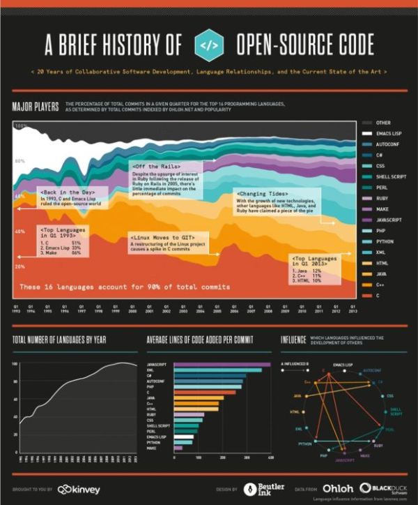
Learn about the last 20 years of collaborative software development, language relationships, and the current state of the art with A Brief History of Open Source Code infographic. Kinvey, a company that helps its clients create mobile apps, published the infographic designed by Beutler Ink back in 2013. For more in-depth reading, check out this article at Read Write.

We were able to visualize the percentage of total commits in a given quarter for the top 16 programming languages from 1993 until today. We hope you’ll find this image—a provocative pattern of dips and spikes—to be as interesting as we do. It truly shows how dynamic the world of programming is. We’ve also included a few graphs on other interesting data points: total number of languages by year, average lines of code per commit, and tracking which languages influenced the development of others.

There is good use of colors and charts to tell the story of the 16 different source code languages. No numbers were needed to show the popularity of each language, only distances between the colors. The colors are similar, but not to the point where we would have trouble telling them apart. I like the gradual color gradient in the infographic. Too many different colors would make the graphic look too busy.  

Found on http://readwrite.com

Thursday
Jul092015

How to Pick Your First Programming Language

How to Pick Your First Programming Language infographic

Udacity presents, How to Pick Your First Programming Language infographic. Your decision depends a lot on where and the job you are aiming for. Check out the graphic for some tips.

If you haven’t picked your first programming language, the programming world is your oyster. Yet with evangelists for every language telling you their language is the best, choosing one to start with can be incredibly overwhelming. We’ve looked at the data for the top ten programming languages in the US (based on IEEE Spectrum data) to help you pick the best language to start with based on your priorities in lifestyle, location, and career potential.

Python is a popular, well-paid language, being versatile enough to be used in many different applications, while Javascript is used widely across the country, and can be a good choice if you don’t want to relocate for a job. Although some newer programming languages, such as Swift, are not included, you shouldn’t discount the growth of their popularity. Career opportunities in iOS development using Swift, similar to Android development using Java, will increase as the field of mobile app development continues to expand.

There are many factors involved in choosing your first programming language. This data can help you figure out what works for you.

Good rundown of the stats behind the programming language careers. I'm not sure that Google searches in the best gauge of language popularity. Maybe something like number of projects on GitHub might have worked better.

The footer should include the URL back to the original infographic landing page, not just the main front page for Udacity.

Thanks to Lindsay for sending in the link!

Tuesday
Feb112014

The "Perfectly Optimized" Page

 The Perfectly Optimized Page infographic

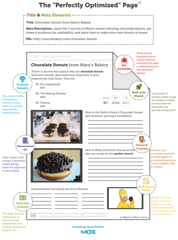
The “Perfectly Optimized” Page infographic states that there is no such thing as a “Perfect Page”. But don’t be discouraged! Moz.com presents 3 key points to be followed to increase user happiness and outreach.

One important takeaway from this post should be that modern on-page SEO is about juggling competing priorities. In general, my recommended ordering of those priorities is as follows:

  1. Create a page that is uniquely valuable to your targeted searchers.
  2. If at all possible, make the page likely to earn links and shares naturally (without needing to build links or prod people).
  3. Balance keyword targeting with usability and user experience, but never ignore the critical elements like page titles, headlines, and body content at the least.

There’s no such thing as a “perfectly optimized” page, but I took a stab at drawing up the mythical beast anyway.

Over time, what’s “perfect” might change, and new services, platforms, and areas of optimizational opportunity could arise. But for the past few years (notwithstanding some newer tactics like Google’s rel=author), the model described in this post has held relatively stable. The “O” in SEO is getting broader, and I think that’s a wonderful thing for marketers of all stripes. Targeting an algorithm instead of people is far worse than hitting both birds with the same handful of optimization stones.

This is a great us of infographics and data visualziations as part of a larger article.  The infographics can stand on their own and be shared online, but also fit inn perfectly with the text article.  This specific design is more of a blueprint diagram without showing and data, but has been very popular by itself.

Found on Hubspot.com and Hombrehormiga1