About
Randy Krum
President of InfoNewt.
Data Visualization and Infographic Design

Infographic Design

Infographics Design | Presentations
Consulting | Data Visualizations

DFW DataViz Meetup

Join the DFW Data Visualization and Infographics Meetup Group if you're in the Dallas/Fort Worth area!

Search the Cool Infographics site

Custom Search

Subscriptions:


Feedburner

The Cool Infographics® Gallery:

How to add the
Cool Infographics button to your:

Cool Infographics iOS icon

- iPhone
- iPad
- iPod Touch


Read on Flipboard for iPad and iPhone

Featured in the Tech & Science category

Flipboard icon

Twitter Feed
From the Bookstore

Caffeine Poster

The Caffeine Poster infographic

Entries in company (5)

Thursday
Jan112018

Abita Beer Release Calendar 2018

Abita Beer Release Calendar 2018

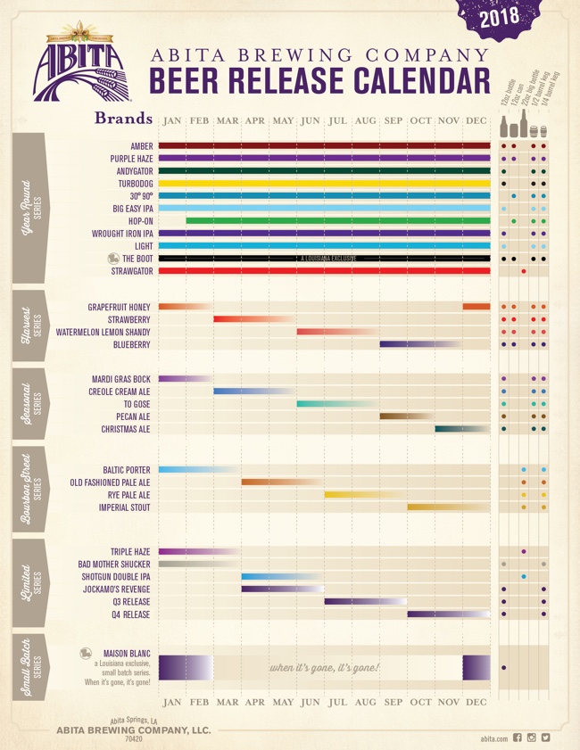
In case you're not familiar with Abita Beers, it's a fantastic brewery out of Louisiana. In addition to a core set of beers, they make a number of seasonal brews that are only available certain times of the year. This visual Beer Release Calendar is your visual guide to when you favorite brews are in season!

The new year is here and we're looking forward to another great year of brews! We've been hard at work behind the scenes planning for 2018 and wanted to share some of what we've been working on. Our 2018 Beer Release Calendar is everything we'll be releasing and boiled down to one single sheet. It's our brew bible! Of course, most of your favorites are back, but as you'll see we're bringing some beers you might recognize out of retirement and releasing a ton of new beers. In all, we'll brew and package 31 beers in 2018 and that's not counting the tons of beers we'll be experimenting with and releasing on our pilot system here at the brewery.

I really like this design. The colors come from the individual beer labels, and I appreciate the additional visualization of the available sizes. I appreciate the repeated guide to the monthly column at the bottom. The cursive font, rotated 90° is hard to read.

The gradient bars are a nice touch since those brews don't have a hard end date, they're only available until supply runs out. It looks like the designer accidentally left a few of those as gradient to white instead of gradient to the background tan color.

Friday
Feb032017

The Evolution of Technology Company Logos

The Evolution of Technology Company Logos infographic

Logos are very important for a company's image, it needs to be simple and memorable. The Evolution of Technology Company Logos infographic from Vizion Online shows a few companies that have very recognizable logos. As you can see, even the professionals tweak their logos often to get the desired look and feel.

Here we have a good looking infographic that we have designed providing information about how technology company logos have evolved over the years. Check out logo evolution for companies such as Amazon, AT&T, Canon, Dell and more by viewing this logo design piece.

We hope that you enjoy this tech company logo infographic and please share it out with your friends on social media or feel free to publish it on your blog or website.

Thanks to the Picture Superiority Effect, people at more likely to remember the company logo than the company name. I talk about this in Chapter 1 of the Cool Infographics book, called the Science of Infographics. You can download an excerpt of that chapter for free HERE!

Thanks to David for sending in the link!

Thursday
Dec242015

The Logistics of Santa Claus

The Logistics of Santa Claus infographic

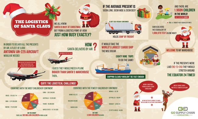
The Logistics of Santa Claus infographic from Go Supply Chain takes a fun look at what it would take for a modern shipping company to achieve the magic deliveries that Santa makes every year.

Ever wondered how Santa Claus does it all?  In the festive spirit our logistics consultants decided to investigate.  This fun infographic explores the options (besides Santa's sleigh) that could be used. We hope that you enjoy this infographic.

A good content strategy is to tie your business in with a holiday or major event. This keep the topic relevant to your business and entertaining to your audience.

However, this design has a few major flaws! First, the pie charts are both bad. They add up to 173% and 167%, which is just bad data visualization design. Pie charts MUST always add up to a grand total of 100%. If we assume the data is correct, this type of data should never have been visualized as a pie chart.

Second, a number of the statistics are shown in text only. This misses the biggest advantage of infographics, which is an opportunity to visualize data for your audience. If you're not going to visualize the data, you might as well just post a text article instead.

Third, where are the data sources? Where is the copyright or Creative Commons license? Where is the URL to the company website and the infographic landing page?

Fourth, I can't find the full-size original online anywhere. It was posted on their blog at a smaller size which makes some of the text very hard to read. Their post should have linked to the full-size version.

This is a fun, engaging topic, but the infographic execution fall short.

Thanks to David for sending in the link.


Thursday
Jan292015

The Salesforce Economy

The Salesforce Economy infographic

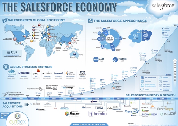
The Salesforce Economy infographic created by Outbox Systems is an overview of where the company is today and a little history on how it came to be.

Salesforce is a global powerhouse.  This infographic displays the Salesforce economy, including the company’s growth, global reach, timeline and more.

This design is a great visual summary of the corporate history of Salesforce. Revenue growth, global presence, acquisitions, strategic partners and an overview of apps. EDIT: You can download the high-resolution PDF version on their landing page.

The overall design is pushing the Fair Use of the Salesforce trademark pretty far. One of the trademark infringement tests is the “possibility for confusion”, and I wouldn’t be surprised if some readers walk away thinking this is an official infographic put out by Salesforce instead of Outbox.

Thanks to Darren for sending in the link!

Thursday
Apr102014

3 Common Time Wasters at Work

3 Common Time Wasters at Work infographic

Do you feel like your employees are slacking? The 3 Common Time Wasters at Work infographic from Biz 3.0 points out the time wasting problems so that you can target them and create a more efficient work day.

No business can afford to have wasted time at work, especially when growth and profitability is directly tied to how productive your employees are. So check out our new infographic that identifies the top three reasons why people waste their time at work, so that you can find possible solutions to eliminating them. 

Great data with fun illustrations that engage the audience.  Great topic for a productivity software company.  The design is informative and will appeal to a broad audience, while being directly related to their product.

However, with all of the number values shown in circles, very few of them are visualized.  For the percentages, the circles could at least have been doughnut charts coloring only the appropriate portion of the circumference.  A good infographic design is supposed to make the data meaningful and relevant to the audience.  This helps them better understand the data, and you have to visualize the information to make that work.

Thanks to John for sending in the link!