About
Randy Krum
President of InfoNewt.
Data Visualization and Infographic Design

Infographic Design

Infographics Design | Presentations
Consulting | Data Visualizations

DFW DataViz Meetup

Join the DFW Data Visualization and Infographics Meetup Group if you're in the Dallas/Fort Worth area!

Search the Cool Infographics site

Custom Search

Subscriptions:


Feedburner

The Cool Infographics® Gallery:

How to add the
Cool Infographics button to your:

Cool Infographics iOS icon

- iPhone
- iPad
- iPod Touch


Read on Flipboard for iPad and iPhone

Featured in the Tech & Science category

Flipboard icon

Twitter Feed
From the Bookstore

Caffeine Poster

The Caffeine Poster infographic

Entries in memory (2)

Friday
Feb032017

The Evolution of Technology Company Logos

The Evolution of Technology Company Logos infographic

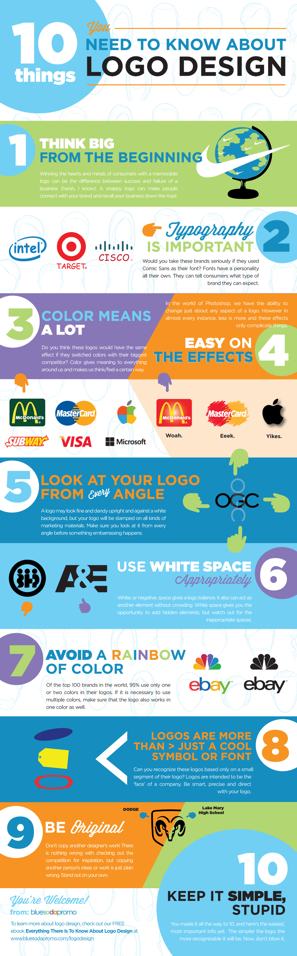
Logos are very important for a company's image, it needs to be simple and memorable. The Evolution of Technology Company Logos infographic from Vizion Online shows a few companies that have very recognizable logos. As you can see, even the professionals tweak their logos often to get the desired look and feel.

Here we have a good looking infographic that we have designed providing information about how technology company logos have evolved over the years. Check out logo evolution for companies such as Amazon, AT&T, Canon, Dell and more by viewing this logo design piece.

We hope that you enjoy this tech company logo infographic and please share it out with your friends on social media or feel free to publish it on your blog or website.

Thanks to the Picture Superiority Effect, people at more likely to remember the company logo than the company name. I talk about this in Chapter 1 of the Cool Infographics book, called the Science of Infographics. You can download an excerpt of that chapter for free HERE!

Thanks to David for sending in the link!

Wednesday
Dec022015

10 Things You Need to Know About Logo Design

10 Things You Need to Know About Logo Design infographic

Logos are more than just a stamp on a page, they embody the whole meaning behind your product. The 10 Things You Need to Know About Logo Design infographic from Blue Soda Promo wants to make sure that you make the best decision when choosing your design.

“People are more likely to remember the company logo, an illustration representing the company, than the actual name of the company. When it comes to purchase decisions, consumers are more likely to buy products from familiar companies. When buyers are in a store looking at products on the shelf, they are more likely to choose the products from companies they recognize, and logos are more likely to be remembered. Companies know this, and are very careful to design their product packaging to clearly show the company or brand logo.”

*Excerpt From: Randy Krum. “Cool Infographics.” - bit.ly/CoolInfoBook

There is a nice comical feeling to the infographic that is consistent throughout. It is good to keep consistency when designing all parts of an infographic.

Nike’s swoosh, McDonalds’s golden’s arches, and Apple’s bitten fruit all have one thing in common…

Well, that’s not exactly true as you’ll find out later in this post.

However! What they do share is the overarching success their logos have had on the world. People no longer need to be told what their logos represent. When their logos are stamped on something they have certain consumer expectations attached to it. Their logos became their own company’s spokespeople, while their products continue to prove their worth.

Examples are key for this kind of topic. People will understand the importance of the points better when the examples are clear and easy to recognize. It also helps reinforce the idea that a logo embodies the personality of the company. When the author changes one of the logos we are familiar with, it just doesn't feel right!

Thanks to Matt for sending in the link!