About
Randy Krum
President of InfoNewt.
Data Visualization and Infographic Design

Infographic Design

Infographics Design | Presentations
Consulting | Data Visualizations

DFW DataViz Meetup

Join the DFW Data Visualization and Infographics Meetup Group if you're in the Dallas/Fort Worth area!

Search the Cool Infographics site

Custom Search

Subscriptions:


Feedburner

The Cool Infographics® Gallery:

How to add the
Cool Infographics button to your:

Cool Infographics iOS icon

- iPhone
- iPad
- iPod Touch


Read on Flipboard for iPad and iPhone

Featured in the Tech & Science category

Flipboard icon

Twitter Feed
From the Bookstore

Caffeine Poster

The Caffeine Poster infographic

Entries in food (83)

Monday
Dec172012

Eat Like A Caveman With The Paleo Diet

Eat Like A Caveman With The Paleo Diet infographic

The Paleo Diet infographic from DrVita.com shows readers what it would take to eat like a caveman!

For those of you who keep asking yourself, “is there a diet that is right for me?” There are hundreds of diets to pick and choose from. One popular diet is Paleo. Below is Paleo in a nutshell.

The paleo diet, sometimes referred to the caveman diet is based on the diet of ancient humans. Getting nutrients from vegetables, fruits, nuts, seeds, meats, and fish, this diet helps you achieve a healthy and nutritious diet. This infographic helps you understand why the paelo diet is healthy, what foods to eat and avoid, and how it works. Give it a try and see if this diet is right for you.

The design is a good, short explanation of the Paleo Diet, and what it would take eat only natural foods like our ancestors.  Intuitively it makes sense, since processed foods and grains are a relatively recent discovery in the history of mankind.

Mostly just a visual explanation, there are a couple statistics included that would have have been better if they had been represented as data visualizations.  The footer should include both a copyright statement and the URL directly to the original, full-size infographic so readers can find the high-resolution version.

Thanks to Mat for sending in the linK!

Friday
Nov022012

How to Travel Like a President

How to Travel like a President infographic

It is almost election time! Hard to imagine how the presidential candidates were able to accomplish visiting so many cities in the amount of time they did! Flipkey crunched some numbers and put together their How to Travel Like a President infographic. They show the candidate’s mode of travel, what they ate and where they stayed. If you want to see the country, I’d recommend traveling with the president! Just make sure they are the ones to flip the bill. 

With less than a month to go before America heads to the polls, we keep thinking about the candidates hitting the road. After all, for those of us here at FlipKey, visiting over 25 towns across the country in a month sounds like a dream job – but who can afford it? Over the past four months, President Obama’s campaign travel expenses have totaled a cool $3 million, which may have factored into his decision to skip this year’s summer vacation. Meanwhile, challenger Mitt Romney has shown that the first step to becoming president is traveling like one: the former governor has poured close to $10 million into travel for himself and his staff. Looking at these price tags, we decided to go to work and find out exactly what it takes to travel like a president…

I like the different approach to data surrounding the election campaigns.  The data is a little bit skewed because of the date range represented.  The numbers for Obama only show 2 days on the road, so hotel and food costs are very small.

Good list of sources, but missing a copyright and a URL link back to the infographic landing page on the FlipKey site.

Thanks to Claire for sending in the link!

Wednesday
Aug292012

American Sugar Consumption

American Sugar Consumption Infographic

OnlineNursingPrograms.com visually shows the readers that they are eating WAY too much sugar with the American Sugar Consumption infographic. It is an eye opener to see how much more we are consuming than the recommended amount and that it can be harmful for us.  It is even going to be difficult to cut back, because sugar is as addictive as cocaine!

 The consumption of sugar will always be an issue for nutritionists and health buffs everywhere. As long as sugar remains a large part of the American diet, we will continue to hear about all the negative effects sugar can have on the body. As someone who is studying nursing, it’ll be important to understand how the overconsumption of sugar may cause many health problems in the future. Many may ask: Is this concern exaggerated? Absolutely not. Sugar is in everything and it has contributed to the growing obesity epidemic in the United States. Since 1990, sugar intake has increased by 40 lbs a year. Is it a coincidence that the obesity rate has increased by 20 percent? As a nurse, you will see many cases in which a reduction of sugar intake could have gone a long way to ensuring less visits to the hospital. It’ll be important as a nurse to educate your patients on why sugar is bad and why they should limit their consumption of sugar. This infographic will show you just how getting your daily sugar fix may be contributing to many short term and long term health issues.

This is a great infographic design.  It’s eye-catching, and uses data visualizations to put the statistical values into context for the readers.  I like the simple color scheme, the use of piles of sugar (like the wheelbarrow and the dumpster) and the real world objects used to provide scale (soda cans and gallon jugs).

Only a couple things I would suggest to improve the design:

  • The average adult easts 22 teaspoons of sugar per day, but the visualization shows 24
  • The average child eats 32 teaspoons of sugar per day, but 33 spoons are shown in the visualization
  • The URL link to the original infographic landing page should be in the footnotes

Thanks to Emily for sending in the link!

Friday
Aug242012

The Infographic Kitchen Cheat Sheet

Kitchen Cheat Sheet Infographic

They’re not kidding when they say cheat sheet! The infographic Kitchen Cheat Sheet from Everest covers anything from kitchen conversions, to how to store your food, to how to cook different parts of animals! I’d recommend posting this infographic on your fridge!

Whether you are new to cooking or an experienced chef, everyone can use a little help in the kitchen sometimes. That’s why we created a comprehensive kitchen cheat sheet for you to fall back on whenever you are in doubt. We find it useful and we hope you do too!

Love the retro design style!  Although I wish they had visualized more of the data, this comprehensive guide covers almost everything you can find on the inside covers of every cookbook!  

The bottom of the infographic should have included a copyright (or Creative Commons) and the URL to the original infographic landing page for readers to be able to find the high-resolution version.

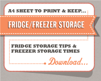
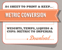
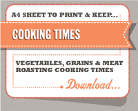
Everest has also provided three, smaller cheat sheets to easily print and post in your kitchen.  These are PDFs sized to A4 paper for the UK, but print fine on Letter parper in the U.S.


Thanks to Shelli for sending in the link!

Friday
Jul202012

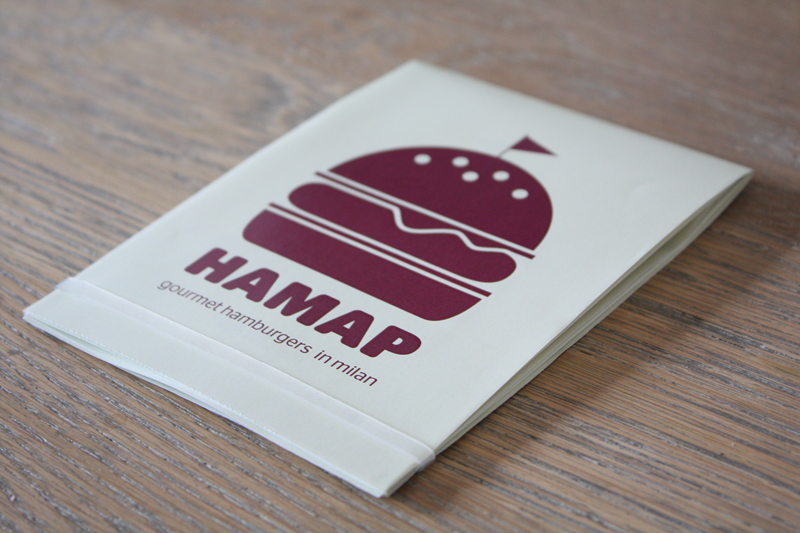
HAMAP Gourmet Burgers in Milan

 HAMAP Gourmet Burgers in Milan infographic

 HAMAP Gourmet Burgers in Milan infographic
HAMAP Gourmet Burgers in Milan infographic


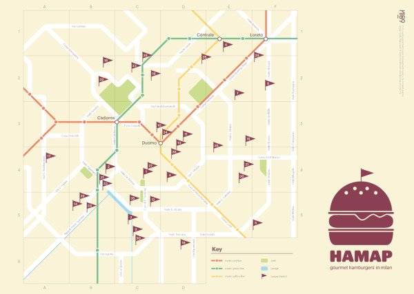
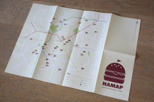
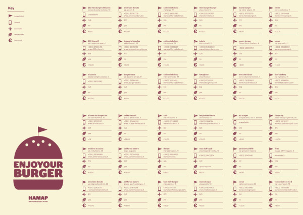
This is neat! From a convenient square to a helpful map! And the most important thing is that is points out gourmet hamburger joints in Milan, Italy!  A must have when traveling. Check out the HAMAP created by Nico and can be found at hamap.tumblr.com and behance.net.

Nico is working on making these available for purchase, but if you’re going to be in Milan before that you can email Nico at info@nico189.com.

A personal project that was born from my passion for burgers. This map shows some Milan’s bistrot where you can enjoy a good sandwich.
Now I prefer the home made by my girlfriend, who was my co-pilot in this project. 

The map is the main focal point of this printed design, but the back side includes all of the details about each restaurant like the address, GPS coordinates, phone number, veggie burger availability and average price.  The map locations are obviously visulized, but it would have been nice the the prices to be visualized as bars behind the numbers to easily compare prices at the different locations.

HAMAP Gourmet Burgers in Milan infographic


Great job Nico!

Monday
Jun042012

Eat at the Best British Restaurants for Less Than You Think

Eat at the Best British Restaurants for Less Than You Think

If you ever find yourself in the UK, this will be a very helpful infographic! The Michelin Star Lunches infographic from thetrainline.com keeps your belly, taste buds, and wallet happy!

For passionate foodies, Michelin star food is one of the finer things in life. However, for many of us, such top quality dining may feel out of reach price-wise. In fact, a day out to enjoy the finest dining (maybe taking the train and enjoying a guilt-free glass of wine or 2) could be as affordable as £15 for two courses at the two star gastro pub, the Hand & Flowers in Marlow. Even fine dining in London is affordable with 3 courses at Arbutus, Soho for just £17.95.

Look at our handy guide to all the Michelin starred restaurants in the UK above - shown in order of their most affordable set lunches.

This is a fantastic, informational, reference infographic to help you find outstanding food at reasonable prices…as long as you go for lunch instead of dinner.  Color-coded by region of the country, and organized in ascending price range, this design tells one story really well.

Seriously, if you travel or live in the UK, I would keep a copy of this infographic on your phone just so you could easily lookup these highly rated restaurants near you.

Thanks to Luke for sending in the link!

Wednesday
May232012

Fast Facts on Coffee Consumption 

Fast Facts on Coffee Consumption infographic


Pouring in Your Cup: Fast Facts About Coffee Consumption is a good infographic from Hamilton Beach.

This is a good example of a company publishing an informative, marketing infographic about a topic related to their products (coffee makers), without feeling like a sales pitch or ad for their products.  However, I don’t think there is a clear story told by the infographic.  It’s generally a bunch of coffee and caffeine statistics put together in an infographic without a clear message.

I like the design and the simple color palette.  Most of the visualizations are clear and easy to understand except the bunch of coffee cups lined up in the middle.  I think each cup is supposed to represent the 20 cups/week the average office worker drinks, and all of the cups together is supposed to represent a year of coffee consumption.  When you line up images like this, the rows really should have only 10 images each for the reader to easily understand the quantity.  So, there should be 52 cups to represent the whole year, but there are only 48 cups shown.

There are a handful of stand-alone statistics that are just shown in text, that could have been visualized.  The clock image shown next to the stats “24 minutes a day” should have had a highlighted portion showing 24 minutes.  I like the male/female symbols used on the coffee cups, and the Venn-diagram style of coffee blends is great.

I’m going to go pour myself my third cup of coffee this morning…

Found on Infographics Showcase, Infographic Pics and Infographipedia

Wednesday
May092012

TEDTalk Video: Information is Food

In March 2012, JP Rangaswami gave a short TEDTalk in Austin, TX, Information Is Food, about treating information similar to how we treat food.

How do we consume data? At TED@SXSWi, technologist JP Rangaswami muses on our relationship to information, and offers a surprising and sharp insight: we treat it like food.

With a background in economics and journalism, JP Rangaswami has been a technology innovator and chief information officer for many leading financial firms. As an advocate for open source and disruptive technologies, Rangaswami has been a leading force in the success of multiple startups, including School of Everything, Salesforce.com and Ribbit. He blogs (unmissably) at Confused of Calcutta.

This is an interesting concept, and was appealing to me because I talk about humans evolving into Informavores in my presentations about infographics and data visualization.

The analogy is that we have food consumption issues that cause health problems, and we can have information overload issues that can cause issues with understanding and our belief systems.  I loved the quote from the presentation posing the question: “Are we going to reach the stage where information has a percentage of fact associated with it?”

The video is also available on YouTube:


Monday
Apr022012

Interactive Infographic: Coca-Cola vs. Pepsi


The Coke VS. Pepsi: The Cola Wars infographic from cnntees.com. Which side are you on?

For over a century Coke and Pepsi have been at each other’s throats in a constant struggle for a bigger piece of the billion-dollar soda market. 

Along the way the companies have picked up a slew of loyalists and fans, adamant that their cola reigns supreme. While there are countless spots online to check out the history of either company we decided to put together an interactive infographic, putting all cola war highlights together in one spot.

This is a really fascinating experiment with infographic design.  Although it appears to be a static infographic, it’s actually interactive.  If you look closely, there are two videos built directly into the middle of the infographic that play when clicked.  The growth chart at the top is also interactive.  Click on a decade, and then choose the specific year, and it displays events in each companies history related to that time period.

The interactivity is so subtle though, most people will probably miss it without me spelling it out in the title and here in the commentary.

The financial stats section is a really poor use of pie charts in the bottle caps.  The logo images work, but pie charts are for visualizing percentages.  Here, they forced the data into the cute visual, but it makes the data confusing and hard to understand.    Are the charts visualizing the percentages of each expense related to total revenue, or just arbitrarily visualizing the values to represent the comparison between the two companies?  No percentages are shown, and no values are shown for the values of the total pie.  This is forcing a round peg into a square hole.

At the bottom, it’s missing a URL to the original blog post (so readers that find this on the Internet can find the original high-resolution infographic), a copyright statement, a trademark statement and a credit to the designer.

Thanks to Ron for sending in the link!

Thursday
Mar222012

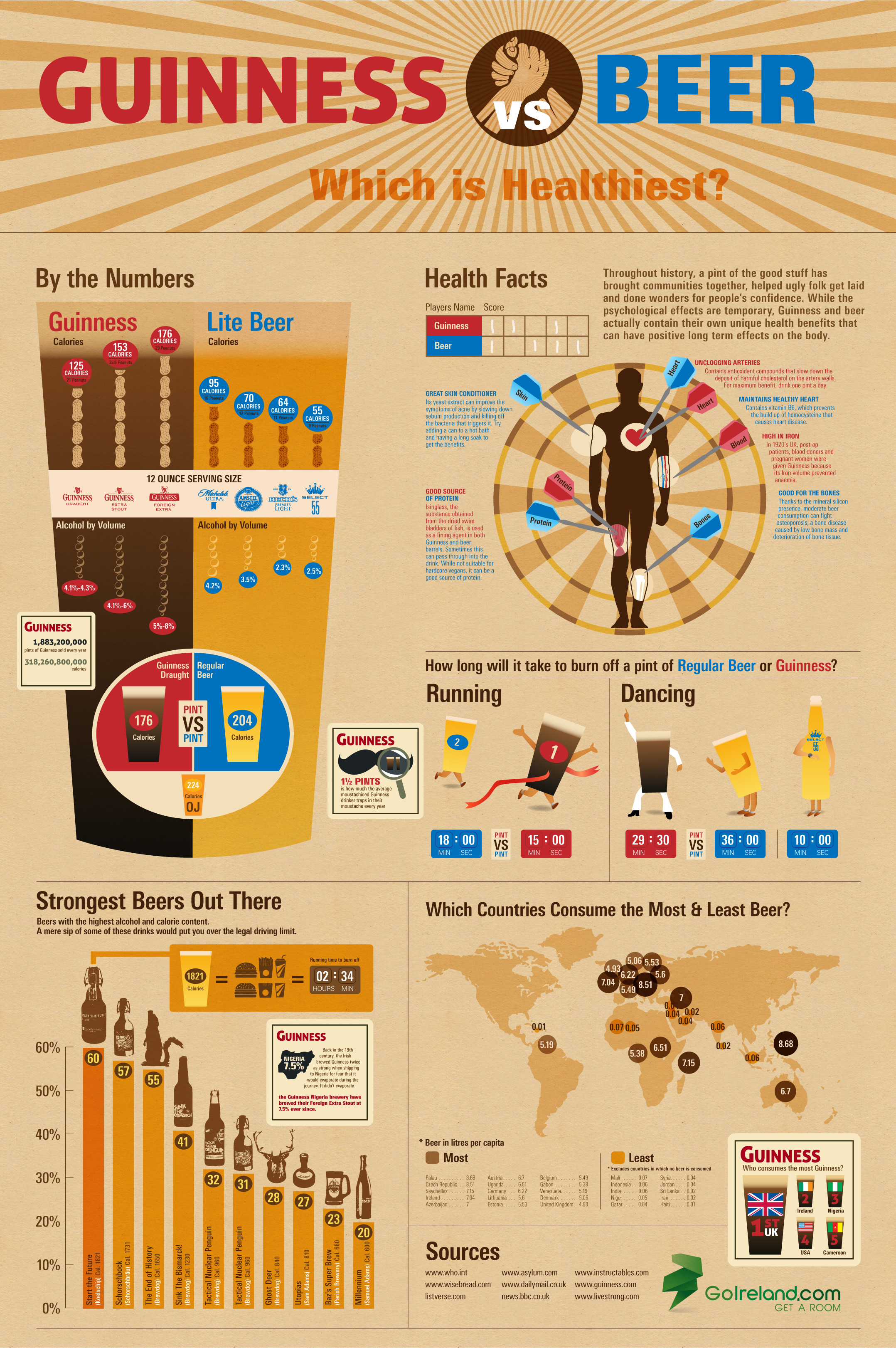
The Health Benefits of Guinness vs. Beer

The Health Benefits of Guinness vs. Beer is a new infographic from the team at GoIreland.com.  Primarily focused on calories, this infographic does a good job at visualizing comparisons.

We at GoIreland have rustled up a useful infographic about Guinness and other beers. But not just any infographic about booze. We recognize that folks in the 21st century are more health conscious than ever, so have combined these two facets to look at the health benefits of Guinness vs. other types of beer.

Whether you enjoy the dark stuff, or lean towards lager, the results show that a pint of one, or the other, can have positive effects on various areas of the body, such as the heart, bones and even your skin. Through painstaking research, we even worked out how many individual peanuts each drink is the equivalent to eating, how long it would take to burn off those calories and taken a look at some of the strongest beers known to mankind.

This infographic is really well designed, and it’s focused on one of my favorite drinks in the world!  The visual comparison between Guinness and a handful of light beers is clear and easy to read.  However, when they start comparing to “Regular Beer” it’s unclear what brand they are using as the average beer and where that data comes from.  I like the Running and Dancing comparisons that are fun and make understanding the differences easier to an average reader.

The only visualization error I see is the circles on the world map.  Circles have to be sized by their AREA, so if we assume the Ireland circle is the correct baseline, then the circles for values of 0.06 and 0.02 would only be a couple pixels wide.  The circles in the design are shown larger than their actual values, which is a false visualization.

At the bottom, I wish there was a URL to the original landing page for readers to get back to the original, and some form of copyright statement.

Thanks to Oli for sending in the link!

Here is an alternate, shorter and in my opinion “better” version.  What do you think?