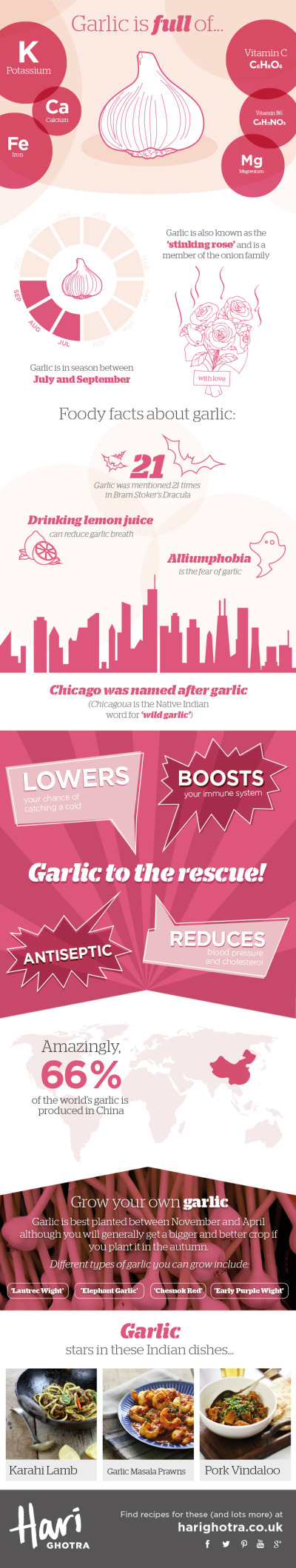
Gardening Hardiness Zones
 Randy
Randy
When planting a garden, it is best to understand which crops will preform best in different climate zones. Avant Gardening has developed the Gardening Hardiness Zones infographic for the gardener in any part of the United States.
We love the changing seasons, but we definitely miss spending time in our gardens. Every winter, we are starting to wonder when we can begin planting again.
So, when can we get back out there? The best time for starting your garden depends on where you live. That’s why every gardener knows their USDA Plant Hardiness zone.
A hardiness zone, as defined by Wikipedia, is a “geographically defined area in which a specific category of plant life is capable of growing, as defined by climatic conditions, including its ability to withstand the minimum temperatures of the zone.”
The USDA sets the zones based on the average annual extreme minimum temperature during a 30-year period in the past. The zones are not determined by the lowest temperature that has ever occurred or what is predicted to occur.Know Your Hardiness Zone
So, how do you know which zone you’re in? The USDA has created a very detailed map outlining the US and how the zones are broken down. This resource is second-to-none when it comes to hardiness zones.
Once you determine in which hardiness zone you reside – and it is as simple as visiting the USDA map and clicking the mouse on your location - you can use this information to better plan your garden.
Thanks to Deirdre for sending in the link!


;)