About
Randy Krum
President of InfoNewt.
Data Visualization and Infographic Design

Infographic Design

Infographics Design | Presentations
Consulting | Data Visualizations

DFW DataViz Meetup

Join the DFW Data Visualization and Infographics Meetup Group if you're in the Dallas/Fort Worth area!

Search the Cool Infographics site

Custom Search

Subscriptions:


Feedburner

The Cool Infographics® Gallery:

How to add the
Cool Infographics button to your:

Cool Infographics iOS icon

- iPhone
- iPad
- iPod Touch


Read on Flipboard for iPad and iPhone

Featured in the Tech & Science category

Flipboard icon

Twitter Feed
From the Bookstore

Caffeine Poster

The Caffeine Poster infographic

Entries in Moon (4)

Wednesday
Jul122017

Every Total Solar Eclipse in your Lifetime

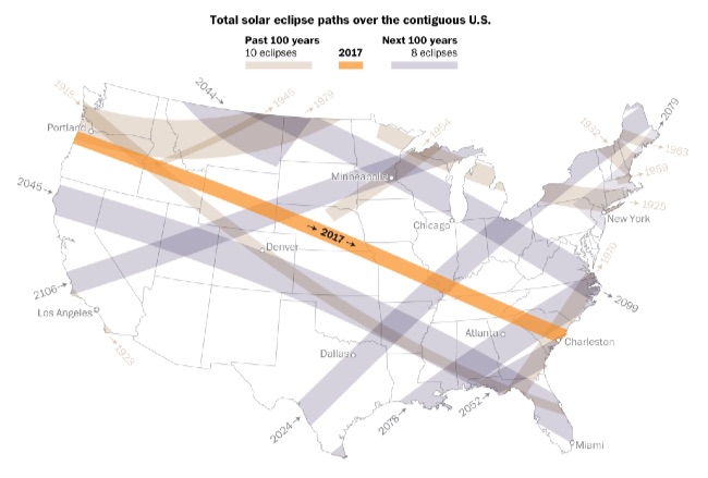
With the upcoming eclipse moving across the U.S. in August, Denise Lu at the Washington Post has created some fantastic visualizations of Every Total Solar Eclipse Happening in your Lifetime.

On Aug. 21, a total solar eclipse will be visible from the contiguous United States. It’ll be the first to traverse coast to coast in nearly a century. There will be 69 total solar eclipses visible from somewhere on the planet in the next 100 years, but only a few will be visible from North America. See how many total solar eclipses are left in your lifetime:

The path of totality for the eclipse in August stretches from coast to coast — passing over Oregon in the west and moving all the way across the country to South Carolina in the east. This is a rare event; it’s the first time the path of totality will eclipse only over the contiguous United States.

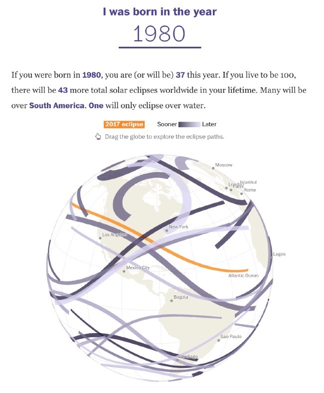
The interactive globe visualization is fascinating. Enter your birth year, and it plots all of the solar eclipses that have occurred and will occur during your expected lifetime across the globe.


Thanks to FlowingData and Chiqui Esteban

Wednesday
Oct152014

If the Moon Were Only 1 Pixel

If the Moon Were Only 1 Pixel infographic

When we talk about outer space, we have a tendency to use comparisons that are not necessarily true, but still represent large distances. However, If the Moon Were 1 Pixel infographic created by Josh Worth uses pixels to accurately measure out the solar system. Explore the full interactive design here!

If the Moon Were Only 1 Pixel infographic

Picture from mic.com

I was talking about the planets with my 5-year-old daughter the other day. I was trying to explain how taking a summer vacation to Mars in the future will be a much bigger undertaking than a trip to Palm Springs (though equally as hot). I kept trying to describe the distance using metaphors like “if the earth was the size of a golf ball, then Mars would be across the soccer field” etc., but I realized I didn’t really know much about these distances, besides the fact that they were really large and hard to understand. Pictures in books, planetarium models, even telescopes are pretty misleading when it comes to judging just how big the universe can be. Are we doing ourselves a disservice by ignoring all the emptiness?

So I thought I would see if a computer screen could help make a map of a solar system that’s a bit more accurate (while teaching myself a few things about javascript, SVGs and viewports along the way).

Not that pixels are any better at representing scale than golfballs, but they’re our main way of interpreting most information these days, so why not the solar system?

I love this animated scale representation of the solar system. Just to fit on the same page, we usually see all of the planets close together in posters and text books. But in the long run, we lose grasp of how much empty space is truly around us.

Found on Mic.com

Thursday
Apr042013

How Far is it to Mars?

How Far is it to Mars? motion infographic

How Far is it to Mars? by David Paliwoda is a fantastic animated, interactive infographic website that shows the viewer the scale of the distance to the Moon and to Mars as measured in pixels.  David calls this a motion-infographic.

Click the image above to see the animated site.  Very cool! 

Found on Daring Fireball

Wednesday
Nov142012

Total Solar Eclipse 2012

Total Solar Eclipse 2012 infographic

Today (Nov 14th) will be a total eclipse of the Sun, and the Solar Eclipses infographic from turu does a great job with visually explaining eclipses and sharing the statistics from prior eclipses.

The total solar eclipse of 2012 is set to be a spectacular event. Occurring just after sunrise on November 14 (local time), the eclipse will be best viewed from Cairns in Australia. Already a popular tourist destination, the 2012 eclipse is expected to flood the coastal city with thousands of domestic and international visitors.

The infographic provides a definition of a solar eclipse as well as information on the Australia 2012 eclipse. It offers an insight into past solar eclipses, noting duration of totality and effects on local tourism.

With a number of events scheduled such as the Solar Eclipse Marathon and the Eclipse 2012 Festival, Cairns aims to cater to this expected influx of tourists. Renowned for its sunshine, Cairns is expected to be a prime location to view the 2012 eclipse. The next opportunity to view a total eclipse in Australia will be in the year 2028, making this year’s event truly special.

A good design that tells a good story.  In the footer should be a Copyright statement, and the URL to the infographic landing page so readers can find the origial full-size version.