About
Randy Krum
President of InfoNewt.
Data Visualization and Infographic Design

Infographic Design

Infographics Design | Presentations
Consulting | Data Visualizations

DFW DataViz Meetup

Join the DFW Data Visualization and Infographics Meetup Group if you're in the Dallas/Fort Worth area!

Search the Cool Infographics site

Custom Search

Subscriptions:


Feedburner

The Cool Infographics® Gallery:

How to add the
Cool Infographics button to your:

Cool Infographics iOS icon

- iPhone
- iPad
- iPod Touch


Read on Flipboard for iPad and iPhone

Featured in the Tech & Science category

Flipboard icon

Twitter Feed
From the Bookstore

Caffeine Poster

The Caffeine Poster infographic

Entries in space (46)

Monday
Dec012008

Voyager Infographic video


Voyager from Jaime Arvizu on Vimeo.

Jaime Arvizu, a student at the Vancouver Film School, sent me a link to this infographic video that he and his team mates (Tyler Lemermeyer and Leo Aguiar) created for their Motion Design class.  You can find a high resolution version at Jaime's blog.

Thanks for sending this in Jaime, I love it!

Wednesday
Jul302008

Bio-Suit EVA Infographic Poster

From the Man Vehicle Lab at MIT, an infographic poster from professor Dava Newman and illustrator Cam Brensinger.  The poster shows the technology development in spacesuits and some future design concepts.

Sunday
Mar302008

Dark Matter distorts light


From NASA.gov, an image depicting how Dark Matter (in red) distorts light from distant galaxies as it travels across the universe.

Explanation: Is the distant universe really what it appears to be? Astronomers hope not. Intervening dark matter, which is normally invisible, might show its presence by distorting images originating in the distance universe, much the way an old window distorts images originating on the other side.

Sunday
Jan202008

Race to the Moon


Cool poster I found over at historyshots.com shows the altitudes reached by all of the U.S. and Russian launches leading up to the 1969 moon landing.

From 1961 to 1969 the USSR and the United States were locked in a history-making race to land the first person on the moon. This detailed map explains the story of this titanic contest in a clear and informative manner.

Saturday
Dec292007

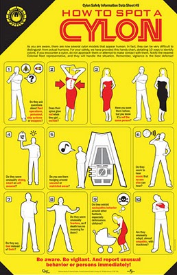
How to Spot a Cylon


This poster for fans of the new Battlestar Galactica is for sale over at QMx for $19.95, so there isn't a high resolution file available. Although, I would propose an image that we could read better would help sell more posters. In the spirit of airline emergency procedure cards, 10 ways to identify a Cylon among us.

Be Aware. Be Vigilant.

EDIT: I noticed this is now available at Amazon too:

Thursday
Nov222007

Timeline of Space Exploration


Newsweek has a cool interactive timeline showing all of the 150+ missions sent into space. Its organized by year (of course) but also by object of destination (planet/moon/asteroid). You can click on a year and zoom in to see specific dates of each launch. Rolling your mouse over any dot gives you the name and details of the mission.

Found on Information Aesthetics.

Thursday
Nov222007

TheGlobalWarming Infographic


TheGlobalWarming Infographic, originally uploaded by Seungho.

Found on Flickr by Seungho.

Saturday
Sep222007

Earth At Night


This satellite photo from NASA spans a 24-hour period showing the entire surface of the Earth in darkness. The lights obviously show the highest areas of concentration of civilization.

Note the Nile River delta, the Siberian Express railway route, the Australian coastal cities, and Africa, literally "the dark continent".
From Princeton's International Networks Archive, the old project of Jonathan Harris.

Sunday
Sep162007

The Elegant Universe


Following my earlier post on Imagining the Tenth Dimension, I found that NOVA has put the entire 3-hour show The Elegant Universe on their website.


The show is full of different visual methods to visual strings, gravity, the scale of particles and multiple dimensions. Brian Greene really did a fantastic job with this show based on his book on the same name.

Monday
Sep102007

Analytics according to Captain Kirk


This is fun one from Matt Bailey, founder of SiteLogic.com.

You can read his full description here, but the point is the use of images in the chart so you can visualize the relationship between separate pieces of information. Phasers represent fights in each episode, Kirk's photo represents affairs during the episode with Captain Kirk and the colored shirts show fatalities of an actor in that colored shirt in that particular episode. Proving once and for all that being a red-shirted ensign is a hazardous job on the Enterprise.